CSS, Bootstrap4 Cards Side by Side

Asked

Viewed 2,171 times

3

good morning! All right?

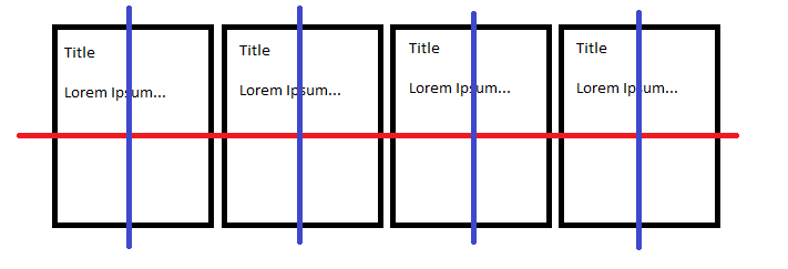
I am having difficulties with bootstrap 4, when using cards I would like them to line up side by side, but they are below each other and I do not know how to leave them side by side, besides the container are giant margins on the sides, and when I used the . container-Fluid hoping to solve the problem he got a mini margin on both sides and I do not know how to remove them, already tried the margin: 0px; and padding: 0px; and nothing solves, could help me please?

I know the doubt is beginner but I would love a light with this.

Below the HTML and CSS, I made some changes to look better for the stack but must have lost some of the indexing perfect, but I guarantee that the code is well organized. Thank you!!!

<!DOCTYPE html>
<html lang="pt-br">

 <head>
    <meta charset="utf-8" />

    <meta name="viewport" content="width=device-width,initial-scale=1.0" />

    <meta http-equiv="X-UA-Compatible" content="ie=edge" />

    <link rel="stylesheet" type="text/css" href="style.css">

    <link rel="stylesheet" href="public/css/bootstrap.min.css">

    <title>Core Store</title>

 </head>

 <body>
    <div = class="container-fluid">
     <header class="header">
        <a href="corestore.html"><img id="logo"src="public\img\logo.gif"></a>
        <nav>
            <ul class="menu">
                <li><a href="http://coresolutions.com.br/core-solutions-it">Sobre</a></li>
                <li><a href="#">Produtos</a></li>
                <li><a href="#">Contato</a></li>
            </ul>
        </nav>
     </header>
    <main>
        <h1>Produtos</h1>
        <div id="card1" class="card" style="width: 300px;">
          <img class="card-img-top" src="public\img\tub1.jpg" alt="Imagem de capa do card">
          <div class="card-body">
            <h5 class="card-title">Título do card</h5>
            <p class="card-text">Um exemplo de texto rápido para construir o título do card e fazer preencher o conteúdo do card.</p>
            <a href="#" class="btn btn-primary">Visitar</a>
          </div>
        </div>
        <div id="card2" class="card" style="width: 300px;">
          <img class="card-img-top" src="public\img\tub2.jpg" alt="Imagem de capa do card">
          <div class="card-body">
            <h5 class="card-title">Título do card</h5>
            <p class="card-text">Um exemplo de texto rápido para construir o título do card e fazer preencher o conteúdo do card.</p>
            <a href="#" class="btn btn-primary">Visitar</a>
          </div>
        </div>
        <div id="card3" class="card" style="width: 300px;">
          <img class="card-img-top" src="public\img\tub3.jpg" alt="Imagem de capa do card">
          <div class="card-body">
            <h5 class="card-title">Título do card</h5>
            <p class="card-text">Um exemplo de texto rápido para construir o título do card e fazer preencher o conteúdo do card.</p>
            <a href="#" class="btn btn-primary">Visitar</a>
          </div>
        </div>
        <div id="card4" class="card" style="width: 300px;">
           <img class="card-img-top" src="public\img\tub3.jpg" alt="Imagem de capa do card">
            <div class="card-body">
                <h5 class="card-title">Título do card</h5>
                <p class="card-text">Um exemplo de texto rápido para construir o título do card e fazer preencher o conteúdo do card.</p>
                <a href="#" class="btn btn-primary">Visitar</a>
            </div>
        </div>
        <div id="card5" class="card" style="width: 300px;">
            <img class="card-img-top" src="public\img\tub5.jpg" alt="Imagem de capa do card">
                <div class="card-body">
                    <h5 class="card-title">Título do card</h5>
                    <p class="card-text">Um exemplo de texto rápido para construir o título do card e fazer preencher o conteúdo do card.</p>
                    <a href="#" class="btn btn-primary">Visitar</a>
                </div>
        </div>
        <div id="card6" class="card" style="width: 300px;">
            <img class="card-img-top" src="public\img\tub4.jpg" alt="Imagem de capa do card">
                <div class="card-body">
                    <h5 class="card-title">Título do card</h5>
                    <p class="card-text">Um exemplo de texto rápido para construir o título do card e fazer preencher o conteúdo do card.</p>
                    <a href="#" class="btn btn-primary">Visitar</a>
                </div>
        </div>
<div id="card7" class="card" style="width: 300px;">
            <img class="card-img-top" src="public\img\tub5.jpg" alt="Imagem de capa do card">
                <div class="card-body">
                    <h5 class="card-title">Título do card</h5>
                    <p class="card-text">Um exemplo de texto rápido para construir o título do card e fazer preencher o conteúdo do card.</p>
                    <a href="#" class="btn btn-primary">Visitar</a>
                </div>
        </div>
        <div id="card8" class="card" style="width: 300px;">
            <img class="card-img-top" src="public\img\tub6.jpg" alt="Imagem de capa do card">
                <div class="card-body">
                    <h5 class="card-title">Título do card</h5>
                    <p class="card-text">Um exemplo de texto rápido para construir o título do card e fazer preencher o conteúdo do card.</p>
                    <a href="#" class="btn btn-primary">Visitar</a>
                </div>
        </div>
        <div id="anuncio" class="card" style="width: 300px;">
            <img class="card-img-top" src="public\img\tub4.jpg" alt="Imagem de capa do card">
                <div class="card-body">
                    <h5 class="card-title">Título do card</h5>
                    <p class="card-text">Um exemplo de texto rápido para construir o título do card e fazer preencher o conteúdo do card.</p>
                    <a href="#" class="btn btn-primary">Visitar</a>
                </div>
        </div>
    </main> 
    <aside><p>teste</p></aside>
    <script src="https://code.jquery.com/jquery-3.3.1.slim.min.js" integrity="sha384-q8i/X+965DzO0rT7abK41JStQIAqVgRVzpbzo5smXKp4YfRvH+8abtTE1Pi6jizo" crossorigin="anonymous"></script>
<script src="https://cdnjs.cloudflare.com/ajax/libs/popper.js/1.14.3/umd/popper.min.js" integrity="sha384-ZMP7rVo3mIykV+2+9J3UJ46jBk0WLaUAdn689aCwoqbBJiSnjAK/l8WvCWPIPm49" crossorigin="anonymous"></script>
<script src="https://stackpath.bootstrapcdn.com/bootstrap/4.1.3/js/bootstrap.min.js" integrity="sha384-ChfqqxuZUCnJSK3+MXmPNIyE6ZbWh2IMqE241rYiqJxyMiZ6OW/JmZQ5stwEULTy" crossorigin="anonymous"></script>  
<footer><p class="text-center">Feito por GFB</p></footer>
</div>
</body>
</html>


body, ul, li, p {
    margin: 0px;
    padding: 0px;
    list-style: none;
    font-size: 1.2rem;
    font-family: arial;
}.container-fluid{
    display: grid;
    grid-template-columns: 1fr 4fr 1fr;
    margin: 0px;
    padding: 0px;
    grid-template-rows: 2fr 96fr 2fr;
    grid-template-areas: "h h h"
                         "a m m"
                         "f f f"
    }
body {
}
main {
    background-color: blue;
    grid-area: m;
}
aside {
    background-color: purple;
    grid-area: a;
}
footer {
    background-color: yellow;
    grid-area: f;
}
a {
    text-decoration: none;
    color: white;
}
h1 {
    text-align: center;
    margin-top: 100px;
}
img {
    max-width: 100%;
    display: block;
}
.header {
    background-color: #101010;
    display: flex;
    flex-wrap: wrap;
    justify-content: space-between;
    padding: 20px;
    align-items: center;
    grid-area: h;
}
.logo{
margin-left: 20px;
height: 100px;
}
.menu {
    display: flex;
}
.menu li {
    margin-left: 10px;
}

.menu li a {
    display: block;
    padding: 10px;
    background-color: #008B8B;
    color: white;
}
.card {
    margin: 0px;
    padding: 0px;
}

4 answers

4

For you to work with Bootstrap, the correct is to use the grids of the same. So to solve your problem, just put each card within a column, the correct structure would be more or less the following:

<div class='row'>

     <div class='col-3'>

          <div class='card'>
               ...
          </div>

     </div>

     <div class='col-6'>

          <div class='card'>
               ...
          </div>

     </div>

     <div class='col-3'>

          <div class='card'>
               ...
          </div>

     </div>

</div>

In the above example I create a line (row), and inside it I put the columns (col). The sum of the value of these columns may not be greater than 12, because otherwise will break your layout. Doing this, your card will automatically stand side by side, and on mobile devices will be responsive. ;)

If you want to understand a little more, leaving the Bootstrap documentation link in English for you to understand a little bit about the grid: https://getbootstrap.com.br/docs/4.1/layout/grid/

I hope it helped, hugs!

  • 1

    Thanks! Helped me a lot tbm

3


Include cards in a div .container-fluid and add other native Bootstrap 4 classes to convert to flexbox:

<div class="container-fluid d-flex flex-wrap">
   COLOQUE OS CARDS AQUI
</div>

How you are changing the native class .container-fluid in your CSS, change the name of the class to another to not mess up the Bootstrap class. For example, you can use the class .grid. Change:

.container-fluid{
    display: grid;
    grid-template-columns: 1fr 4fr 1fr;
    margin: 0px;
    padding: 0px;
    grid-template-rows: 2fr 96fr 2fr;
    grid-template-areas: "h h h"
                         "a m m"
                         "f f f"
}

For:

.grid{
    display: grid;
    grid-template-columns: 1fr 4fr 1fr;
    margin: 0px;
    padding: 0px;
    grid-template-rows: 2fr 96fr 2fr;
    grid-template-areas: "h h h"
                         "a m m"
                         "f f f"
}

And in the main div (the one that comes just after the opening of the body) add the class .grid:

<div class="container-fluid grid">

Another problem is the margin-top in the <h1>. Remove it as it creates an empty space between the div where it is and the header.

Instead, put a padding-top in the main with the value you want to give the spacing.

Your code will look like this:

body, ul, li, p {
    margin: 0px;
    padding: 0px;
    list-style: none;
    font-size: 1.2rem;
    font-family: arial;
}
.grid{
    display: grid;
    grid-template-columns: 1fr 4fr 1fr;
    margin: 0px;
    padding: 0px;
    grid-template-rows: 2fr 96fr 2fr;
    grid-template-areas: "h h h"
                         "a m m"
                         "f f f"
}
body {
}
main {
    background-color: blue;
    grid-area: m;
    padding-top: 50px;

}
aside {
    background-color: purple;
    grid-area: a;
}
footer {
    background-color: yellow;
    grid-area: f;
}
a {
    text-decoration: none;
    color: white;
}
h1 {
    text-align: center;
    /*margin-top: 100px;*/
}
img {
    max-width: 100%;
    display: block;
}
.header {
    background-color: #101010;
    display: flex;
    flex-wrap: wrap;
    justify-content: space-between;
    padding: 20px;
    align-items: center;
    grid-area: h;
}
.logo{
margin-left: 20px;
height: 100px;
}
.menu {
    display: flex;
}
.menu li {
    margin-left: 10px;
}

.menu li a {
    display: block;
    padding: 10px;
    background-color: #008B8B;
    color: white;
}
.card {
    margin: 0px;
    padding: 0px;
}
<link rel="stylesheet" type="text/css" href="https://maxcdn.bootstrapcdn.com/bootstrap/4.1.0/css/bootstrap.min.css">

<div class="container-fluid grid">
  <header class="header">
     <a href="corestore.html"><img id="logo"src="public\img\logo.gif"></a>
     <nav>
         <ul class="menu">
             <li><a href="http://coresolutions.com.br/core-solutions-it">Sobre</a></li>
             <li><a href="#">Produtos</a></li>
             <li><a href="#">Contato</a></li>
         </ul>
     </nav>
  </header>
 <main>
     <h1>Produtos</h1>
     <div class="container-fluid d-flex flex-wrap">
     <div id="card1" class="card" style="width: 300px;">
       <img class="card-img-top" src="public\img\tub1.jpg" alt="Imagem de capa do card">
       <div class="card-body">
         <h5 class="card-title">Título do card</h5>
         <p class="card-text">Um exemplo de texto rápido para construir o título do card e fazer preencher o conteúdo do card.</p>
         <a href="#" class="btn btn-primary">Visitar</a>
       </div>
     </div>
     <div id="card2" class="card" style="width: 300px;">
       <img class="card-img-top" src="public\img\tub2.jpg" alt="Imagem de capa do card">
       <div class="card-body">
         <h5 class="card-title">Título do card</h5>
         <p class="card-text">Um exemplo de texto rápido para construir o título do card e fazer preencher o conteúdo do card.</p>
         <a href="#" class="btn btn-primary">Visitar</a>
       </div>
     </div>
     <div id="card3" class="card" style="width: 300px;">
       <img class="card-img-top" src="public\img\tub3.jpg" alt="Imagem de capa do card">
       <div class="card-body">
         <h5 class="card-title">Título do card</h5>
         <p class="card-text">Um exemplo de texto rápido para construir o título do card e fazer preencher o conteúdo do card.</p>
         <a href="#" class="btn btn-primary">Visitar</a>
       </div>
     </div>
     <div id="card4" class="card" style="width: 300px;">
        <img class="card-img-top" src="public\img\tub3.jpg" alt="Imagem de capa do card">
         <div class="card-body">
             <h5 class="card-title">Título do card</h5>
             <p class="card-text">Um exemplo de texto rápido para construir o título do card e fazer preencher o conteúdo do card.</p>
             <a href="#" class="btn btn-primary">Visitar</a>
         </div>
     </div>
     <div id="card5" class="card" style="width: 300px;">
         <img class="card-img-top" src="public\img\tub5.jpg" alt="Imagem de capa do card">
             <div class="card-body">
                 <h5 class="card-title">Título do card</h5>
                 <p class="card-text">Um exemplo de texto rápido para construir o título do card e fazer preencher o conteúdo do card.</p>
                 <a href="#" class="btn btn-primary">Visitar</a>
             </div>
     </div>
     <div id="card6" class="card" style="width: 300px;">
         <img class="card-img-top" src="public\img\tub4.jpg" alt="Imagem de capa do card">
             <div class="card-body">
                 <h5 class="card-title">Título do card</h5>
                 <p class="card-text">Um exemplo de texto rápido para construir o título do card e fazer preencher o conteúdo do card.</p>
                 <a href="#" class="btn btn-primary">Visitar</a>
             </div>
     </div>
      <div id="card7" class="card" style="width: 300px;">
         <img class="card-img-top" src="public\img\tub5.jpg" alt="Imagem de capa do card">
             <div class="card-body">
                 <h5 class="card-title">Título do card</h5>
                 <p class="card-text">Um exemplo de texto rápido para construir o título do card e fazer preencher o conteúdo do card.</p>
                 <a href="#" class="btn btn-primary">Visitar</a>
             </div>
     </div>
     <div id="card8" class="card" style="width: 300px;">
         <img class="card-img-top" src="public\img\tub6.jpg" alt="Imagem de capa do card">
             <div class="card-body">
                 <h5 class="card-title">Título do card</h5>
                 <p class="card-text">Um exemplo de texto rápido para construir o título do card e fazer preencher o conteúdo do card.</p>
                 <a href="#" class="btn btn-primary">Visitar</a>
             </div>
     </div>
     <div id="anuncio" class="card" style="width: 300px;">
         <img class="card-img-top" src="public\img\tub4.jpg" alt="Imagem de capa do card">
             <div class="card-body">
                 <h5 class="card-title">Título do card</h5>
                 <p class="card-text">Um exemplo de texto rápido para construir o título do card e fazer preencher o conteúdo do card.</p>
                 <a href="#" class="btn btn-primary">Visitar</a>
             </div>
     </div>
     </div>
 </main> 

  • Perfect! You helped me so much!! Thank you so much.

2

Hello, good has several ways to address this theme, being flexbox, or grid.... Follow a practical example of using flexbox


<!doctype html>
<html lang="pt-br">
  <head>

    <title>Bootstrap - Classes flexbox</title>

    <!-- Required meta tags -->
    <meta charset="utf-8">
    <meta name="viewport" content="width=device-width, initial-scale=1, shrink-to-fit=no">

    <!-- Bootstrap CSS -->
    <link rel="stylesheet" href="css/bootstrap.min.css">

    <style type="text/css">
      .caixa {
        background: #f5f5f5;
        height: 200px;
      }
      .item {
        border:1px solid black;
        padding: 5px;
      }

    </style>

  </head>

  <body>

    <div class="container">

      <h2>Flex container e flex itens (d-flex, flex-row, flex-column, flex-row-reverse)</h2>
      <div class="caixa d-flex flex-row-reverse">
        <div class="item">Flex item 1</div>
        <div class="item">Flex item 2</div>
        <div class="item">Flex item 3</div>
      </div>
      <br><br>

      <h2>Alinhamento horizontal: justify-content-ALINHAMENTO (start, center, end, around e between)</h2>
      <div class="caixa d-flex justify-content-between">
        <div class="item">Flex item 1</div>
        <div class="item">Flex item 2</div>
        <div class="item">Flex item 3</div>
      </div>
      <br><br>

      <h2>Colunas (d-flex, flex-column, flex-column-reverse)</h2>
      <div class="caixa d-flex flex-column-reverse">
        <div class="item">Flex item 1</div>
        <div class="item">Flex item 2</div>
        <div class="item">Flex item 3</div>
      </div>
      <br><br>

      <h2>Alinhamento vertical: align-items-ALINHAMENTO (start, center, end, baseline e stretch)</h2>
      <div class="caixa d-flex align-items-stretch">
        <div class="item" style="padding-top: 30px;">Flex item 1</div>
        <div class="item">Flex item 2</div>
        <div class="item" style="padding-bottom: 50px;">Flex item 3</div>
      </div>
      <br><br>

      <h2>Alinhamento self: align-self-ALINHAMENTO (start, center, end, baseline e stretch)</h2>
      <div class="caixa d-flex">
        <div class="item align-self-start">Flex item 1</div>
        <div class="item align-self-center">Flex item 2</div>
        <div class="item align-self-end">Flex item 3</div>
        <div class="item align-self-baseline">Flex item 4</div>
        <div class="item align-self-stretch">Flex item 5</div>
      </div>
      <br><br>

    </div>

    <!-- Optional JavaScript -->
    <!-- jQuery first, then Popper.js, then Bootstrap JS -->
    <script src="https://code.jquery.com/jquery-3.3.1.slim.min.js" integrity="sha384-q8i/X+965DzO0rT7abK41JStQIAqVgRVzpbzo5smXKp4YfRvH+8abtTE1Pi6jizo" crossorigin="anonymous"></script>
    <script src="https://cdnjs.cloudflare.com/ajax/libs/popper.js/1.14.3/umd/popper.min.js" integrity="sha384-ZMP7rVo3mIykV+2+9J3UJ46jBk0WLaUAdn689aCwoqbBJiSnjAK/l8WvCWPIPm49" crossorigin="anonymous"></script>
    <script src="js/bootstrap.min.js"></script>
  </body>
</html>
  • But in that case I would have to remove all CSS GRID from my correct code? and would not like to do this because it helps me to keep organized in the template I want, I used only in the header flexbox.

2

Hello!!

So... At first we need to understand how html works:

html works in a schema that displays one element per line (no css), so by default of it, each control created corresponds to a line and then it will always "break" before to insert another control. This can be manipulated in the css.

The Bootstrap has a behavior defined through classes where you can manipulate rows and columns to display symmetrically(or not) and organized their controls.

The Class Row works so that all or as many controls within it as possible are displayed in a single row if the size exceeds the screen size, it breaks the content.

Ex:

<div class="row">
    <div class="card column-md-3">
        <h1>Title</h1>
        <p>lorem ipsum...</p>
    </div>
    <div class="card column-md-3">
        <h1>Title</h1>
        <p>lorem ipsum...</p>
    </div>
    <div class="card column-md-3">
        <h1>Title</h1>
        <p>lorem ipsum...</p>
    </div>
    <div class="card column-md-3">
        <h1>Title</h1>
        <p>lorem ipsum...</p>
    </div>
</div>

Grossly, we can have with some more css the following style:

Exemplo de tratamento.

To Red Line refers to the behavior of Row, displaying the content on the same line.

As Blue Lines make reference to the behavior of Columns which can be worked further ahead.

Utilize the class Row for this case, and add the amount of cards you want per line, for each line use a "div class="Row"".

Content for consultation on the bootstrap grid system: https://getbootstrap.com/docs/4.1/layout/grid/

Browser other questions tagged

You are not signed in. Login or sign up in order to post.