How does an image adapt to the placement of an element in css?

Asked

Viewed 48 times

-2

I’m building a project and I had to use css, which by the way is not my strong suit, and I came across the following situation, the site needs to be responsive, but when I went to put elements inside a div in which the image not only needs to adapt its positioning but the size, the following situation happened:

abaixo o erro de posicionamento

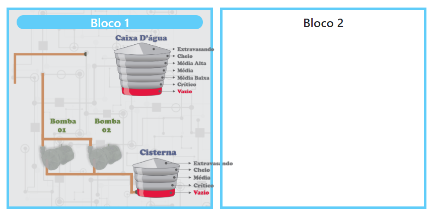
Above, the elements should connect because this brown part symbolizes a pipe and is connected regardless of the size of the device, and burst the div as you can see, what will be happening?

Note: the elements are images divided in parts because I will work with the DOM.

Follow the html code of the page:

<div class="container">
    <div id="bloco1" class="container">
        <h4 class="text-center" id="blc1">Bloco 1</h4>
        <img src="/img/caixa_vazio.png" alt="cisterna vazia" class="caixa">
        <img src="/img/bombas_off.png" alt="bombas off" class="bombas">
        <img src="/img/cisterna_vazio.png" alt="cisterna vazio" class="cisterna">
    </div>
    <div id="bloco2">
        <h4 class="text-center" id="blc2">Bloco 2</h4>
    </div>
</div>

css code applied:

#bloco1{
    width: 410px;
    height: 400px;
    border: solid 5px rgb(64, 206, 250);
    margin-top: 20px;
    display: inline-block;
    background: no-repeat url(/img/imagem_fundo.png);
    background-size: cover;

}

h4#blc1{
    margin-top: 10px;
    border: 1px black;
    background-color: rgb(64, 206, 250);
    color: white;
    border-radius: 20px;
}

#bloco2{
    position: relative;
    width: 410px;
    height: 400px;
    border: solid 5px rgb(64, 206, 250);
    margin: 20px 0px 10px 10px;
    display: inline-block;}

h4#blc2{
    margin-top: 10px;
}

.caixa{
    position: absolute;
    width: 200px;
    height: auto;
    left: 322px;
    margin-top: 2px;
}

.bombas{
    position:absolute;
    width: 200px;
    height: auto;
    left: 169.7px;
    top: 150px;
}

.cisterna{
    position:absolute;
    width: 200px;
    height: auto;
    left: 359px;
    top: 300px;
}

body{
    margin-bottom: 10px;
}
  • 1

    Send the images so you can test the alignment on different devices. Use https://imgur.com/ links or other sharing device of your choice.

  • download from my drive: https://drive.google.com/file/d/1WAuWv7bhb6G9jB0-JwG8QYa_4MQACCJ7/view?usp=sharing

1 answer

0


Problem solving:

I solved the problem by putting the property position: sticky;in the images with this they accompanied at all times its parent element that was the div, I made some modifications to the project and my code was like this:

NOTE: I am using the view engine handlebars.

On the HTML page:

<div class="container">
    <div id="bloco1" class="container">
        <h4 class="text-center" id="blc1">Bloco 1</h4>
        <div>
            <small hidden id="valor_caixa01">{{caixa}}</small>
            <img src="/img/caixa_vazio.png" id="caixa_foto01" class="caixa">
        </div>
        <div>
            <small hidden id="bomba_valor01">{{bomba}}</small>
            <img src="/img/bombas_off.png" id="bomba_foto01" class="bomba">
        </div>
        <div>
            <small hidden id="cisterna_valor01">{{cisterna}}</small>
            <img src="img/cisterna_vazio.png" id="cisterna_foto01" class="cisterna">
        </div>
        <div>
            <h6 id="temperatura01" class="temperatura">Temperatura: {{temperatura}}°C</h6>
            <h6 id="pressao01" class="pressao">Pressão: {{pressao}}</h6>
            <h6 id="createdAt01" class="createdAt">Data da Consulta: {{createdAt}}</h6>
        </div>
    </div>
    <div id="bloco2">
        <div class="container">
            <h4 class="text-center" id="blc2">Bloco 2</h4>
        </div>
    </div>
</div>

In the content of the CSS:

footer{
    text-align: center;
    background-color: #343a40;
    color: white;
    width: 100%;
    padding: 10px;
    bottom: 0;
    position: fixed;
}

#login.container{
    width: 400px;
    margin-top: 200px;
    background-color: #343a40;
    height: 250px;
    color: white;
    border-radius: 20px;
}

#monitor{
    display: inline-block;
    margin-left: 250px;
}

#relatorio{
    display: inline-block;
    margin: 200px 0px 0px 300px;
}

#bloco1{
    width: 430px;
    height: 520px;
    border: solid 5px rgb(0, 31, 167);
    margin-top: 20px;
    display: inline-block;
    background: no-repeat url(/img/imagem_fundo.png);
    background-size: cover;
    border-radius: 5px;
}

h4#blc1{
    margin-top: 10px;
    border: 1px black;
    background-color: rgb(0, 31, 167);
    color: white;
    border-radius: 3px;
    padding: 3px;
}

#bloco2{
    position: absolute;
    width: 430px;
    height: 520px;
    border: solid 5px rgb(0, 31, 167);
    margin: 20px 0px 0px 150px;
    display: inline-block;
    border-radius: 5px;
    background: no-repeat url(/img/imagem_fundo.png);
    background-size: auto;
    background-size: cover;
}

h4#blc2{
    margin-top: 10px;
    border: 1px black;
    background-color: rgb(0, 31, 167);
    color: white;
    border-radius: 3px;
    padding: 3px;
}

.caixa{
    position: sticky;
    width: 200px;
    margin-left: 149px;
    margin-top: 10px;
}

.bomba{
    position: sticky;
    width: 150px;
    margin-top: -75px;
    margin-left: 30px;
}

.cisterna{
    position: sticky;
    width: 200px;
    margin-left: 170px;
    margin-top: -110px;
}

.temperatura{
    margin-top: 10px;
    font-size: 15pt;
    font-weight: bold;
}

.pressao{
    font-size: 15pt;
    font-weight: bold;
}

.createdAt{
    font-size: 15pt;
    font-weight: bold;
}

Browser other questions tagged

You are not signed in. Login or sign up in order to post.