Distribute <li> list in 3 columns

Asked

Viewed 1,432 times

2

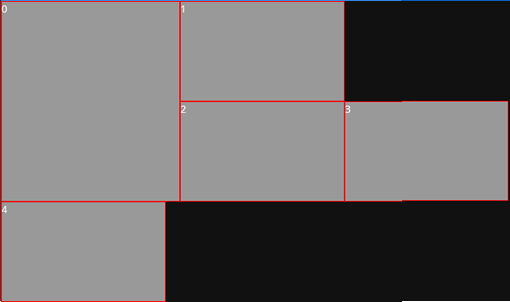
I’m trying to create a list with 5 blocks, 4 230X140px and 1 250X280px , but they don’t align side-by-side correctly, they’re like this:

inserir a descrição da imagem aqui

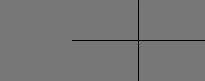
I wish they’d stay that way:

inserir a descrição da imagem aqui

codes:

HTML

<ul>
    <li class="tile-high">0</li>
    <li>1</li>
    <li>2</li>
    <li>3</li>
    <li>4</li>
</ul>

CSS

    ul {
    padding: 0;
    margin: 0;
    list-style: none;
}
ul li {
    width: 230px;
    height: 140px;
    margin: 0;
    border: 1px solid red;
    background: #999;
    overflow: hidden;
}
ul li.tile-high {
    width: 250px;
    height: 280px;
}
ul li:nth-child(odd) {
    float: left;
}

2 answers

3

One way is to apply the float:left to all <li> and tag <ul> within a <div> of defined size. It would look like this:

HTML:

<div id="main">
<ul>
    <li class="tile-high">0</li>
    <li>1</li>
    <li>2</li>
    <li>3</li>
    <li>4</li>
</ul>
</div>

CSS:

#main{
    width: 720px;
}
ul {
    padding: 0;
    margin: 0;
    list-style: none;
}
ul li {
    width: 230px;
    height: 140px;
    margin: 0;
    border: 1px solid red;
    background: #999;
    overflow: hidden;
}
ul li.tile-high {
    width: 250px;
    height: 280px;
}
ul li {
    float: left;
}

1

Apparently, just remove the :nth-child(odd)of the last selector and wrap the list in a DIV whose width adds the dimensions of all boxes (more borders and paddings of the box-model):

div {
    width: 716px;
}
ul {
    padding: 0;
    margin: 0;
    list-style: none;
}
ul li {
    width: 230px;
    height: 140px;
    margin: 0;
    border: 1px solid red;
    background: #999;
    overflow: hidden;
}
ul li.tile-high {
    width: 250px;
    height: 280px;
}
ul li {
    float: left;
}
<div>
    <ul>
        <li class="tile-high">0</li>
        <li>1</li>
        <li>2</li>
        <li>3</li>
        <li>4</li>
    </ul>
</div>

Browser other questions tagged

You are not signed in. Login or sign up in order to post.