Distribute list of <li> in two columns

Asked

Viewed 14,224 times

8

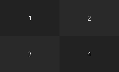
I’m trying to create a list with 4 blocks, but they don’t align side-by-side correctly, they’re like this:

inserir a descrição da imagem aqui

I wish they’d stay that way:

inserir a descrição da imagem aqui

HTML:

<li></li>
<li></li>
<li></li>
<li></li>

CSS

#test li {
    width: 230px;
    height: 140px;
    margin: 0;
    border: 1px solid red;
    background: #999;
    float: left;
    overflow: hidden;
}

Why aren’t they lining up?

  • Does the parent section have a fixed size? The float: left will not help if the section occupies a variable size with the browser resize.

  • I don’t understand, buddy, how so section dad?

  • <div id="pai"><ol><li></li></ol></div> In this case, your <ol> or your <div> has width specified? Or when you resize your browser <li> are moving?

  • Yes, the div is 1000px in size.

  • In this case the float: left will make the element float and fill the space that is available. You need to increase the size of the width of their li (something like 500px maybe) or change li for div.

6 answers

7

Here is a CSS3 solution that takes into account several factors:

  • Variable width: you can change the size of the UL, which the cells will follow;

  • Security when setting the 50% not to "burst" the available space by browser inconsistencies;

  • Includes the solution for "checkered" CSS colors (even if it’s just for illustration, it’s nice to know how to do it);

html, body, ul {      /* aqui o que importa é o UL, o resto é pra estética do demo.          */
  position:relative;  /* reset do position, não relacionado ao demo, mas bom pra uso geral.  */
  margin:0;           /* Zeramos as margens e o padding do UL para as células.encostarem     */
  padding:0;
  width:100%;         /* por default, os blocos são 100%, mas vamos garantir isso.           */
  height:100%;        /* aqui foi feito pra fins de demonstração apenas.                     */
}


li {
  display:block;             /* primeiro passo, transformar o LI em bloco.                   */ 
  list-style-type: none;     /* depois, remoção dos bullets.                                 */
  margin:0;                  /* nao queremos espaços ente os blocos.                         */
  background-color:#666;     /* cor de fundo principal, o "grid" fazemos depois              */
  box-sizing: border-box;    /* medidas são de borda à borda, o padding não é acrescentado.  */
  height:25%;                /* esta linha é pela estética do demo                           */
}

li:nth-child(odd) {          /* este css será aplicato nos LI impares (1, 3, 5... ).         */
  clear:both;                /* forçamos a quebra de linha por segurança...                  */
  float:left;                /* ... e o alinhamos à esquerda.                                */
  width:50%;                 /* Aplicamos 50% na esquerda, os da direita "herdam" o resto.   */
}

li:nth-child(4n+2),          /* aqui pulamos de 4 em 4 itens começando do 2 ( 2, 6, ...).    */
li:nth-child(4n+3) {         /* aqui de 4 em 4 começando do 3 ( 3, 7, ... )                  */
  background-color:#444;     /* e mudamos a cor, dando efeito de quadriculado                */
}
<ul>
  <li>1</li>
  <li>2</li>
  <li>3</li>
  <li>4</li>
  <li>5</li>
  <li>6</li>
  <li>7</li>
  <li>8</li>
</ul>

  • 1

    Thank you very much, man!

5

You could do this by only affecting odd blocks:

ul li {
  width: 230px;
  height: 140px;
  margin: 0;
  border: 1px solid red;
  background: #999;
  overflow: hidden;
}

ul li:nth-child(odd) {
  float:left;
}
<ul>
<li></li>
<li></li>
<li></li>
<li></li>
</ul>

<ul>
<li></li>
<li></li>
<li></li>
<li></li>
</ul>
  • 1

    Thank you very much, man!

  • Dude, what if I want to add one more block only bigger, getting 4 of 230x140px and another 250x280px, the biggest at the beginning and the 4 at the side? I tried, but it was like, "out"

  • Ex: http://s18.postimg.org/cmwrc02ux/Untitled_1.jpg

  • 1

    @user3386417 Is this still a list? It looks like a three-column Row. It would be interesting to create a new question with the image and the code, here it is complicated to answer.

  • this @NGTHM4R3, marks the one that best met as an answer, cites in a new question this question, but that now needs another block, only bigger the left. And I’m sure that fast we answer, seriously, the guys answer really fast, I can’t even answer :/

3

You can also set the width to 50%

ul{width: 400px; height: 400px; list-style:none; margin:0; padding: 0; font-family: Arial; color: #FFF; font-size: 1.5em}
li{float: left; width:50%; height: 50%; padding: 0; background-color: #292929;}
li:first-child, li:last-child{background-color: #222222 !important;}
li > span{display: block; width: 100%; text-align: center; padding: 44% 0;}
<ul>
  <li><span>1</span></li>
  <li><span>2</span></li>
  <li><span>3</span></li>
  <li><span>4</span></li>
</ul>

  • And Ockham’s Razor strikes again. :)

0

Assigning the display: inline-block solves in part, you can also add width to break according to size. I hope this time help and clarify the doubts. Follow very good link: http://pt-br.learnlayout.com/inline-block.html

ul {width: 30px;}
ul li {
    display: inline-block;
}
  • 1

    Why doesn’t it provide an answer? It should be improved.

  • Responding with code only does not explain the actual procedure for solving the problem. Try to edit your answer.

  • @Celsomtrindade agrees with Jorgeb, the only problem of the answer and does not give an explanation about the resolution, but there is nothing wrong with putting only code (even if it is a single line).

  • @Omni But in this case, what will his code do to solve the problem? How will it help? Just switching to inline-block does not answer, let alone solve the problem.

0

I particularly prefer using "display: inline-block" because using float causes the parent element (in the case of "ul") to lose height, and with that Voce needs more property(s) so that "ul" does not lose height.

ul {
  font-size: 0;
}
ul li {
  box-sizing: border-box;
  display: inline-block;
  width: 50%;
  height: 140px;
  margin: 0;
  border: 1px solid red;
  background: #999;
  overflow: hidden;
}
<ul>
<li></li>
<li></li>
<li></li>
<li></li>
</ul>

-1

Correct solution:

ul {
    -moz-column-count: 4;
    -moz-column-gap: 20px;
    -webkit-column-count: 4;
    -webkit-column-gap: 20px;
    column-count: 4;
    column-gap: 20px;
}

Reference: https://www.w3.org/TR/css-multicol-1/

  • No, it’s not the right solution, mate

  • You say no. What semantic solution then would you give without JS and that CSS already provides this?

  • You see his CSS, it’s like this #test li {..., probably means that before the LI should have the UL with the ID test, Another thing, your CSS doesn’t work, it’s not like the example reference image. And I found it strange that you say that is the "correct answer", because the others are not, already have answer talking about UL, and the CSS here does not solve the question... It was just a note ok, test your code that you will see

  • I gave an example of the CSS properties, not on top of the guy’s example. I showed the properties that should be used only.

Browser other questions tagged

You are not signed in. Login or sign up in order to post.