Spacing in table

Asked

Viewed 67 times

1

Good morning, everyone!

All right?

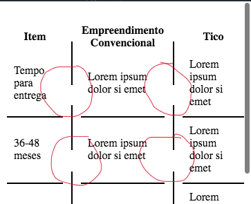
I have a little problem on my table

I want to make a table in this model here

inserir a descrição da imagem aqui

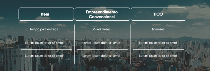
I did it this way here, what’s the problem? When it’s in the mobile version, the vertical line breaks down (it separates).

inserir a descrição da imagem aqui

HTML

<section class="home-imovel-time">
    <div class="home-imovel-time-wrapper">
        <table class="home-imovel-time-info">
            <thead>
                <tr>
                    <th>Item</th>
                    <th></th>
                    <th>Empreendimento Convencional</th>
                    <th></th>
                    <th>Tico</th>
                </tr>
            </thead>
            <tbody>
                <tr>
                    <td>Tempo para entrega</td>
                    <td class="empty"></td>
                    <td>Lorem ipsum dolor si emet</td>
                    <td class="empty"></td>
                    <td>Lorem ipsum dolor si emet</td>
                </tr>
                <tr>
                    <td>36-48 meses</td>
                    <td class="empty"></td>
                    <td>Lorem ipsum dolor si emet</td>
                    <td class="empty"></td>
                    <td>Lorem ipsum dolor si emet</td>
                </tr>
                <tr>
                    <td>12 meses</td>
                    <td class="empty"></td>
                    <td>Lorem ipsum dolor si emet</td>
                    <td class="empty"></td>
                    <td>Lorem ipsum dolor si emet</td>
                </tr>
            </tbody>
        </table>
    </div>
</section>

CSS

.home-imovel-time-info {
     margin-top: 30px;
}
 .home-imovel-time-info td, .home-imovel-time-info tr {
     color: black;
}
 .home-imovel-time-info td {
     padding: 10px;
}
 .home-imovel-time-info td.empty {
     border: none;
     display: initial;
     margin: 10px;
     border-right: 2px solid black;
     padding: 0;
     padding-bottom: 30px;
     padding-top: 15px;
}
 .home-imovel-time-info td:last-child {
     border: none;
}
 .home-imovel-time-info tr:not(:first-child) td {
     border-top: 2px solid black;
}

This code is also in jsfiddle.

https://jsfiddle.net/u59zphyv/

Who can help me thank!

Thanks a lot, guys. A Good Day!

2 answers

2

You can do something like this:

.home-imovel-time-info {
     margin-top: 30px;
}
 .home-imovel-time-info td, .home-imovel-time-info tr {
     color: black;
}
 .home-imovel-time-info td {
     padding: 10px;
     border: 4px solid #fff;
     border-top: none;
     border-bottom: none;
}
 .home-imovel-time-info td.empty {
     padding: 1px;
     background-color: #000;
}
 .home-imovel-time-info tr:not(:first-child) td {
     border-top: 2px solid black;
}
<link rel="stylesheet" type="text/css" href="https://maxcdn.bootstrapcdn.com/bootstrap/4.1.0/css/bootstrap.min.css">
<section class="home-imovel-time">
    <div class="home-imovel-time-wrapper">
        <table class="home-imovel-time-info">
            <thead>
                <tr>
                    <th>Item</th>
                    <th></th>
                    <th>Empreendimento Convencional</th>
                    <th></th>
                    <th>Tico</th>
                </tr>
            </thead>
            <tbody>
                <tr>
                    <td>Tempo para entrega</td>
                    <td class="empty"></td>
                    <td>Lorem ipsum dolor si emet</td>
                    <td class="empty"></td>
                    <td>Lorem ipsum dolor si emet</td>
                </tr>
                <tr>
                    <td>36-48 meses</td>
                    <td class="empty"></td>
                    <td>Lorem ipsum dolor si emet</td>
                    <td class="empty"></td>
                    <td>Lorem ipsum dolor si emet</td>
                </tr>
                <tr>
                    <td>12 meses</td>
                    <td class="empty"></td>
                    <td>Lorem ipsum dolor si emet</td>
                    <td class="empty"></td>
                    <td>Lorem ipsum dolor si emet</td>
                </tr>
            </tbody>
        </table>
    </div>
</section>

See that you only need to put one padding: 1px and a black background in cells .empty and a padding of 4px on the sides of the other cells. It will be the same in any screen resolution. Also note that there is a good code reduction to get the result.

  • Speak Sam, solved here.. Thank you very much guy!

1

Living Ola adds something like this. Using media darlings, you can customize / change behaviors for mobile tablet, and various super wide screen resolutions, etc. I share your example that solves the problem, but you may have others that you have to solve in this way.

.home-imovel-time-info {
  margin-top: 30px;

  td,
  tr {
    color: black;
  }

  td {
    padding: 10px;

    &.empty {
      border: none;
      display: initial;
      margin: 10px;
      border-right: 2px solid black;
      padding: 0;
      padding-bottom: 30px;
      padding-top: 15px;
    }

    &:last-child {
      border: none;
    }
  }

  tr {
    &:not(:first-child) {
      td {
        border-top: 2px solid black;
      }
    }
  }

  //NEW
  @media (max-width: 781px) {

    td {
        &.empty {
          border-right: 2px solid black;
          padding-bottom: 100px;
          }
      }
    }
}
  • Thank you very much guy!

Browser other questions tagged

You are not signed in. Login or sign up in order to post.