1
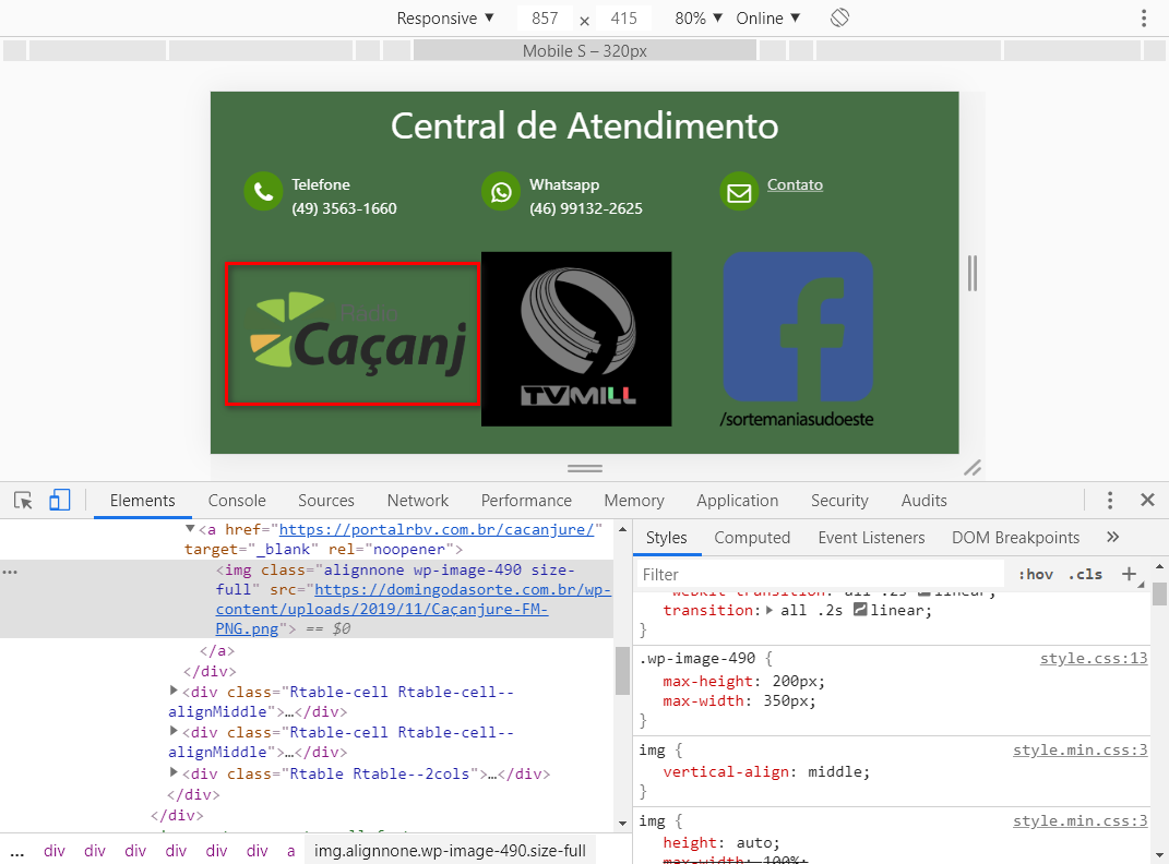
At the bottom of this Wordpress site there are various logo images.
These images are entered by the site administrator himself within a table Pods, so I have no individual control for each image, I just need to apply a pattern to all images.
The original image dimensions are very different, so I need to restrict their sizes using max-width and max-height, which I put in the class wp-image-490:

But in doing so, if I reduce the screen size (to test responsiveness), the first image is being cropped:
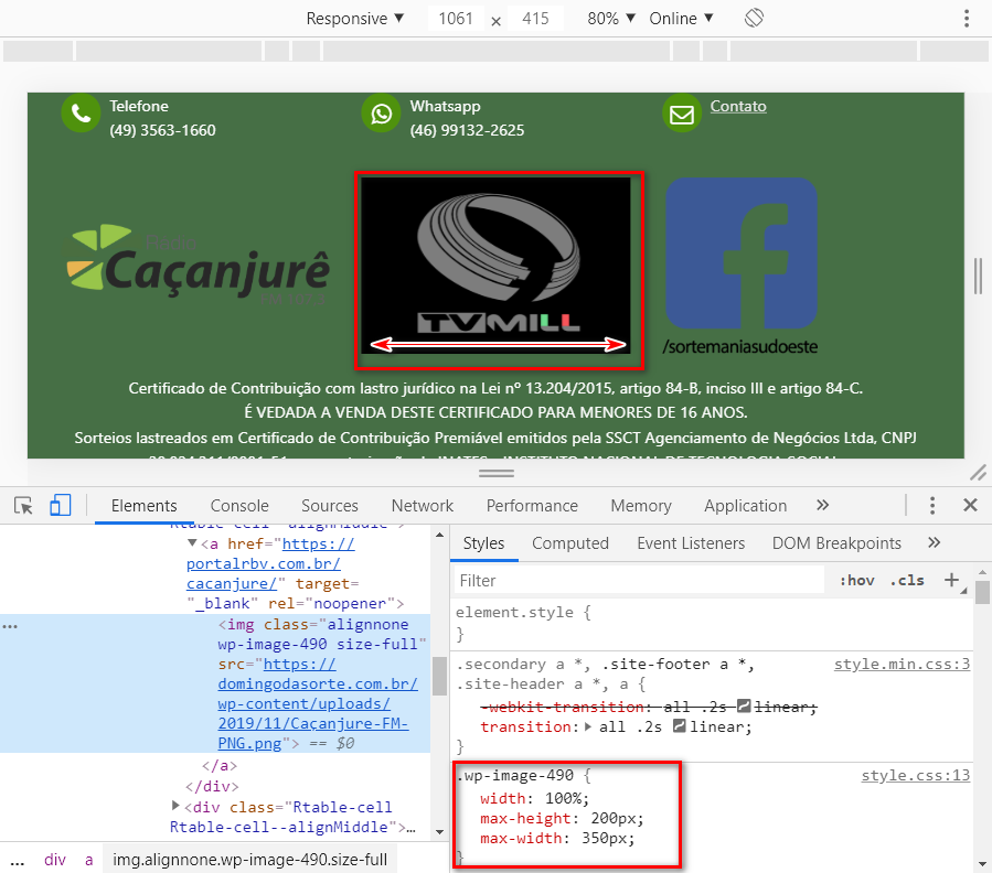
And at the same time, I tried to fix it by inserting width: 100% in this same class, but in doing so, the second image is distorted:
Could someone help?

Put in the image tag Object-fit: contain and Object-position: 50% 50%; if you solve tell me that put as response :)
– hugocsl
Dude, you’re really awesome huh! Just inserting "Object-fit: contain" along with the current "width: 100%" already solved the problem. You can put that as an answer. Thank you!
– Rogério Dec
It’s answered, it was worth the force :)
– hugocsl