Make Divs to be inline

Asked

Viewed 141 times

0

Good morning, I’m having trouble leaving this box below with the inline display, the div box is the div that encompasses everything, the div hentaiBox is the div of each box, atulamente are all cascading I don’t know why, and I would like them to stand next to each other, And when you can’t fit on the screen anymore, stay down. The css code is at the end.

.hentaiBox>a>img {
  float: left;
  width: 170px;
  height: 220px;
  margin-right: 12px;
}

.hentaiBox>a>img:hover {
  width: 175px;
  height: 225px;
}

.nota {
  font-size: 15px;
}

.nomeAnime {
  font-size: 19px;
}

.episodiosAnime {
  font-size: 14px;
  color: gray;
}

.comentario {
  font-size: 16px;
  text-align: justify
}

.genero {
  font-size: 14px;
  color: gray;
}

.p2 {
  color: gray;
}
<div class="box">
  <div class="hentaiBox">
    <a href="#">
      <img src="~/images.jpg" />
    </a>
    <p class="nomeAnime">Nome do anime</p>
    <p class="nota">Nota:
      <font color="light-green">98</font> pontos</p>
    <p class="episodiosAnime">4 episódio - completo</p>
    <p class="genero">Genero1, Genero2</p>
  </div>
</div>

2 answers

2


Look my tip is to put flex in the container pai, but also put flex in the container filho, so you can have the image in one column and the text next in another column. To separate the text and image and leave everything semantic in the container pai I used the tag <figure> and the text I put in ta tag <figcaption>. So it became more organized, but semantic and kept the alignment with the text next to the image.

inserir a descrição da imagem aqui

Follow the image code above

.hentaiBox>a>img {
  /* float: left; */
  width: 170px;
  height: 220px;
  margin-right: 12px;
}

.hentaiBox>a>img:hover {
  width: 175px;
  height: 225px;
}

.nota {
  font-size: 15px;
}

.nomeAnime {
  font-size: 19px;
}

.episodiosAnime {
  font-size: 14px;
  color: gray;
}

.comentario {
  font-size: 16px;
  text-align: justify
}

.genero {
  font-size: 14px;
  color: gray;
}

.p2 {
  color: gray;
}

.box {
  display: flex;
  flex-wrap: wrap;
}
.hentaiBox {
  display: flex;
  height: 225px;
  box-sizing: border-box;
  padding-right: 16px;
  margin: 0;
}
<div class="box">

  <figure class="hentaiBox">
    <a href="#">
      <img src="~/images.jpg" />
    </a>
    <figcaption>
      <p class="nomeAnime">Nome do anime</p>
      <p class="nota">Nota:
        <font color="light-green">98</font> pontos</p>
      <p class="episodiosAnime">4 episódio - completo</p>
      <p class="genero">Genero1, Genero2</p>
    </figcaption>
  </figure>

</div>

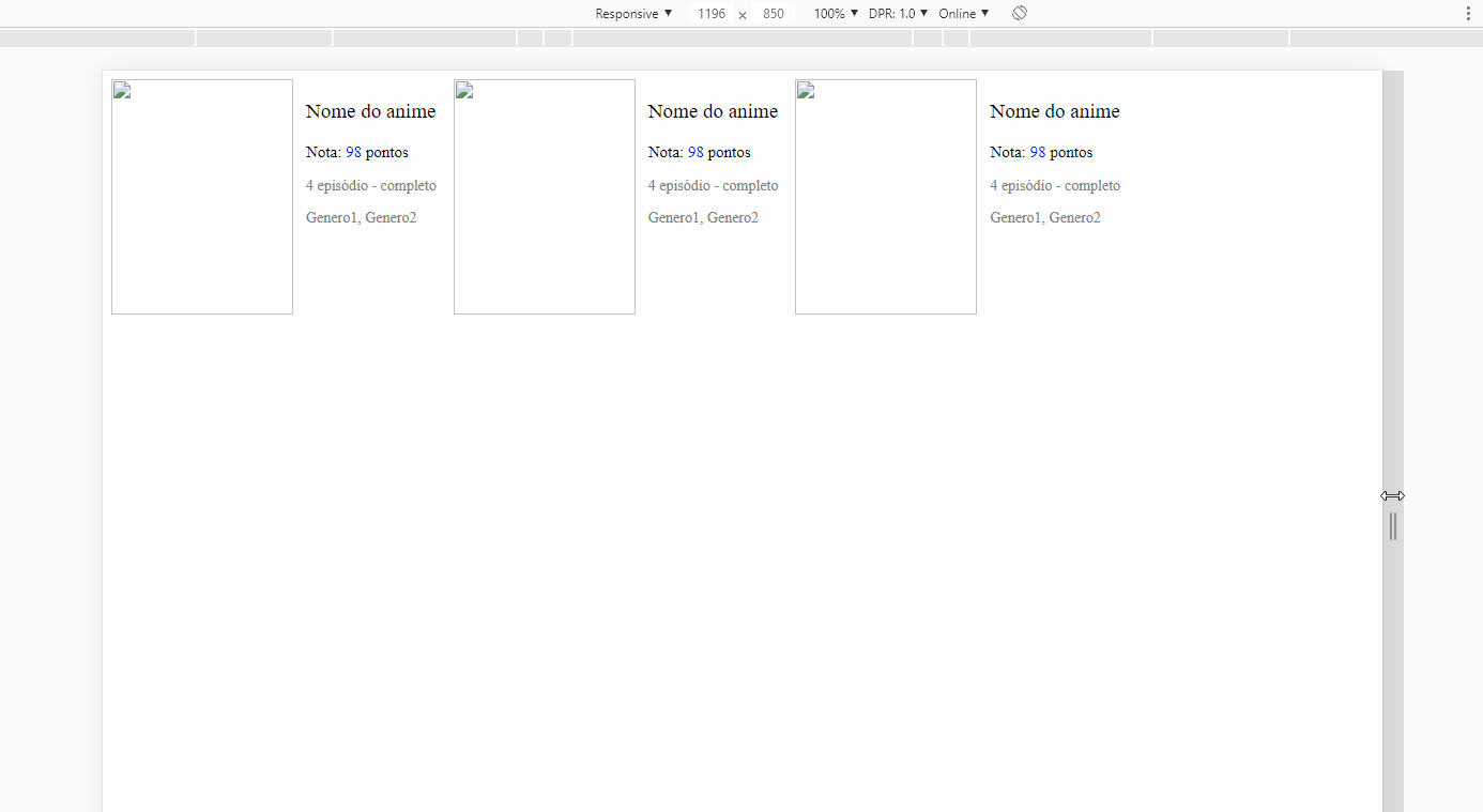
  • vlw man, it helped a lot, but when I pass the Hover is activated it pushes everything a little to the side, I would like only the image to be bigger.

  • @predo_json vc noticed that in your CSS when you put the img:hover your mind the width from 170px to 175px, then end up shifting even what is around. If you want another option change your code and put a width only 170px, and in img:hover you can put transform: scale(1.1) Another thing, you can only mark an answer as accepted, when you mark another answer it is valid as the accepted answer. So consider which answer really answered your problem and mark it, you can’t mark two answer with ok

0

The question is a little confusing.. From what I understand I believe that using flex display with a flex-wrap (to be below when no more fit) solve your problem..

.hentaiBox>a>img {
  float: left;
  width: 170px;
  height: 220px;
  margin-right: 12px;
}

.hentaiBox>a>img:hover {
  width: 175px;
  height: 225px;
}

.nota {
  font-size: 15px;
}

.nomeAnime {
  font-size: 19px;
}

.episodiosAnime {
  font-size: 14px;
  color: gray;
}

.comentario {
  font-size: 16px;
  text-align: justify
}

.genero {
  font-size: 14px;
  color: gray;
}

.p2 {
  color: gray;
}

/* Display flex */ 
.box {
  display: flex;
  flex-direction: row;
  flex-wrap: wrap;
  max-width: 40rem;
}
   .hentaiBox {
 margin: .2rem;
   }
<div class="box">
  <div class="hentaiBox">
    <a href="#">
      <img src="~/images.jpg" />
    </a>
    <p class="nomeAnime">Nome do anime</p>
    <p class="nota">Nota:
      <font color="light-green">98</font> pontos</p>
    <p class="episodiosAnime">4 episódio - completo</p>
    <p class="genero">Genero1, Genero2</p>
  </div>
</div>

Browser other questions tagged

You are not signed in. Login or sign up in order to post.