I can’t line up Divs

Asked

Viewed 36 times

2

I’m a beginner in the area and I’m trying to build a layout with floating elements using html and css, but when I create the second div it doesn’t align with the original div.
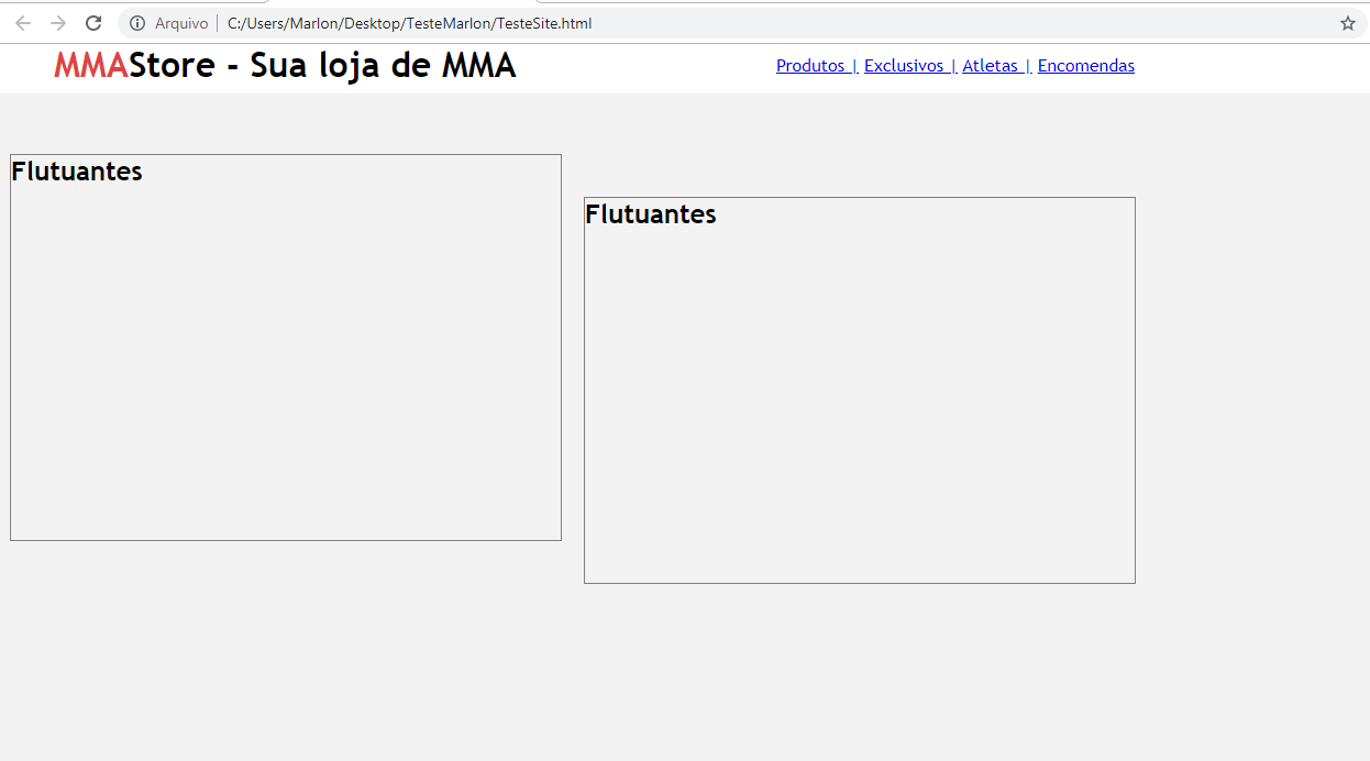
 inserir a descrição da imagem aqui

* {
	margin:0;
	padding: 0;
}

body {
	font-size: 16px;
	font-family: "Trebuchet MS", Helvetica, sans-serif;
	background: #f3f3f3;
}

.barra-navegacao{
	background: #fff;
	height: 45px;
	top: 0;
	width: 100%;
	position: fixed;
}

#logo{
	font-family: Trebuchet MS, sans-serif;
	float: left;
	margin-right: : 500px;
	position: fixed;
	left: 50px;
}

.vermelho{
	color: #de4444;
}

.area{
	width: 720px;
	margin: 0 auto;
}

#menu{	
	float: right;
	padding: 10px;
	margin-left: 100px;
}
   

.flutuantes{
	border: 1px solid grey;
	height: 350px;
	width: 500px;
	float: left;
	margin: 10px;
	margin-top: 100px;
}
<div class="barra-navegacao">
		<div class="area">
		<h1 id="logo"><span class="vermelho">MMA</span>Store - Sua loja de MMA</h1>
		<div id="menu">
			<a href="produtos.html">Produtos |</a>
			<a href="exclusivos.html"> Exclusivos |</a>
			<a href="produtos.html"> Atletas |</a>
			<a href="exclusivos.html"> Encomendas</a>

		</div>
	</div>

		<div class="flutuantes"> <h2>Flutuantes<h2></div>

		<div class="flutuantes"> <h2>Flutuantes<h2></div>

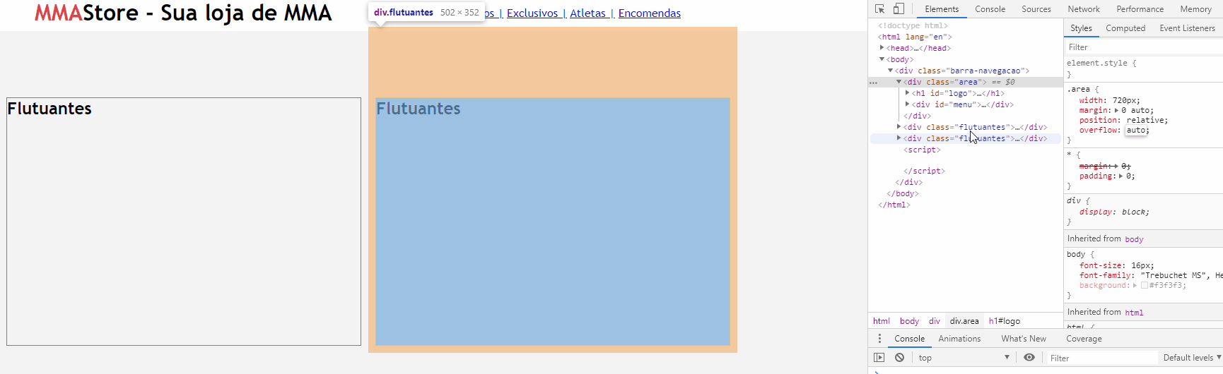
  • Since @hugocsl already gave you a good response, I recommend you take a look at CSS Grid, as it makes it easy to handle layouts here is a good tutorial =)

  • Thank you very much, I’ll take a look.

1 answer

5


Your problem is that inside the div area you have an element logo with position fixed, what I can tell you is that this layout structure is kind of compromised, because very likely when the content grows and the page has scroll you may have some problem...

Anyway to fix it just put overflow: auto in div area, this will change the scope of the elements that are inside her and she will pass the "take on children" (even if they have float or position) rss

inserir a descrição da imagem aqui

Follow the adjusted code.

* {
  margin:0;
  padding: 0;
}

body {
  font-size: 16px;
  font-family: "Trebuchet MS", Helvetica, sans-serif;
  background: #f3f3f3;
}

.barra-navegacao{
  background: #fff;
  height: 45px;
  top: 0;
  width: 100%;
  position: fixed;
}

#logo{
  font-family: Trebuchet MS, sans-serif;
  float: left;
  margin-right: : 500px;
  position: fixed;
  left: 50px;
}

.vermelho{
  color: #de4444;
}

.area{
  width: 720px;
  margin: 0 auto;
  overflow: auto;
}

#menu{	
  float: right;
  padding: 10px;
  margin-left: 100px;
}
    

.flutuantes{
  border: 1px solid grey;
  height: 350px;
  width: 500px;
  float: left;
  margin: 10px;
  margin-top: 100px;
}
<div class="barra-navegacao">
    <div class="area">
    <h1 id="logo"><span class="vermelho">MMA</span>Store - Sua loja de MMA</h1>
    <div id="menu">
      <a href="produtos.html">Produtos |</a>
      <a href="exclusivos.html"> Exclusivos |</a>
      <a href="produtos.html"> Atletas |</a>
      <a href="exclusivos.html"> Encomendas</a>

    </div>
  </div>

    <div class="flutuantes"> <h2>Flutuantes<h2></div>

    <div class="flutuantes"> <h2>Flutuantes<h2></div>

  • Perfect, thank you very much!

  • @Marlonjohnson then takes a little time to study on flex display, then you will become much less dependent on using position and float to make layout. If you think the answer solved the problems consider marking it with accepted in this icon below the arrows next to the answer. Then if you think you should remove the acceptance or change to some answer that you think is more appropriate.

Browser other questions tagged

You are not signed in. Login or sign up in order to post.