0
html {
    box-sizing: border-box;
}
body > section {
    display: flex;
    justify-content: center;
    width: 100vw;
}

section#categorias > div.internas > div {
    display: flex;
    flex-wrap: wrap;
    justify-content: center;
    width: 100%;
}

section#categorias > div.internas > div > div {
    display: flex;
    flex-direction: column;
    align-items: center;
    width: 28%;
    height: 400px;
    padding: 5px;
    margin: 30px;
    border: 1px solid #000;
    background: #CCC;
}
section#categorias > div.internas > div > div > img {
    width: 60%;
}

section#categorias > div.internas > div > div > h3 {
    display: flex;
    align-items: center;
    text-align: center;
    height: 100px;
}

section#categorias > div.internas > div > div > a {
    display: flex;
    align-items: center;
    justify-content: center;
    width: 70%;
    height: 50px;
    border: 1px solid #CCC;
    background: #fff;
}

@media screen and (max-width: 1000px) and (min-width: 0px) {

  div.internas {
      width: 100%;
  }

  section#categorias > div.internas > div > div,
  section#duvidas > div.internas > div > article {
    width: 100% !important;
  }

}
<section id='categorias'>
<div class="internas">
<div>
  <div>

     <img src="https://ctemcasb.com.br/img/categorias/pecas.png" />

     <h3>Fornecedores de Peças</h3>

     <a href="fornecedores/6">Acesse aqui</a>

  </div>

</div>
</div>
</section>Hello guys, I need a help.
I have the code above. I tried to create, according to the forum guidance, a minimum, complete and verifiable example.
THE PROBLEM:
Works well in PC and Notebook’s browser.
But we browsers of cellular, to image is not obeying his height and sometimes it’s div leading.
Running the example right here in Stacks already gives you a sense of the error!
But on cell phone is that the error is more grotesque.
in fact, there are more blocks of the kind:
<div>
<img src="https://ctemcasb.com.br/img/categorias/pecas.png" />
<h3>Fornecedores de Peças</h3>
<a href="fornecedores/6">Acesse aqui</a>
</div>
</div>
Within
<section id='categorias'>

  <div class="internas">

    <div>

        ...

    </div>

  </div>

</section>
This failure can only be checked on cell phones.
At some Divs, to image stays altered, in others is the div main who stays!
I couldn’t understand it!
In time:
In the Internet Explorer 11, so much to us Pcs how much in Notebooks the error occurs equal!
Anyone who wants to take a look at their own cell phone the link is ctemcasb.com.br.
In the middle of the page are the categories.
Note: It is no use to reduce the size of the browsers (with the exception of IE 11) in the computers that the error does not happen. Only in mobile phones. Hence my difficulty!
Print of IE 11 leftmost
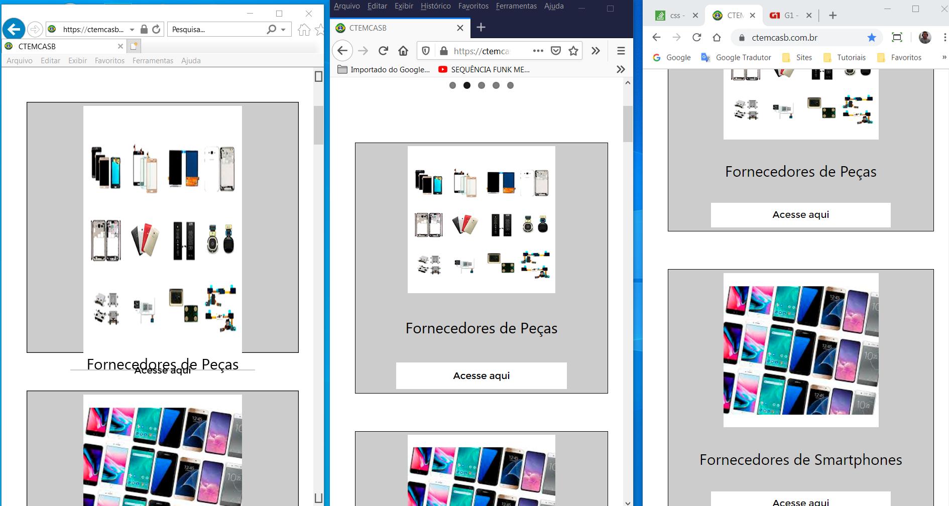
Puts a print with an image of how it looks on the screen of cell phones. Something else IE11 died forget it
– hugocsl
kkk, the colleague’s solution solved. I had forgotten to put the heart of media-query. But now I really need to solve the problem for IE 11. Added print at the end of the question.
– Carlos Rocha