0
I’m venturing into the frontend just like the backend. I’m having a hard time making my table responsive. What is the best way to make a user profile,leaving it in cell phone size?
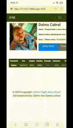
<table class="table-sm rob" cellpadding="3">
    <thead>
      <tr>
        <th>
          <img src="{{ form1.avatar(180) }}" alt="" class="img-rounded img-sm" />
        </th>
        <th>
          <h4>{{ form1.first_name }} {{ form1.last_name }}</h4>
          <p>Sobre :{% if form1.about_me %}
            {{ form1.about_me }}
            {% endif %}</p>
           <p> {{ form1.email }}</p>
            Grau: {{ form1.grau }}
            {% if form1.last_seen %}
            Última visita: {{ form1.last_seen.strftime('%d/%m/%Y %H:%M:%S') }}</i>
            {% endif %}
          </p>
          <div class="btn-group">
            <a class="btn-sm btn-primary" href="{{ url_for('edit_profile') }}" role="button"
              style="width: 130px; height: 50px">Edita Perfil</a>
            <a class="btn-sm btn-secondary"
              href="https://wordpress.com/log-in/pt-br?client_id=1854&redirect_to=https%3A%2F%2Fpublic-api.wordpress.com%2Foauth2%2Fauthorize%3Fclient_id%3D1854%26response_type%3Dcode%26blog_id%3D0%26state%3D39ad9d7e0e4eb19f951dce539ce091bd328c8d9660bcc1b2eaa182c8603b95ff%26redirect_uri%3Dhttps%253A%252F%252Fen.gravatar.com%252Fconnect%252F%253Faction%253Drequest_access_token"
              role="button" target="_blank" style="width: 130px; height: 50px">Trocar Avatar</a>
          </div>
        </th>
      </tr>
    </thead>
  </table>
Dalmo edits the question and places the code there in the way it is rendered in the browser. This
{{ form1.first_name }}does not help much, puts a populated HTML so that to simulate your problem. And if you are using some CSS besides the CSS of Bootstrap tb includes there in the question, without it becomes complicated to help you– hugocsl
I didn’t really understand your question but this is how it is rendered in the browsed I use flask-python jinja2
– Dalmo Cabral