0
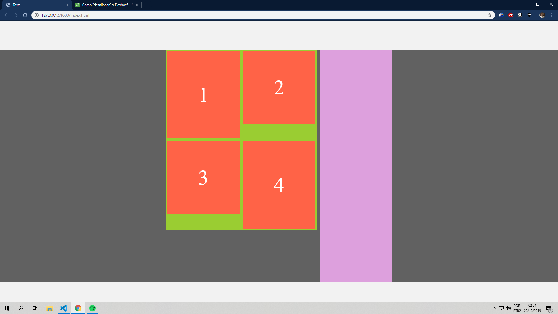
Good night, you guys. I’ve been taking a beating from the flexbox for a long time, as I can’t "misalign" my Ivs and leave them without vertical space when one div is larger than the other. Does anyone know how to fix this using flexbox? For example, I want to leave the 4 div higher up, just with the margin that I gave to all of them, and not all the spacing that flexbox does to align with 3 horizontally.
OBS: margin-top is not an option, because it is not only the 4 that will have to go up, it will be a news grid, that the height increases as the amount of content inside it, so there is no way to give an exact height for the Divs.
html, body {margin:0;padding:0;box-sizing:border-box;background:#f2f2f2;}

div#conteudo {
    width:100%;
    min-height:500px;
    background:rgba(0,0,0, .6);
    margin:0 auto;
    margin-top:100px;
    display:flex;
    align-items:flex-start;
    justify-content:center;
    flex-flow:row wrap;
}
div.cont {
    display:flex;
    align-items:flex-start;
    flex-flow:row wrap;
}
div#c1 {
    width:520px;
    min-height:400px;
    background:yellowgreen;
    margin-right:10px;
}
div.cnews {
    color:#fff;
    background:tomato;
    width:250px;
    min-height:250px;
    margin:5px;
    display:flex;
    align-items: center;
    justify-content:center;
    font-size:72px;
}
div.cnews:nth-child(1) {
    height:300px;
}
div.cnews:nth-last-child(1) {
    height:300px;
}
div#c2 {
    width:250px;
    height:800px;
    background:plum;
}
<!DOCTYPE html>
<html lang="pt-BR">
<head>
<meta charset="UTF-8">
<meta name="viewport" content="width=device-width, initial-scale=1.0">
<meta http-equiv="X-UA-Compatible" content="ie=edge">
<title>Teste</title>
<link rel="stylesheet" href="style.css">
</head>
<body>
<div id="conteudo">
<div class="cont" id="c1">
<div class="cnews">1</div>
<div class="cnews">2</div>
<div class="cnews">3</div>
<div class="cnews">4</div>
</div>
<div class="cont" id="c2"></div>
</div>
</body>
</html>