Dude first, there is no version 3.5, the newest summer of Bootstrap 3 is the 3.4
Now to do this you will need 3 extra classes that are not default Bootstrap classes. BS3 does not have a flex or width class as in version 4, so I recreated these classes with the same name as version 4, made the classes w-100 for width: 100% and d-flex for display:flex, Plus I used the Utilities of BS3 to show and hide divs in the breacking point, and ready was as below (see documentation https://getbootstrap.com/docs/3.4/css/#Responsive-Utilities-classes)
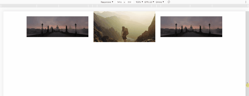
Follow the image code above
<!DOCTYPE html>
<html lang="en">

<head>
<meta charset="utf-8" />
<meta http-equiv="X-UA-Compatible" content="IE=edge">
<title>Page Title</title>
<meta name="viewport" content="width=device-width, initial-scale=1">
<!-- <link rel="stylesheet" type="text/css" href="https://maxcdn.bootstrapcdn.com/bootstrap/3.3.7/css/bootstrap-theme.min.css" /> -->
<link rel="stylesheet" type="text/css" href="https://maxcdn.bootstrapcdn.com/font-awesome/4.7.0/css/font-awesome.min.css" />
<link rel="stylesheet" type="text/css" href="https://maxcdn.bootstrapcdn.com/bootstrap/3.3.7/css/bootstrap.min.css" />
<style>
    .w-100 {
        width: 100%;
    }

    .d-flex {
        display: flex;
    }

    .align-itens-center {
        align-items: center;
    }

</style>
</head>

<body>

    <div class="container">
        <div class="row hidden-md hidden-lg">
            <div class="col-xs-12 d-flex align-itens-center">
                <img class="img-responsive w-100 center-block text-center" src="https://unsplash.it/300/150">
            </div>
        </div>
        <div class="row d-flex">
            <div class="col-xs-6 col-sm-6 col-md-4 d-flex align-itens-center">
                <img class="img-responsive w-100 center-block text-center" src="https://unsplash.it/300/100">
            </div>
            <div class="col-md-4 hidden-xs hidden-sm d-flex align-itens-center">
                <img class="img-responsive w-100 center-block text-center" src="https://unsplash.it/300/150">
            </div>
            <div class="col-xs-6 col-sm-6 col-md-4 d-flex align-itens-center">
                <img class="img-responsive w-100 center-block text-center" src="https://unsplash.it/300/100">
            </div>
        </div>
    </div>

</body>

</html>
Hugo, you’re the man! Thank you, help me a lot!!!! I’ll read the documentation you give me!
– Gabi M
@gaabmmelo guy if he helped you in any way and solved the problem, remember to mark this answer as accepted by clicking on this icon below the arrows next to the answer.
– hugocsl
Hugo, could you help me with this other question: https://answall.com/questions/417580/carousel-bootstrap-3 !
– Gabi M
If it was with Bootstrap 4 had a ready here https://answall.com/questions/331103/customiza%C3%A7%C3%a3o-Carousel/331112#331112, with BS3 is more complicated believe, Plus there’s the text that’s gonna be inside that I don’t know how to do... I don’t think I can help you on this one
– hugocsl