0
<!DOCTYPE html>
<html lang="pt-br">
<head>
<meta charset="UTF-8">
<meta name="viewport" content="width=device-width, initial-scale=1.0">
<meta http-equiv="X-UA-Compatible" content="ie=edge">
<title>Cubo Gira</title>
<style>
body {
background-color: beige;
}
#cubo {
margin: auto;
margin-top: 200px;
width: 300px;
height: 300px;
background-color: red;
}
#btn {
margin: auto;
margin-left: 125px;
margin-top: 125px;
width: 50px;
height: 25px;
}
</style>
</head>
<body>
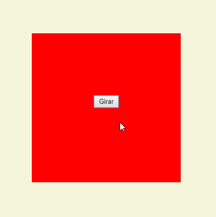
<div id="cubo">
<input type="button" value="Girar" onclick="giro()" id="btn">
</div>
</body>
</html>
I wanted to use Function in the Code Script to add the Transform: Rotate() event squared when the button is clicked.
But I can’t use Document.getElementById("").style.Transform = Rotate();
The question, in general, is, how do I put two functions on that button. Function: Rotate the square into -45deg and 2° Function: Rotate the square into 45deg (return to initial position).
rotate()is not a JS function, but you can trigger it in thestyleas a string that will be interpreted by the CSS engine, thus:document.getElementById("cubo").style.transform = "rotate(-45deg)"– Andre