-2
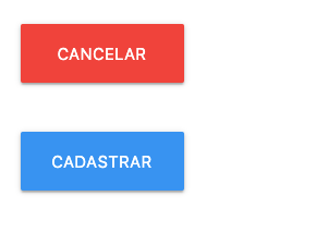
Making a small page using Angular, I came across a problem of overlapping two buttons. When they are on screens more than 420 px wide (cell phone in horizontal position, for example), it does not become a problem, and the buttons are positioned as shown below:

But, when you are with a device of less than 420 px of horizontal size (Blackberry Z30, for example), the page does not break the line, but overlaps the buttons, as in the image below:

What I wanted is that when you used a device with this configuration, if you broke the line, getting both buttons below each other. As you can see in the HTML below, I have already used a span an entire line to separate the buttons from the other fields (so they don’t overlap the fields).
Page structure:
<div class="container">
  <form class="">
    <div class="row">
      <!-- campos do formulário -->

      <span class="col s12"></span>

      <div class="input-field col s4">

        <a class="btn-large red">cancelar</a>
      </div>
      <div class="input-field col s4">
        <button class="btn-large blue" type="submit">Cadastrar</button>
      </div>
    </div>
  </form>
</div>
I kept the CSS of the empty page component.
I’m using Angular 8 and Materialize CSS.
Edit: I was able to avoid overlaying the buttons by removing them from the containers, in this way:
<!-- original -->
<div class="input-field col s4">

  <a class="btn-large red">cancelar</a>
</div>
<div class="col s4">
    <button class="btn-large blue" type="submit">Cadastrar</button>
</div>
<!-- modificado -->
<a class="col s4 btn-large red">cancelar</a>
<button class="col s4 push-s5 btn-large blue" type="submit">Cadastrar</button>
But they still don’t break the line by getting too close, and now they twist until they become a colored scratch in the middle of the screen.
Is this not because of class
input-fielddiv? It’s just a kick....– hugocsl
Worse than not, I removed the class and the problem persisted...
– Arthur Siqueira