Align table data in different fields

Asked

Viewed 74 times

0

I am working with a card that will work to return data like (today, current month, day yesterday and anyway), but I would like to leave the day equal to image, I could not using tables, follows the code:

.mes-setado {
  letter-spacing: 15px;
  font-size: 35px;
  width: 100%;
  padding-left: 150px;
  float: right;
  margin-right: -5px;
  margin-bottom: 10px;
}

.ano-setado {
  letter-spacing: 3px;
  font-size: 35px;
  width: 100%;
  padding-left: 150px;
  float: right;
  margin-right: -5px;
}

.dia-setado {
  font-size: 80px;
  padding-top: 10px;
  width: 100%;
}

.simple {
  text-align: right;
  margin-right: 2.5px;
  margin-top: 5px;
}

.values {
  font-size: 25px;
  align-content: right;
  text-align: right;
  width: 100%;
  padding-bottom: 10.5px;
}

.tabela {
  width: 100%;
  margin-top: 10px;
  display: inline;
}

.info {
  width: 100%;
  border-top: 1px solid #000000;
  margin-top: 10.5px;
}
<link href="https://stackpath.bootstrapcdn.com/bootstrap/4.3.1/css/bootstrap.min.css" rel="stylesheet"/>
<div class="col-md-12 col-sm-12 col-lg-12 row justify-content-center">
  <nb-card accent="info">
    <nb-card-body>
      <div class="row justify-content-center">
        <div class="container">
          <table class="tabela">
            <td class="dia-setado">23</td> <br>
            <td class="mes-setado">SET</td> <br>
            <td class="ano-setado">2019</td>
          </table>
        </div>
      </div>
      <div class="info"></div>
      <div>
        <div class="simple">Digitados</div>
        <div class="values">310.800</div>
        <div class="simple">Pagos</div>
        <div class="values">128.100</div>
      </div>
      <nb-progress-bar status="info" [value]="30"></nb-progress-bar>
    </nb-card-body>
  </nb-card>
</div>

Deve ficar assim

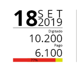
  • What exactly is the problem? The output generated was very close to the expected. By the way, the elements <nb-card>, <nb-card-body>, etc are not native to HTML, which suggests that you are using something more than just HTML 5 and CSS 3.

  • The number is very high, not aligned with month/year. Sorry, I edited now putting Bootstrap and Angular.

  • I also suggest [Edit] and list what differences you are seeking to correct.

2 answers

1

If you are using table you have to use rowspan/colspan as needed, in addition you should not assemble the table with vc fez, playing TDs within a Table... And don’t put display: inline; in a table! The table has to be display:table;, or use divs and not a table. I recommend you read this Two data cells for one header and also this documentation that has practical examples https://www.w3schools.com/html/html_tables.asp

Besides you’ll need to treat the line-height for vertical spacing to become more "compact" for this I put line-hiegt of 100%, that is, 100% of the height of the character itself roughly.

OBS: everything you put in and didn’t need how float:left etc I left commented... notice the amount of thing ;)

.mes-setado {
    letter-spacing: 15px;
    font-size: 35px;
    /* width: 100%; */
    /* padding-left: 150px; */
    /* float: right; */
    /* margin-right: -5px; */
    /* margin-bottom: 10px; */
}

.ano-setado {
    letter-spacing: 3px;
    font-size: 35px;
    /* width: 100%; */
    /* padding-left: 150px; */
    /* float: right; */
    /* margin-right: -5px; */
    line-height: 100%;
}

.dia-setado {
    font-size: 80px;
    /* padding-top: 10px; */
    /* width: 100%; */
    line-height: 100%;
}

.simple {
    text-align: right;
    /* margin-right: 2.5px; */
    margin-top: 5px;
}

.values {
    font-size: 25px;
    /* align-content: right; */
    text-align: right;
    /* width: 100%; */
    padding-bottom: 10.5px;
}

.tabela {
    /* width: 100%; */
    margin-top: 10px;
    /* display: inline; */
}

.info {
    /* width: 100%; */
    border-top: 1px solid #000000;
    margin-top: 10.5px;
}
<link rel="stylesheet" type="text/css" media="screen" href="https://stackpath.bootstrapcdn.com/bootstrap/4.2.1/css/bootstrap.min.css" />

<div class="col-md-12 col-sm-12 col-lg-12 row justify-content-center">
    <nb-card accent="info">
        <nb-card-body>
            <div class="row justify-content-center">
                <div class="container">
                    <table class="tabela">
                        <tr>
                            <td rowspan="2" class="dia-setado">23</td> 
                            <td class="ano-setado">2019</td>
                        </tr>
                        <tr>
                            <td class="ano-setado">2019</td>
                        </tr>
                    </table>
                </div>
            </div>
            <div class="info"></div>
            <div>
                <div class="simple">Digitados</div>
                <div class="values">310.800</div>
                <div class="simple">Pagos</div>
                <div class="values">128.100</div>
            </div>
            <nb-progress-bar status="info" [value]="30"></nb-progress-bar>
        </nb-card-body>
    </nb-card>
</div>

  • I did it! Thanks!

  • @Wandersonbueno cool that worked out there!! If you think the answer helped you in any way consider marking it as accepted in this icon below the little arrows next to the answer ;)

  • Just one more question, I want to generate two more cards like this, I want you to be on the other side, but the way it is, they keep going down, you know something you can use?

  • In that div of yours <div class="col-md-12 col-sm-12 col-lg-12 row justify-content-center"> she has to be inside another div with class Row. And put it like this and see if you solve <div class="col-4">. @Wandersonbueno Take a look at this other answer that will help you understand the Bootstrap Grid https://answall.com/questions/182188/qual-a-diferen%C3%a7a-entre-col-lg-col-Md-e-col-Sm-no-bootstrap/352550#352550

  • I got one on the other, but they’re stuck together. The question now beyond this being together is that I can keep one size only for cards, because the first two are identical. But the last one is only Month/Year. Then when I change, it automatically changes the width size.

  • Can you tell me how I could adjust width x height of these cards? In a way that maintains responsiveness.

  • @Wandersonbueno does this to make it easier for me to help you, creates a Codepen, or Jsfiddle and puts your most current code, with the cards you have etc, then I take a look at you, but the idea is that you put each group of elements inside a grid cell of Bootstrap itself. Another option is to open a new question here on the site even with your current code and explaining what you need, so I or another user can help you :) Look at this and tell me that I help you

Show 2 more comments

0


Note that some changes can be made just by adjusting the CSS. Try this way tbm, although the CSS gets longer (apparently) but you can use your own settings and not get stuck to the Bootstrap.

body {
    line-height: 1 !important;
}

tr {
	width: 30% !important;
}

.dia-setado {
  font-size: 80px;
  padding-top: 0px;
  padding: 0px;
}

.mes-setado {
  letter-spacing: 12px;
  font-size: 35px;
  width: 100%;
  float: right;
  margin-right: -2px;
  margin-bottom: -18px;
  margin-top: 10px;
}

.ano-setado {
  letter-spacing: 3px;
  font-size: 35px;
  width: 100%;
  float: right;
  margin-right: -2px;
  margin-top: 15px;
}

.simple {
  text-align: right;
  font-size: 10px;
  margin-right: 2.5px;
  margin-top: 1px;
}

.values {
  font-size: 25px;
  align-content: right;
  text-align: right;
  width: 100%;
  padding-bottom: 1.5px;
}

.tabela {
  width: 100%;
  margin-top: 10px;
  display: inline;
}

.info {
  width: 100%;
  border-top: 1px solid #000000;
  margin-top: 0.5px;
}

.container {
    width: 100%;
    padding-right: 5px !important;
    padding-left: 15px;
    margin-right: 0px;
    margin-left: 10px;
}

.col-md-1, .col-md-10, .col-md-11, .col-md-12, .col-md-2, .col-md-3, .col-md-4, .col-md-5, .col-md-6, .col-md-7, .col-md-8, .col-md-9{
	position: relative !important;
	width: 100% !important;
	max-height: 5rem;
	padding-right: 2px !important;
	padding-left: 2px !important;
}

.col-md-2{
	max-width: 12.3rem !important;
}

.col-md-5{
	max-width: 6rem !important;
}

.col-md-7{
	max-width: 6rem !important;
}

.col-md-10{
	max-width: 12.3rem !important;
}

.card {
    width: 18rem!important;
    border: 0px solid rgba(0,0,0,.125) !important;
}

.card-body {
    padding: 5px !important;
        padding-top: 5px !important;
        padding-right: 5px !important;
        padding-bottom: 5px !important;
        padding-left: 5px !important;
}

.row {
    display: -ms-flexbox !important;
    display: flex !important;
    -ms-flex-wrap: wrap !important;
    flex-wrap: wrap !important;
    margin-right: -15px !important;
    margin-left: 0px !important;
	max-width: 11.7rem !important;
}
<body>
<link href="https://stackpath.bootstrapcdn.com/bootstrap/4.3.1/css/bootstrap.min.css" rel="stylesheet"/>
<div class="col-md-2 col-sm-2 col-lg-2 row justify-content-center">
  <div class="card">
  <div class="card " style="max-width: 180px;">
  <div class="row">
    <div class="col-md-5">
		<div class="tabela">
            <div class="dia-setado">23</div>
          </div>
    </div>
    <div class="col-md-7">
		<div class="tabela">
            <div class="mes-setado">SET</div>
            <div class="ano-setado">2019</div>
          </div>
      </div>
  </div>
	</div>
   
      <div class="info"></div>
    <div class="col-md-10">
		<div class="simple">Digitados</div>
        <div class="values">310.800</div>
        <div class="simple">Pagos</div>
        <div class="values">128.100</div>
        
    </div>
      <nb-progress-bar status="info" [value]="30"></nb-progress-bar>
    </div>
  </div>
</div>
</body>

  • I’ll see if I can do it this way, I need to put two more cards. One is another format, the layout changes there is changing me the width of the card.

Browser other questions tagged

You are not signed in. Login or sign up in order to post.