Why is the text out of line? and how to solve in bootstrap 4?

Asked

Viewed 81 times

0

Continuing with my question made earlier, I am now using the following code. There was another simple problem that I am not able to solve. The text written "CLEAR FILTERS" is out of tune regarding a button. Below is in picture the problem.

inserir a descrição da imagem aqui

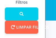
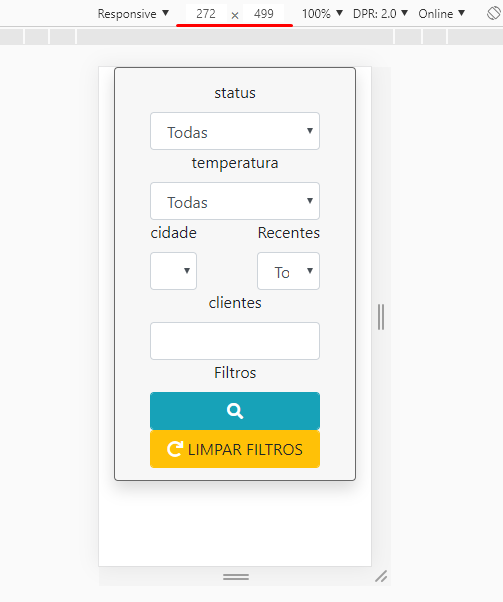
The text "CLEAN FILTERS" is passing out of the button. Every time I resize to the minimum before the inputs, Labels and selects is, superimposed, this text is not attached to the button.

However I do not know how to proceed to make this text responsive, my goal is that when I resize to the minimum before the overlay, the text "CLEAR FILTERS" decreases in size or the button increases its size to proceed next to the text.

What’s going on in this case and how can I solve this problem?

When doing a test, even the icones of the span are mismatched, so try to resize to the minimum possible, before everything is overlapped.

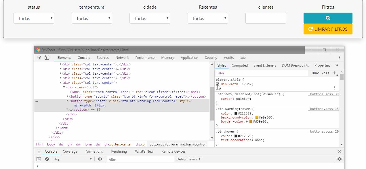
  • This field should have some fixed width. Have you inspected the element and seen the CSS code? If you can post the code as HTML here, it will be helpful.

  • the code is found here https://www.bootply.com/arthurabi1515/UTgRK5DuZ7

1 answer

1


Puts a min-width on the button that is of sufficient size to fit the whole text. I used 170px and worked well for screens up to 272px wide.

In your CSS put something like CSS below and in HTML put class="limpar" in your btn

button.limpar {
    min-width: 170px;
}

See how it looks

inserir a descrição da imagem aqui

inserir a descrição da imagem aqui

  • I just found that I made a mistake, I didn’t update my bootply with the corrected code of the previous question that you helped me with. Now this updated. If you can help me thank you. I’m sorry for this inconvenience.

  • @Arthurabitante cara tests with this code see if t eatende https://codepen.io/hugocsl/pen/dybQxNJ

  • In the code you sent, it still seems to be mismatched, I switched to bootply worked well. I did the test by putting in my system and got something strange, it’s all on top of each other, like the Abels are in the same place, in the same position.

  • I’m trying to see on my system where the bootstrap library is being included to see if it’s not something related to the version

  • @What happens is that with col-12 col-Md-2 the column gets fixed size, when it is good to use only Col on the grid. To put the fields below each other I put the flex-column class on the Row, as you can see in this Codepen link I mentioned above

  • I would like to leave a post as well, I just realized that depending on the versioning, the bootstrap error. I am using version 4.1.2 of bootstrap and using this method is not working as it should. But changing the version to 4.3.1. Again thank you very much for your help, you solved my problem very well, thank you very much

  • @Cool arthurabitante that solved then! Tmj

Show 2 more comments

Browser other questions tagged

You are not signed in. Login or sign up in order to post.