Resize DIV according to menu size

Asked

Viewed 234 times

-1

I put html + css code inside a Jsfiddle to help visualize the problem.

What I need to do is that the div named "kk" resizes according to the menu size, for example: if the menu is minimized it should have the full size with the minimized menu, if the user hovers over the menu and the expand menu the div would have to be "pushed" to the right and make sure the menu does not overlap the div.

https://jsfiddle.net/edbngqtL/

@import url(//netdna.bootstrapcdn.com/font-awesome/4.0.3/css/font-awesome.css);
}
@import url(https://fonts.googleapis.com/css?family=Titillium+Web:300);
.fa-2x {
font-size: 2em;
}
.fa {
position: relative;
display: table-cell;
width: 60px;
height: 36px;
text-align: center;
vertical-align: middle;
font-size:20px;
}


.main-menu:hover,nav.main-menu.expanded {
width:250px;
overflow:visible;
}

.main-menu {
background:#212121;
border-right:1px solid #e5e5e5;
position:absolute;
top:0;
bottom:0;
height:100%;
left:0;
width:60px;
overflow:hidden;
-webkit-transition:width .05s linear;
transition:width .05s linear;
-webkit-transform:translateZ(0) scale(1,1);
z-index:1000;
}

.main-menu>ul {
margin:7px 0;
}

.main-menu li {
position:relative;
display:block;
width:250px;
}

.main-menu li>a {
position:relative;
display:table;
border-collapse:collapse;
border-spacing:0;
color:#999;
 font-family: arial;
font-size: 14px;
text-decoration:none;
-webkit-transform:translateZ(0) scale(1,1);
-webkit-transition:all .1s linear;
transition:all .1s linear;
  
}

.main-menu .nav-icon {
position:relative;
display:table-cell;
width:60px;
height:36px;
text-align:center;
vertical-align:middle;
font-size:18px;
}

.main-menu .nav-text {
position:relative;
display:table-cell;
vertical-align:middle;
width:190px;
  font-family: 'Titillium Web', sans-serif;
}

.main-menu>ul.logout {
position:absolute;
left:0;
bottom:0;
}

.no-touch .scrollable.hover {
overflow-y:hidden;
}

.no-touch .scrollable.hover:hover {
overflow-y:auto;
overflow:visible;
}

a:hover,a:focus {
text-decoration:none;
}

nav {
-webkit-user-select:none;
-moz-user-select:none;
-ms-user-select:none;
-o-user-select:none;
user-select:none;
}

nav ul,nav li {
outline:0;
margin:0;
padding:0;
}
.main-menu li:hover>a,nav.main-menu li.active>a,.dropdown-menu>li>a:hover,.dropdown-menu>li>a:focus,.dropdown-menu>.active>a,.dropdown-menu>.active>a:hover,.dropdown-menu>.active>a:focus,.no-touch .dashboard-page nav.dashboard-menu ul li:hover a,.dashboard-page nav.dashboard-menu ul li.active a {
color:#fff;
background-color:#5fa2db;
}
.area {
float: left;
background: #e2e2e2;
width: 100%;
height: 100%;
}
@font-face {
  font-family: 'Titillium Web';
  font-style: normal;
  font-weight: 300;
  src: local('Titillium WebLight'), local('TitilliumWeb-Light'), url(http://themes.googleusercontent.com/static/fonts/titilliumweb/v2/anMUvcNT0H1YN4FII8wpr24bNCNEoFTpS2BTjF6FB5E.woff) format('woff');
}

.kk {
  border: 3px solid red;
  background-color:red;
  
}
<html>
  <head>


  </head>
  <link rel="stylesheet" type="text/css" href="i.css">
  <body><div class="area"></div>
    <nav class="main-menu">
            <ul>
                <li>
                    <a href="http://justinfarrow.com">
                        <i class="fa fa-home fa-2x"></i>
                        <span class="nav-text">
                            Dashboard
                        </span>
                    </a>
                  
                </li>
                <li class="has-subnav">
                    <a href="#">
                        <i class="fa fa-laptop fa-2x"></i>
                        <span class="nav-text">
                            Stars Components
                        </span>
                    </a>
                    
                </li>
                <li class="has-subnav">
                    <a href="#">
                       <i class="fa fa-list fa-2x"></i>
                        <span class="nav-text">
                            Forms
                        </span>
                    </a>
                    
                </li>
                <li class="has-subnav">
                    <a href="#">
                       <i class="fa fa-folder-open fa-2x"></i>
                        <span class="nav-text">
                            Pages
                        </span>
                    </a>
                   
                </li>
                <li>
                    <a href="#">
                        <i class="fa fa-bar-chart-o fa-2x"></i>
                        <span class="nav-text">
                            Graphs and Statistics
                        </span>
                    </a>
                </li>
                <li>
                    <a href="#">
                        <i class="fa fa-font fa-2x"></i>
                        <span class="nav-text">
                           Quotes
                        </span>
                    </a>
                </li>
                <li>
                   <a href="#">
                       <i class="fa fa-table fa-2x"></i>
                        <span class="nav-text">
                            Tables
                        </span>
                    </a>
                </li>
                <li>
                   <a href="#">
                        <i class="fa fa-map-marker fa-2x"></i>
                        <span class="nav-text">
                            Maps
                        </span>
                    </a>
                </li>
                <li>
                    <a href="#">
                       <i class="fa fa-info fa-2x"></i>
                        <span class="nav-text">
                            Documentation
                        </span>
                    </a>
                </li>
            </ul>

            <ul class="logout">
                <li>
                   <a href="#">
                         <i class="fa fa-power-off fa-2x"></i>
                        <span class="nav-text">
                            Logout
                        </span>
                    </a>
                </li>  
            </ul>
        </nav>
    <div class="kk">
        KKK Lorem ipsum dolor sit amet consectetur adipisicing elit. Voluptatem cupiditate dolore repellendus magnam ratione molestias hic deserunt enim harum at sequi fugit, expedita repudiandae similique quasi tempore, possimus alias magni!
    </div>
    
  </body>
    </html>

1 answer

1


Face you have to make some simple adjustments, as you have the structure in HTML <nav> + <div kk> makes it easy to do this in CSS using nav:hover + .kk { }

What you need to do is put one translateX() in div.kk and at the same time decrease the width that value of translate plus the margin, for that I used width: calc(100% - 256px), that’s not gonna happen scroll horizontal on your page

inserir a descrição da imagem aqui

Follow the image code above:

@import url(https://netdna.bootstrapcdn.com/font-awesome/4.0.3/css/font-awesome.css);


@import url(https://fonts.googleapis.com/css?family=Titillium+Web:300);

.fa-2x {
    font-size: 2em;
}

.fa {
    position: relative;
    display: table-cell;
    width: 60px;
    height: 36px;
    text-align: center;
    vertical-align: middle;
    font-size: 20px;
}


.main-menu:hover,
nav.main-menu.expanded {
    width: 250px;
    overflow: visible;
}

.main-menu {
    background: #212121;
    border-right: 1px solid #e5e5e5;
    position: absolute;
    top: 0;
    bottom: 0;
    height: 100%;
    left: 0;
    width: 60px;
    overflow: hidden;
    -webkit-transition: width .05s linear;
    transition: width .05s linear;
    -webkit-transform: translateZ(0) scale(1, 1);
    z-index: 1000;
}

.main-menu > ul {
    margin: 7px 0;
}

.main-menu li {
    position: relative;
    display: block;
    width: 250px;
}

.main-menu li > a {
    position: relative;
    display: table;
    border-collapse: collapse;
    border-spacing: 0;
    color: #999;
    font-family: arial;
    font-size: 14px;
    text-decoration: none;
    -webkit-transform: translateZ(0) scale(1, 1);
    -webkit-transition: all .1s linear;
    transition: all .1s linear;

}

.main-menu .nav-icon {
    position: relative;
    display: table-cell;
    width: 60px;
    height: 36px;
    text-align: center;
    vertical-align: middle;
    font-size: 18px;
}

.main-menu .nav-text {
    position: relative;
    display: table-cell;
    vertical-align: middle;
    width: 190px;
    font-family: 'Titillium Web', sans-serif;
}

.main-menu > ul.logout {
    position: absolute;
    left: 0;
    bottom: 0;
}

.no-touch .scrollable.hover {
    overflow-y: hidden;
}

.no-touch .scrollable.hover:hover {
    overflow-y: auto;
    overflow: visible;
}

a:hover,
a:focus {
    text-decoration: none;
}

nav {
    -webkit-user-select: none;
    -moz-user-select: none;
    -ms-user-select: none;
    -o-user-select: none;
    user-select: none;
}

nav ul,
nav li {
    outline: 0;
    margin: 0;
    padding: 0;
}

.main-menu li:hover > a,
nav.main-menu li.active > a,
.dropdown-menu > li > a:hover,
.dropdown-menu > li > a:focus,
.dropdown-menu > .active > a,
.dropdown-menu > .active > a:hover,
.dropdown-menu > .active > a:focus,
.no-touch .dashboard-page nav.dashboard-menu ul li:hover a,
.dashboard-page nav.dashboard-menu ul li.active a {
    color: #fff;
    background-color: #5fa2db;
}

.area {
    float: left;
    background: #e2e2e2;
    width: 100%;
    height: 100%;
}

@font-face {
    font-family: 'Titillium Web';
    font-style: normal;
    font-weight: 300;
    src: local('Titillium WebLight'), local('TitilliumWeb-Light'), url(http://themes.googleusercontent.com/static/fonts/titilliumweb/v2/anMUvcNT0H1YN4FII8wpr24bNCNEoFTpS2BTjF6FB5E.woff) format('woff');
}

.kk {
    border: 3px solid red;
    background-color: red;

}

/* Aqui os ajustes de CSS */
html, body {
    margin: 0;
}

.kk {
    margin-left: 60px;
    transition: all 0.05ms; 
}

nav:hover + .kk {
    transform: translateX(190px);
    width: calc(100% - 256px);
}
<nav class="main-menu">
    <ul>
        <li>
            <a href="http://justinfarrow.com">
                <i class="fa fa-home fa-2x"></i>
                <span class="nav-text">
                    Dashboard
                </span>
            </a>

        </li>
        <li class="has-subnav">
            <a href="#">
                <i class="fa fa-laptop fa-2x"></i>
                <span class="nav-text">
                    Stars Components
                </span>
            </a>

        </li>
        <li class="has-subnav">
            <a href="#">
                <i class="fa fa-list fa-2x"></i>
                <span class="nav-text">
                    Forms
                </span>
            </a>

        </li>
        <li class="has-subnav">
            <a href="#">
                <i class="fa fa-folder-open fa-2x"></i>
                <span class="nav-text">
                    Pages
                </span>
            </a>

        </li>
        <li>
            <a href="#">
                <i class="fa fa-bar-chart-o fa-2x"></i>
                <span class="nav-text">
                    Graphs and Statistics
                </span>
            </a>
        </li>
        <li>
            <a href="#">
                <i class="fa fa-font fa-2x"></i>
                <span class="nav-text">
                    Quotes
                </span>
            </a>
        </li>
        <li>
            <a href="#">
                <i class="fa fa-table fa-2x"></i>
                <span class="nav-text">
                    Tables
                </span>
            </a>
        </li>
        <li>
            <a href="#">
                <i class="fa fa-map-marker fa-2x"></i>
                <span class="nav-text">
                    Maps
                </span>
            </a>
        </li>
        <li>
            <a href="#">
                <i class="fa fa-info fa-2x"></i>
                <span class="nav-text">
                    Documentation
                </span>
            </a>
        </li>
    </ul>

    <ul class="logout">
        <li>
            <a href="#">
                <i class="fa fa-power-off fa-2x"></i>
                <span class="nav-text">
                    Logout
                </span>
            </a>
        </li>
    </ul>
</nav>

<div class="kk">
    KKK Lorem ipsum dolor sit amet consectetur adipisicing elit. Voluptatem cupiditate dolore repellendus magnam ratione molestias hic deserunt enim harum at sequi fugit, expedita repudiandae similique quasi tempore, possimus alias magni!
</div>

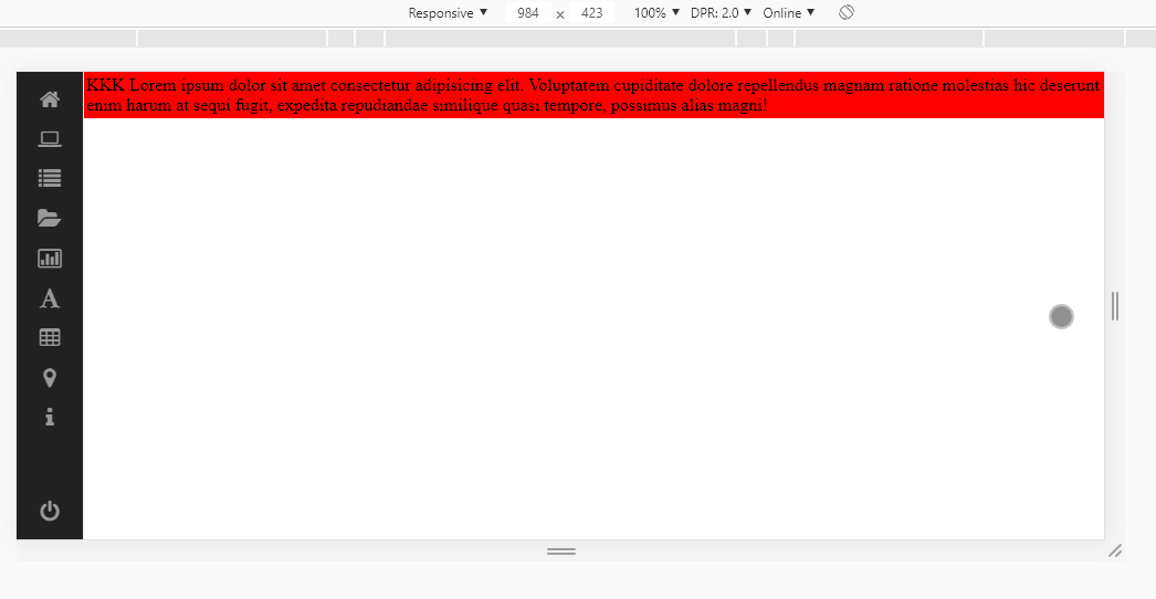
  • Thank you, that’s exactly what I needed :)!

  • @Fernandomunhoz cool young, good that solved there!

Browser other questions tagged

You are not signed in. Login or sign up in order to post.