0
I have the following code.
var logo = document.getElementById("svgLogo");
var area1 = document.getElementById("area1");
var area2 = document.getElementById("area2");
var area3 = document.getElementById("area3");
var area4 = document.getElementById("area4");

area1.addEventListener('click', function(){
	console.log("ÁREA 1");
	area1.classList.add("animationLogin1");
	area2.classList.add("animationLogin2");
	area3.classList.add("animationLogin3");
	area4.classList.add("animationLogin4");


	var timer = setInterval(hidden,3990);
	stars1.classList.add("transition");
	stars2.classList.add("transition");
	stars3.classList.add("transition");
});

area2.addEventListener('click', function(){
	console.log("ÁREA 2");
	area1.classList.add("animationLogin1");
	area2.classList.add("animationLogin2");
	area3.classList.add("animationLogin3");
	area4.classList.add("animationLogin4");


	var timer = setInterval(hidden,3990);
	stars1.classList.add("transition");
	stars2.classList.add("transition");
	stars3.classList.add("transition");
});

area3.addEventListener('click', function(){
	console.log("ÁREA 3");
	area1.classList.add("animationLogin1");
	area2.classList.add("animationLogin2");
	area3.classList.add("animationLogin3");
	area4.classList.add("animationLogin4");


	var timer = setInterval(hidden,3990);
	stars1.classList.add("transition");
	stars2.classList.add("transition");
	stars3.classList.add("transition");
});

area4.addEventListener('click', function(){
	console.log("ÁREA 4");
	area1.classList.add("animationLogin1");
	area2.classList.add("animationLogin2");
	area3.classList.add("animationLogin3");
	area4.classList.add("animationLogin4");


	var timer = setInterval(hidden,3990);
	stars1.classList.add("transition");
	stars2.classList.add("transition");
	stars3.classList.add("transition");
});

function hidden(){
	logo.style.display = "none";
}
#svgLogo{
position: absolute;
height: 1000px;
width: 1000px;
top: calc(35% - 500px);
left: calc(50% - 500px);
}
#area1{
position:absolute;
/*height:200%;*/
margin:0px 0px 0px 0px;
stroke: white;
stroke-width: 0.2;
fill: #4285F4;
}
#area2{
position:absolute;
/*height:200%;*/
margin:0px 0px 0px 0px;
stroke: white;
stroke-width: 0.15;
fill: #34A853;
}
#area3{
position:absolute;
/*height:200%;*/
margin:0px 0px 0px 0px;
stroke: white;
stroke-width: 0.15;
fill: #FBBC05;
}
#area4{
position:absolute;
/*height:200%;*/
margin:0px 0px 0px 0px;
stroke: white;
stroke-width: 0.15;
fill: #EA4335;
}
.animationLogin1{
-webkit-animation-name: globalRotate;
/* Center=cx/viewBox=20.5/41=50% */
-webkit-transform-origin: 50% 50%;
-webkit-animation-duration: 4s;
-webkit-animation-delay: 0s;
z-index:1;
}
.animationLogin2{
-webkit-animation-name: globalRotate;
/* Center=cx/viewBox=20.5/41=50% */
-webkit-transform-origin: 50% 50%;
-webkit-animation-duration: 4s;
-webkit-animation-delay: 0.5s;
z-index:1;
}
.animationLogin3{
-webkit-animation-name: globalRotate;
/* Center=cx/viewBox=20.5/41=50% */
-webkit-transform-origin: 50% 50%;
-webkit-animation-duration: 4s;
-webkit-animation-delay: 1s;
z-index:1;
}
.animationLogin4{
-webkit-animation-name: globalRotate;
/* Center=cx/viewBox=20.5/41=50% */
-webkit-transform-origin: 50% 50%;
-webkit-animation-duration: 4s;
-webkit-animation-delay: 1.5s;
z-index:1;
}
@keyframes globalRotate {
0% {-webkit-transform: translate(0px,0px) rotate(0deg) scale(1,1); opacity:1}
/*50% {-webkit-transform: translate(0px,0px) rotate(180deg) scale(1,1);opacity:1}*/
100% {-webkit-transform: translate(0px,0px) rotate(1800deg) scale(0.2,0.2);opacity:0}
} <!DOCTYPE html>
<html lang='en' class=''>
<head>
<meta charset="UTF-8">
<link rel="stylesheet" type="text/css" href="SpaceX.css">
<link rel="stylesheet" type="text/css" href="Baner.css">
<link rel="stylesheet" type="text/css" href="ButtonMenu.css">
</head>
<body>
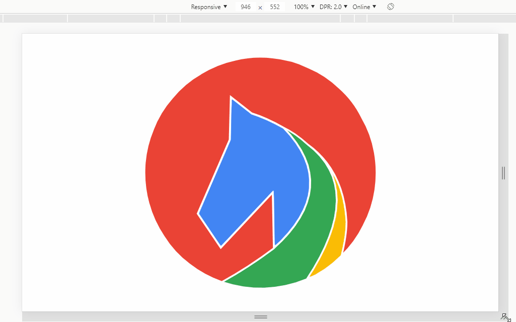
<svg id="svgLogo" viewBox="0 0 41 41">
<path id="area1"
d="M21.7,27.35 21.6,22.3Q19.25,24.8 16.9,27.3Q15.85,25.75 14.8,24.2Q16.25,20.85 17.7,17.5Q17.75,15.55 17.8,13.6Q18.75,14.35 19.7,15.1Q21,15.5 22.6,16.4Q27.85,21.8 21.7,27.35" stroke-linecap="round"/>
<path id="area2"
d="M17,30.4Q19.45,29.05 21.7,27.35Q27.85,21.8 22.6,16.4Q23.65,16.9 24.75,17.9Q30.1,21.95 24.7,30.15Q20.85,31.7 17,30.4" stroke-linecap="round"/>
<path id="area3"
d="M24.7,30.15Q30.1,21.95 24.75,17.9Q28.05,20.25 28.3,24.95Q28.3,26.2 27.85,28Q26.35,29.5 24.7,30.15" stroke- linecap="round" />
<path id="area4"
d="M21.7,27.35 21.6,22.3Q19.25,24.8 16.9,27.3Q15.85,25.75 14.8,24.2Q16.25,20.85 17.7,17.5Q17.75,15.55 17.8,13.6Q18.75,14.35 19.7,15.1Q21,15.5 22.6,16.4Q23.65,16.9 24.75,17.9Q28.05,20.25 28.3,24.95Q28.3,26.2 27.85,28Q29.1,26.8 29.85,25.25Q30.65,23.75 30.9,22.05Q31.15,20.35 30.85,18.65Q30.55,16.95 29.7,15.5Q28.95,13.95 27.65,12.8Q26.4,11.6 24.85,10.95Q23.3,10.2 21.6,10.05Q19.9,9.85 18.2,10.25Q16.55,10.6 15.1,11.5Q13.6,12.35 12.5,13.7Q11.35,15 10.75,16.6Q10.1,18.15 10,19.85Q9.9,21.6 10.35,23.25Q10.8,24.9 11.75,26.3Q12.65,27.75 14.05,28.8Q15.4,29.85 17,30.4Q19.45,29.05 21.7,27.35" stroke-linecap="round" />
</svg>
</body>
</html>I’m trying to get the animation to readjust to screen size
I’m trying to use display: flex
Dude it wasn’t clear what you want to do... Your idea is to center the logo in the center of the screen horizontally and vertically is this?
– hugocsl
@hugocsl, I’m sorry if I’m unclear. .
– Gabriel Silva