1
I have the following modal and inside it basically there’s an image in the upper left area and a text on the right side of the image and then a form. Everything is working perfectly well, but when opened on mobile mine div which contains the text is not centralised.
Follows the code:
<!DOCTYPE html>
<html lang="pt-br">
<head>
<meta name="viewport" content="width-device-width, initial-scale=1.0, maximum-scale=1.0">
<meta charset="UTF-8">
<link rel="stylesheet" href="https://stackpath.bootstrapcdn.com/bootstrap/4.3.1/css/bootstrap.min.css" integrity="sha384-ggOyR0iXCbMQv3Xipma34MD+dH/1fQ784/j6cY/iJTQUOhcWr7x9JvoRxT2MZw1T" crossorigin="anonymous">
<title>Modal automatico</title>
</head>
<body>
<!--Modal-->
<div class="modal fade" id="modalExemplo" tabindex="-1" role="dialog" aria-labelledby="exampleModalLabel" aria-hidden="true">
<div class="modal-dialog modal-lg mt-5" role="document">
<div class="modal-content">
<div class="modal-header">
<h5 class="modal-title" id="exampleModalLabel">Lorem Ipsum</h5>
<button type="button" class="close" data-dismiss="modal" aria-label="Fechar">
<span aria-hidden="true">×</span>
</button>
</div>
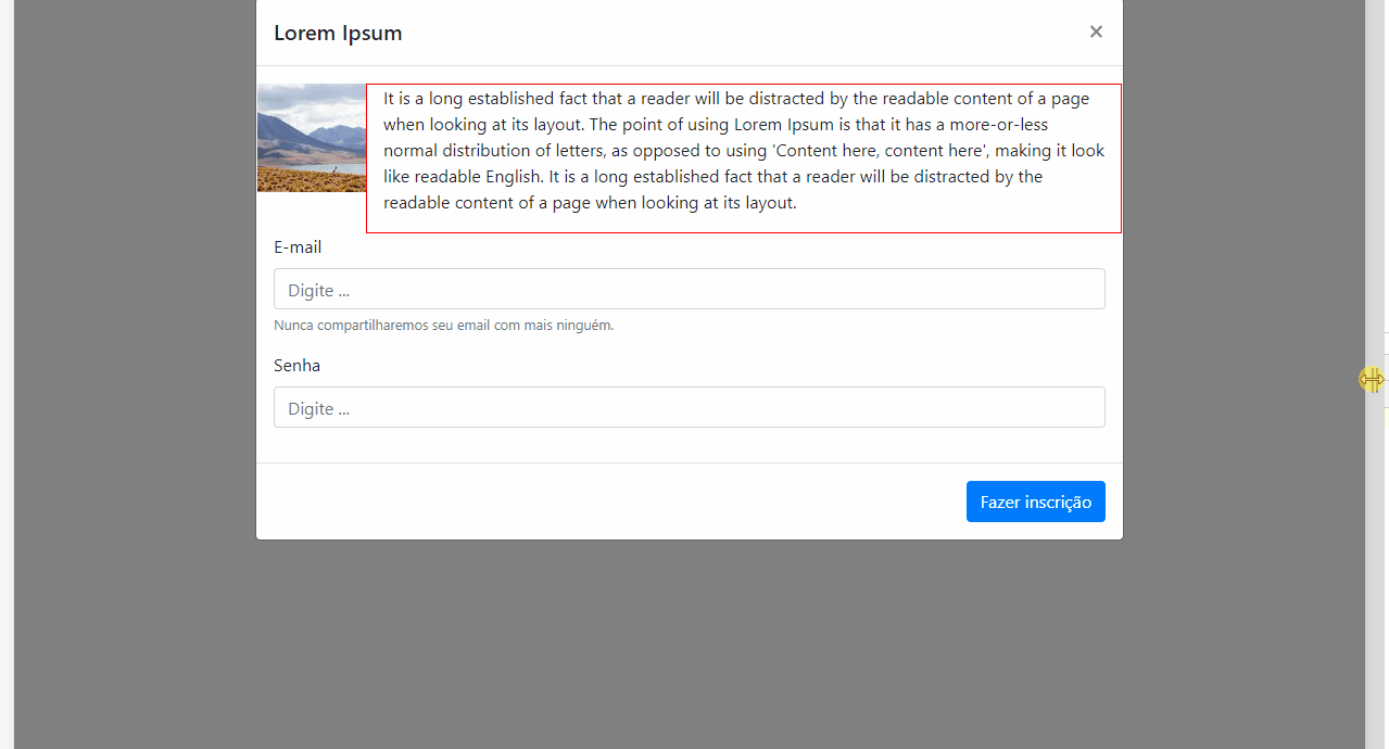
<div class="modal-body">
<img src="" title="nao sei inserir imagem no SO-pt" style="float: left">
<div style="width: 50%; height: auto; border: 1px solid red; float: left; margin-left: 20px">
<p>It is a long established fact that a reader will be distracted by the readable content of a page when looking at its layout. The point of using Lorem Ipsum is that it has a more-or-less normal distribution of letters, as opposed to using 'Content here, content here', making it look like readable English. It is a long established fact that a reader will be distracted by the readable content of a page when looking at its layout.</p>
</div>
<form style="clear: both">
<div class="form-group">
<label for="exampleInputEmail1">E-mail</label>
<input type="email" class="form-control" id="exampleInputEmail1" aria-describedby="emailHelp" placeholder="Digite ...">
<small id="emailHelp" class="form-text text-muted">Nunca compartilharemos seu email com mais ninguém.</small>
</div>
<div class="form-group">
<label for="exampleInputPassword1">Senha</label>
<input type="password" class="form-control" id="exampleInputPassword1" placeholder="Digite ...">
</div>
</form>
</div>
<form class="modal-footer" method="GET" action="inscricao.php">
<button type="submit" class="btn btn-primary">Fazer inscrição</button>
</form>
</div>
</div>
</div>
<script src="https://code.jquery.com/jquery-3.3.1.slim.min.js" integrity="sha384-q8i/X+965DzO0rT7abK41JStQIAqVgRVzpbzo5smXKp4YfRvH+8abtTE1Pi6jizo" crossorigin="anonymous"></script>
<script src="https://cdnjs.cloudflare.com/ajax/libs/popper.js/1.14.7/umd/popper.min.js" integrity="sha384-UO2eT0CpHqdSJQ6hJty5KVphtPhzWj9WO1clHTMGa3JDZwrnQq4sF86dIHNDz0W1" crossorigin="anonymous"></script>
<script src="https://stackpath.bootstrapcdn.com/bootstrap/4.3.1/js/bootstrap.min.js" integrity="sha384-JjSmVgyd0p3pXB1rRibZUAYoIIy6OrQ6VrjIEaFf/nJGzIxFDsf4x0xIM+B07jRM" crossorigin="anonymous"></script>
<!--chamando o modal-->
<script type="text/javascript">
$(window).on('load',function(){
$('#modalExemplo').modal('show');
});
</script>
</body>
</html>The intention was to do with the div which contains the text aligned with the beginning of the form and the end of the form, i.e., occupying similar space as the form occupies.
I made the modifications you mentioned, opened the link to doc and I’ve already started reading, actually I’ve been reading, only sometimes I need to do something on demand and fall into this scenario. Only when I open Google Dev Tools and start resizing the screen comes to a given where the height of the image is changed and it looks very strange.
– Lucas Inácio
@Lucasinácio its image has fixed size in px?
– hugocsl
has yes, why?
– Lucas Inácio
@Lucasinácio Pq if it has fixed measure in px was not to happen that, edits your question ai with your code like this at the time and a print of how ta getting
– hugocsl
I set here, I used media queries
– Lucas Inácio
@Lucasinácio good boy, it was worth the strength
– hugocsl