How to make a navbar with two logos?

Asked

Viewed 87 times

1

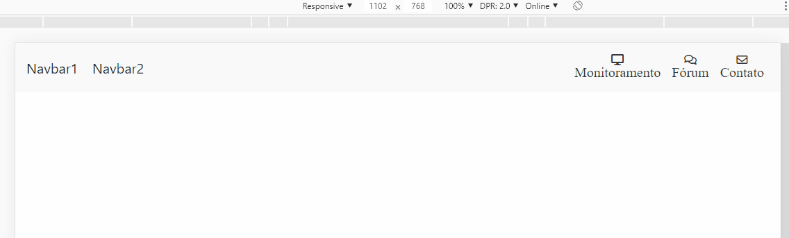
I need to make a navbar that receives two Banks, one next to the other

<nav class="navbar navbar-light navbar-expand-lg">
    <div class="col-md-3 navbar-nav">
        <a class="navbar-brand" href="#">
            <img src="/assets/img/logo1.png" class="img-fluid">
        </a>
    </div>
    <div class="col-md-3 navbar-nav">
        <a class="navbar-brand" href="#">
            <img src="/assets/img/logo2.png" class="img-fluid">
        </a>
    </div>    
    <button class="navbar-toggler" type="button" data-toggle="collapse" data-target="#tools" aria-controls="menu" aria-expanded="false" aria-label="Toggle navigation">
      <span class="navbar-toggler-icon"></span>
    </button>
    <div class="collapse navbar-collapse" id="tools">
        <ul class="navbar-nav ml-auto">
            <li class="nav-item">
                <a class="nav-link text-dark" href="#"><i class="fas fa-desktop text-center"><br><span class="text-center  lead">Monitoramento</span></i></a>
            </li>
            <li class="nav-item">
                <a class="nav-link text-dark" href="#"><i class="far fa-comments text-center"><br><span class="text-center  lead">Fórum</span></i></a>
            </li>
            <li class="nav-item">
                <a class="nav-link text-dark" href="#"><i class="far fa-envelope text-center"><br><span class="text-center  lead">Contato</span></i></a>
            </li>
        </ul>
    </div>
</nav>

These logos can’t get too small, so when you get to the mobile version, you need to have a line break by getting one right up and one down. As in the example below

inserir a descrição da imagem aqui

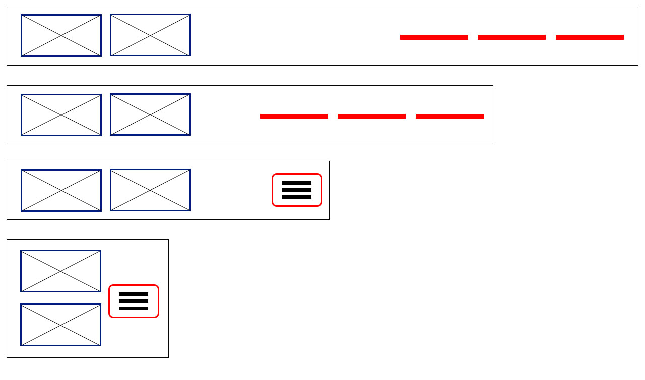
The problem is that I need the toggle button to be right, in my code when it breaks to the mobile version the toggle button is going to the bottom line. Another problem is that in the tablet version the second Brand is getting centralized, I would like you to stand next to each other.

1 answer

1


Just put the two logos inside one span, in that span vc will use the native flex classes of Bootstrap to control the positioning of the logo. When it is on small screens you will put d-flex and flex-column in the span and you will have this behavior as in the image

inserir a descrição da imagem aqui

Follow the image code above:

<!DOCTYPE html>
<html lang="en">

<head>
<meta charset="utf-8" />
<title>Page Title</title>
<meta name="viewport" content="width=device-width, initial-scale=1">
<link rel="stylesheet" type="text/css" media="screen" href="https://stackpath.bootstrapcdn.com/bootstrap/4.2.1/css/bootstrap.min.css" />
<link rel="stylesheet" type="text/css" media="screen" href="https://cdnjs.cloudflare.com/ajax/libs/font-awesome/5.8.2/css/all.min.css" />
<style>

</style>
</head>

<body>

    <nav class="navbar navbar-expand-lg navbar-light bg-light">
        <span class="d-flex flex-column d-sm-inline">
            <a class="navbar-brand" href="#">Navbar1</a>
            <a class="navbar-brand" href="#">Navbar2</a>
        </span>
        <button class="navbar-toggler" type="button" data-toggle="collapse" data-target="#navbarNav" aria-controls="navbarNav" aria-expanded="false" aria-label="Toggle navigation">
            <span class="navbar-toggler-icon"></span>
        </button>
        <div class="collapse navbar-collapse" id="navbarNav">
            <ul class="navbar-nav ml-auto">
                <li class="nav-item">
                    <a class="nav-link text-dark" href="#"><i class="fas fa-desktop text-center"><br><span class="text-center  lead">Monitoramento</span></i></a>
                </li>
                <li class="nav-item">
                    <a class="nav-link text-dark" href="#"><i class="far fa-comments text-center"><br><span class="text-center  lead">Fórum</span></i></a>
                </li>
                <li class="nav-item">
                    <a class="nav-link text-dark" href="#"><i class="far fa-envelope text-center"><br><span class="text-center  lead">Contato</span></i></a>
                </li>
            </ul>
        </div>
    </nav>

    <script src="https://code.jquery.com/jquery-3.2.1.min.js"></script>
    <script src="https://cdnjs.cloudflare.com/ajax/libs/popper.js/1.12.9/umd/popper.min.js"></script>
    <script src="https://stackpath.bootstrapcdn.com/bootstrap/4.2.1/js/bootstrap.min.js"></script>
</body>

</html>

Browser other questions tagged

You are not signed in. Login or sign up in order to post.