-1
I am working in a virtual store and I am using the site Nuvemshop to develop the website.
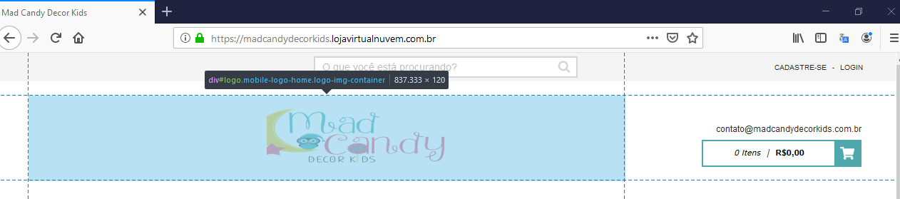
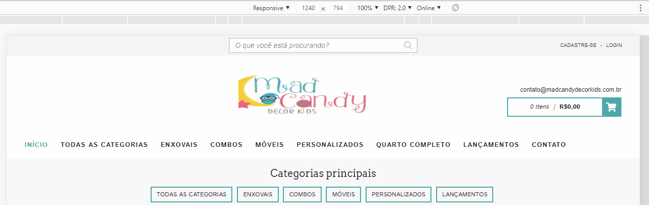
Only that I am facing a problem when positioning the logo of the store on the site.
Since the layout is responsive I need to align the store logo to the center of the page, so I apply an alignment code in the css in the image class, but desktop alignment is one way and mobile is another and never aligned exactly to the center on both devices, when aligns on one, offset on the other.
This is the CSS code I used:
.logo-img{ width: 50%; height: 50%; margin-left: 40%;
}
And this is the link from my page:
https://madcandydecorkids.lojavirtualnuvem.com.br/
I tried to select other classes, to see if I could work with a desktop class and another mobile class, but unfortunately all the classes I selected, the way I did none solved my alignment problem, here is my last option.
If anyone can help me with this, I will be very grateful, I thank the whole team.