Card misalignment in bootstrap 4’s smaller resolution size

Asked

Viewed 412 times

1

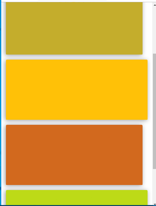
Good friends. I have the following problem regarding the vertical alignment of my cards, below I leave the image and the code to better illustrate. Is there any way they can help me? To point out that it’s inside a container.. I’m still in the learning phase... Thank you

inserir a descrição da imagem aqui

<div class="row">
                <div class="col-sm-5 mr-3 mb-3 justify-content-sm-center">
                    <div class="card border-0" id="content-a" style="height:
                        12rem;">
                        <div class="card-body text-center">
                            <h4 class="card-title font-weight-bold">Jogos da
                                Multiplicação</h4>
                            <a href="multip_game.html" class="card-link
                                text-center" style="font-size: 15pt;
                                text-decoration: underline;">&rarr;Entra e
                                joga!&larr;</a>


                        </div>

                    </div>


                </div>

                <div class="col-sm-5 mb-3 ">
                    <div class="card border-0 bg-warning" id="content-b"
                        style="height: 12rem;">
                        <div class="card-body text-center">
                            <h4 class="card-title text-center font-weight-bold">Jogo
                                da Divisão</h4>
                            <a href="divi_game.html" class="card-link
                                text-center" style="font-size:
                                15pt;text-decoration: underline;">&rarr;Entra e
                                joga!&larr;</a>


                        </div>

                    </div>
                </div>

            </div>

<div class="row">

                <div class="col-sm-5 mr-3 mb-3">
                    <div class="card border-0" id="content-c" style="height:
                        12rem;">
                        <div class="card-body text-center">
                            <h4 class="card-title font-weight-bold">Jogo do Par
                                ou Impar <span class="special-word">?</span><span
                                    class="special-word3">?</span></h4>
                            <a href="par_impar_game.html" class="card-link"
                                style="font-size: 15pt;text-decoration:
                                underline;">&rarr;Entra e joga!&larr;</a>


                        </div>

                    </div>

                </div>

                <div class="col-sm-5 mb-5 mb-3 ">
                    <div class="card border-0" id="content-d" style="height:
                        12rem;">
                        <div class="card-body text-center">
                            <h4 class="card-title font-weight-bold">Jogo do
                                Primo ou não primo<span class="special-word">?</span><span
                                    class="special-word3">?</span></h4>
                            <a href="prim_game.html" class="card-link"
                                style="font-size: 15pt;text-decoration:
                                underline;">&rarr;Entra e joga!&larr;</a>

                        </div>

                    </div>
                </div>
            </div>
  • What’s the matter?

  • I would like to align the cards so that they are aligned. In the image you can see that the first card is aligned with the third card and the second is aligned with the last

3 answers

1

I believe this image was taken in mobile, the error is exactly the margin added with the class mr-3, as already quoted. But an alternative is to use the bootstrap 4 responsiveness api. Adding mr-3 for mr-sm-3, and then you’ll have the right margin just the size sm up, excluding the margins on mobile or xs.

0


Thank you very much... I have already solved my problem, I have introduced all the cards in a single Row and for each card I created a col-Sm-6, making that when the row already had two elements to fill 12 columns automatically the remaining cards would pass down.

0

The problem is these classes .mr-3 that applies a margin-right in some Ivs making them smaller when the screen is on .col-sm- (up to 575px wide).

You can use a media query in CSS to reset these margins:

@media screen and (max-width: 575px){
   .mr-3{
      margin-right: 0 !important;
   }
}

Browser other questions tagged

You are not signed in. Login or sign up in order to post.