How to create a triangular progress bar with borders?

Asked

Viewed 104 times

0

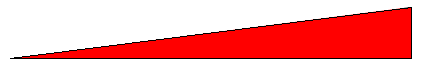
I’m trying to create a progress bar that has the format of a rectangle triangle, as in the image below:

inserir a descrição da imagem aqui

It’s actually a div with the size of 70% x 50px and a 1px border, and a pseudo ::after with a background color that goes "filling" in an animated way representing progress.

The problem is I couldn’t get this div to assume this triangular shape with the edges.

I even tried to use clip-path to "cut out" the top part of the div, but the top edge is also eliminated, thus becoming, what is not desirable:

inserir a descrição da imagem aqui

You can do this in CSS?

The code I have is this (no clip-path):

$(function(){
   $("#progresso").addClass("ativo");
});
#progresso{
   width: 70%;
   height: 50px;
   border: 1px solid #000;
   position: relative;
}

#progresso::after{
   content: '';
   position: absolute;
   top: 0;
   left: 0;
   width: 0;
   height: 100%;
   background-color: red;
   transition: width 2s linear;
}

#progresso.ativo::after{
   width: 100%;
}
<script src="https://cdnjs.cloudflare.com/ajax/libs/jquery/3.3.1/jquery.min.js"></script>
<div id="progresso"></div>

Code with clip-path:

$(function(){
   $("#progresso").addClass("ativo");
});
#progresso{
   width: 70%;
   height: 50px;
   border: 1px solid #000;
   position: relative;
   clip-path: polygon(0 100%, 100% 1px, 100% 100%);
}

#progresso::after{
   content: '';
   position: absolute;
   top: 0;
   left: 0;
   width: 0;
   height: 100%;
   background-color: red;
   transition: width 2s linear;
}

#progresso.ativo::after{
   width: 100%;
}
<script src="https://cdnjs.cloudflare.com/ajax/libs/jquery/3.3.1/jquery.min.js"></script>
<div id="progresso"></div>

1 answer

5

Apart from the fact that the top edge is not exactly one pixel, you can do it with two gradients:

.volume {
  width:70%;height:50px;
  border: 1px solid black; border-width:0 1px 1px 0;
  background:linear-gradient(to bottom right, #fff 0%, #fff 50%, #000 50%, #000 51%, transparent 51%),
    linear-gradient(90deg,red 0%, red 65%, gray 65%);
}
<div class="volume"></div>

Said two so that one of them is progress. If it were only the red triangle, it would only be gradient + solid background.


Animating with pure CSS:

Like gradients are not "anime" with pure CSS (with JS would animate the first example), can use a pseudoelement to make the animation:

.volume {
  width:70%;height:50px;
  border: 1px solid black; border-width:0 1px 1px 0;
  background:linear-gradient(to bottom right, #fff 0%, #fff 50%, #000 50%, #000 51%, transparent 51%);
}

.volume::after {
  content:'';display:block;position:relative;
  width:0;height:100%;
  background:red;
  z-index:-1;
  animation-name:teste;
  animation-duration:4s;
  animation-iteration-count: infinite;
}

@keyframes teste {
  0%   {width:0}
  50% {width:100%}
  100% {width:0}
}
<div class="volume"></div>

Browser other questions tagged

You are not signed in. Login or sign up in order to post.