1
<html lang="pt-br">
<body>
<?php
include_once 'header.php';
?>
<?php
if(!isset($_SESSION["email"]) || !isset($_SESSION["senha"])){
header("Location: logar.php");
exit;
}else{
}
?>
<link rel="stylesheet" href="Estilo/css/sidebar.css"/>
<div>
<section>
<hr class="m-0 mt-4">
<div class="d-flex" id="wrapper">
<!-- Sidebar -->
<div class="bg-light border-right" id="sidebar-wrapper">
<div class="sidebar-heading"><?php echo $_SESSION["nome"] ?> </div>
<div class="list-group list-group-flush">
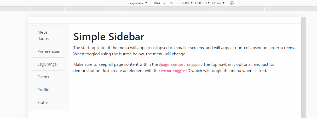
<a href="#" class="list-group-item list-group-item-action bg-light">Meus dados</a>
<a href="#" class="list-group-item list-group-item-action bg-light">Preferências</a>
<a href="#" class="list-group-item list-group-item-action bg-light">Segurança</a>
<a href="#" class="list-group-item list-group-item-action bg-light">Events</a>
<a href="#" class="list-group-item list-group-item-action bg-light">Profile</a>
<a href="#" class="list-group-item list-group-item-action bg-light">Status</a>
</div>
</div>
<!-- /#sidebar-wrapper -->
<!-- Page Content -->
<div id="page-content-wrapper">
<div class="container-fluid" id="menu-toggle">
<h1 class="mt-4">Simple Sidebar</h1>
<p>The starting state of the menu will appear collapsed on smaller screens, and will appear non-collapsed on larger screens. When toggled using the button below, the menu will change.</p>
<p>Make sure to keep all page content within the <code>#page-content-wrapper</code>. The top navbar is optional, and just for demonstration. Just create an element with the <code>#menu-toggle</code> ID which will toggle the menu when clicked.</p>
</div>
</div>
</section>
</div>
<?php
include_once 'footer.php';
?>
</body>
</html>
So I’m using this sidebar that I found on github, and since I’m new to this I wanted to know how to make the menu disappear when the screen goes down, like the bootstrap navbar, I’m not sure but I think it’s the Collapse function that does it. So how do I use it in the sidebar?