1
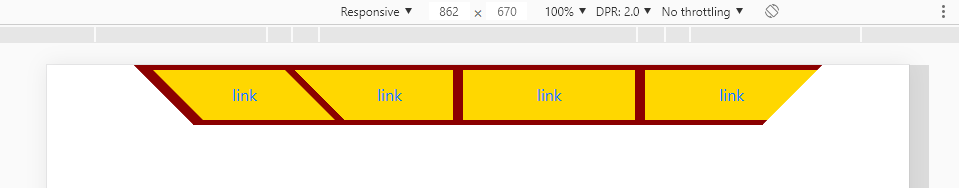
Hi, I’m doing a navbar and I wanted all the buttons to stay inside an image like this: 
I went on a lot of website but none specifically talked about this topic, so if anyone can help me I’d appreciate it.
My code:
@keyframes pular{
    0%, 20%, 60%, 100%{
        -webkit-transfomr: translateY(0);
        transform: translateY(0)
    }
    40%{
        -webkit-transfomr: translateY(-20px);
        transform: translateY(-20px)
    }
    80%{
        -webkit-transfomr: translateY(-10px);
        transform: translateY(-10px)
    }
}

.pulo:hover{
    animation: pular 1s;
}
<!DOCTYPE html>
<html lang="pt-br">
<head>
<meta charset="utf-8">
<title>Pokemon Generations</title>
<link rel="icon" href="Logo/Dream_Poké_Ball_Sprite.png">
<meta charset="utf-8">
<meta name="viewport" content="width-device-width, initial scale=1.0">
<meta name="author" content="Daniel Lucas">
<meta name="description" content="Tela Inicial do site">
<meta name="keywords" content="pokémon,bingo,história">
<link rel="stylesheet" href="estilo.css">
<link rel="stylesheet" href="node_modules/bootstrap/compiler/bootstrap.css">
<link rel="stylesheet" href="node_modules/bootstrap/compiler/style.css">
<link rel="stylesheet" href="https://stackpath.bootstrapcdn.com/bootstrap/4.3.1/css/bootstrap.min.css" integrity="sha384-ggOyR0iXCbMQv3Xipma34MD+dH/1fQ784/j6cY/iJTQUOhcWr7x9JvoRxT2MZw1T" crossorigin="anonymous">
<script src="https://code.jquery.com/jquery-3.3.1.slim.min.js" integrity="sha384-q8i/X+965DzO0rT7abK41JStQIAqVgRVzpbzo5smXKp4YfRvH+8abtTE1Pi6jizo" crossorigin="anonymous"></script>
<script src="https://cdnjs.cloudflare.com/ajax/libs/popper.js/1.14.7/umd/popper.min.js" integrity="sha384-UO2eT0CpHqdSJQ6hJty5KVphtPhzWj9WO1clHTMGa3JDZwrnQq4sF86dIHNDz0W1" crossorigin="anonymous"></script>
<script src="https://stackpath.bootstrapcdn.com/bootstrap/4.3.1/js/bootstrap.min.js" integrity="sha384-JjSmVgyd0p3pXB1rRibZUAYoIIy6OrQ6VrjIEaFf/nJGzIxFDsf4x0xIM+B07jRM" crossorigin="anonymous"></script>
<script src="node_modules/jquery/dist/jquery.js"></script>
<script src="node_modules/popper.js/dist/umd/popper.js"></script>
<script src="node_modules/bootstrap/dist/js/bootstrap.js"></script>
<body style="background-image: url(Fundo/fundo_pokemon_branco.jpg)">
<nav class="navbar sticky-top navbar-expand-lg navbar-dark" style="background-color:#38102b" >
<div class="container">
<a class="navbar-brand h1 mb-0" href="site_inicial.htm"><img src="Logo/shining_legends.png"></a>
<button class="navbar-toggler" type="button" data-toggle="collapse" data-target="#navbarSite">
<span class="navbar-toggler-icon"></span>
</button>
<div class="collapse navbar-collapse " id="navbarSite" >
<ul class="navbar-nav">
<li class="nav-item"><a class="nav-link" href="#"><button type="button" class="btn btn-outline-warning" class="ml-1"><img src="icone_personagens_gold.png" >Personagens</button></a></li>
<li class="nav-item"><a class="nav-link" href="#"><button type="button" class="btn btn-outline-warning" class="ml-1"><img src="icone_comojogar_gold.png" >Como jogar</button></a></li>
<li class="nav-item"><a class="nav-link" href="#"><button type="button" class="btn btn-outline-warning" class="ml-1"><img src="icone_jogar_gold1.png" >Jogar</button></a></li>
<li class="nav-item"><a class="nav-link" href="#"><button type="button" class="btn btn-outline-warning" class="ml-1"><img src="icone_atualizacoes_gold.png" >Atualizações</button></a></li>
<li class="nav-item mr-5"><a class="nav-link" href="#"><button type="button" class="btn btn-outline-warning" class="ml-1"><img src="icone_quemsou_gold.png" >Quem Sou</button></a></li>
<li class="nav-item " id="charmander"><a class="navbar-brand h1 mb-0 pulo" target="_blank" href="https://www.youtube.com/channel/UC6VdsMMnL-GdcoKc9qZEtQA?disable_polymer=true"><img src="Icones/icone_charmander.png"></a></li>
<li class="nav-item"><a class="navbar-brand h1 mb-0 pulo " target="_blank" href="http://api.whatsapp.com/send?1=pt_BR&phone=5584996011922"><img src="Icones/icone_bulbasaur.png"></a></li>
<li class="nav-item"><a class="navbar-brand h1 mb-0 pulo" target="_blank" href="https://twitter.com/LegendsShining"><img src="Icones/icone_squirtle.png"></a></li>
</ul>
</div>
</div>
</nav>
</body>
</html>THE CODE ABOVE IS WITHOUT THE IMAGES
The image that will be the navbar:

Do you want to make this bar by customizing a native Bootstrap Navbar? Or a simple example without using Bootstrap helps you? I’m asking you this because Bootstrap’s Navbar already comes by default with A LOT of original CSS from Bootstrap itself and these CSS will more mess up than helping to make a Nav as customized as what you want... Ideally you make your menu and not use the original Bootstrap Nav...
– hugocsl
I’m using bootstrap more by resizing than anything else, so I could do this menu with some navbar-expand-lg bootstrap classes?
– Akali
Just designing Navbar isn’t that complicated, but making it responsive would be more boring... You have to think about how you’re going to treat this menu on small screens. But my tip is you make a new bar and do not use the original Bootstrap pq Navbar it already comes with a lot of CSS that Bootstrap puts in it that will more mess than help! If you want an example without using the bootstrap Nav I can give you a help, but to customize and transform the BS Nav in this Nav, I think it’s not worth it...
– hugocsl
It can be without the bootstrap Nav so then I turn around to do the resizing
– Akali