How do break the children aligned with flexbox?

Asked

Viewed 38 times

0

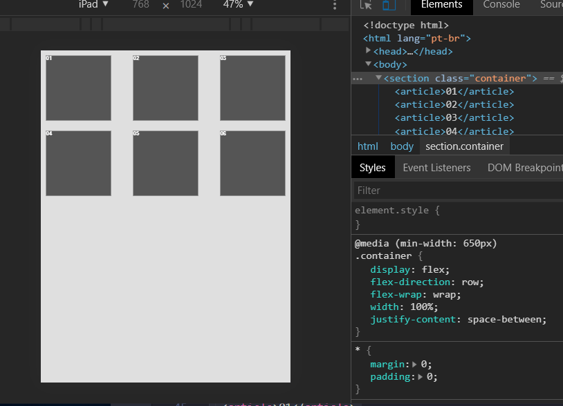
How do I get kids 4 5 6 below 1 2 3 when the site is in tablet mode ?

<!DOCTYPE html>
<html lang="pt-br">
<head>
	<title>flexbox</title>
	<meta charset="utf-8">
	<meta name="viewport" content="width=device-width, initial-scale=1">

	 <style type="text/css">
	 	
	 	*{
	 		margin:0;
	 		padding:0;
	 	}

	 	body{
	 		background:#dfdfdf;
	 	}
        /* MOBILE */
	 	@media(max-width:649px){
	 		.container{
		 		display:flex;
		 		flex-direction:column;
	 		}

		 	.container article{
		 		margin-bottom:1em;
		 		height:250px;
		 		border:2px solid black;
		 		color:white;
		 		font-family:arial;
		 		font-weight:bold;
		 	}

		 	.container article:nth-child(1){
		 		background: black;
		 		
		 	}

		 	.container article:nth-child(2){
		 		background:#111;
		 		
		 	}

		 	.container article:nth-child(3){
		 		background:#222;
		 		
		 	}

		 	.container article:nth-child(4){
		 		background:#333;
		 		
		 	}
	 	}

        /* TABLET */
	 	@media(min-width:650px){
	 		.container{
		 		display:flex;
		 		flex-direction:row;
	 		}

		 	.container article{
		 		height:200px;
		 		
		 		color:white;
		 		font-family:arial;
		 		font-weight:bold;
		 		margin-right:0.5em;
		 	}

		 	.container article:nth-child(1){
				flex:1;		 		
				background: black;
				border:2px solid #222;
		 	}
		 	
		 	.container article:nth-child(2){
				flex:1;
				background:#111;
		 	}
		 	
		 	.container article:nth-child(3){
				flex:1;
				background:#222;
		 	}

		 	.container article:nth-child(4){
				flex:1;
				background:#333;
		 	}

		 	.container article:nth-child(5){
				flex:1;
				background:#444;
		 	}

		 	.container article:nth-child(6){
				flex:1;
				background:#555;
				margin-right:0;
		 	}
	 	}

	 </style>
</head>
<body>

	<section class="container">
		<article>01</article>
		<article>02</article>
		<article>03</article>
		<article>04</article>
		<article>05</article>
		<article>06</article>
	</section>

</body>
</html>

1 answer

0

You can combine the flex-Direction and fle-wrap properties to get the result you want.

<!DOCTYPE html>
<html lang="pt-br">

<head>
 <title>flexbox</title>
 <meta charset="utf-8">
 <meta name="viewport" content="width=device-width, initial-scale=1">

 <style type="text/css">
  * {
   margin: 0;
   padding: 0;
  }

  body {
   background: #dfdfdf;
  }

  /* TABLET */
  @media(min-width:650px) {
   .container {
    display: flex;
    flex-direction: row;
    flex-wrap: wrap;
    width: 100%;
    justify-content: space-between;
   }

   .container article {
    height: 200px;
    width: 200px;
    margin: 1rem;
    color: white;
    font-family: arial;
    font-weight: bold;
    background: #555;
   }
  }
 </style>
</head>

<body>

 <section class="container">
  <article>01</article>
  <article>02</article>
  <article>03</article>
  <article>04</article>
  <article>05</article>
  <article>06</article>
 </section>

</body>

</html>

inserir a descrição da imagem aqui

Browser other questions tagged

You are not signed in. Login or sign up in order to post.