You have some problems in your code, first that in BS 4 does not exist col-xs-6, if you want each column to be 50% wide on small screens just put col-6 in place of xs-6.
Another problem is that you put one width maximum with max-width, so they line up in each other, you have to declare beyond the max-width also the width:100% So when the container has less than 324px the image occupies 100% of the container understands...
A tip about the image in the format different from the others is ideal that you put the size in a container and not directly in the image, so the container gets the size you want, and the image inside it gets 100% height and width...
<!DOCTYPE html>
<html lang="en">
<head>
  <meta charset="utf-8" />
  <title>Page Title</title>
  <meta name="viewport" content="width=device-width, initial-scale=1">
  <link rel="stylesheet" type="text/css" media="screen" href="https://stackpath.bootstrapcdn.com/bootstrap/4.2.1/css/bootstrap.min.css" />
  <link rel="stylesheet" type="text/css" media="screen" href="https://cdnjs.cloudflare.com/ajax/libs/font-awesome/5.8.2/css/all.min.css" />
<style>
    img {
    display: block;
    width: 100%;
    max-width: 324px !important;
    max-height: 324px !important;
    object-fit: cover;
    border: 2px solid red !important;
  }
</style>
</head>
<body>


<link href="https://stackpath.bootstrapcdn.com/bootstrap/4.3.1/css/bootstrap.min.css" rel="stylesheet"/>
<section class="section section-sm">

  <div class="container-fluid clearfix d-flex">

    <div class="row list-inline mx-auto justify-content-center" *ngIf="grid">
      <!-- A view wtih big Photos and no text -->
      <div class="p-0 col-6 col-lg-3 col-md-3 col-sm-3 ">
        <div class="photoContainer d-flex justify-content-center">
          <a href="#" target="_blank" >
            <img class="img-fluid" src="https://via.placeholder.com/640x640" >
          </a>
        </div>
      </div>
            <div class="p-0 col-6 col-lg-3 col-md-3 col-sm-3 ">
        <div class="photoContainer d-flex justify-content-center">
          <a href="#" target="_blank" >
            <img class="img-fluid" src="https://via.placeholder.com/640x640" >
          </a>
        </div>
      </div>
            <div class="p-0 col-6 col-lg-3 col-md-3 col-sm-3 ">
        <div class="photoContainer d-flex justify-content-center">
          <a href="#" target="_blank" >
            <img class="img-fluid" src="https://via.placeholder.com/640x640" >
          </a>
        </div>
      </div>
            <div class="p-0 col-6 col-lg-3 col-md-3 col-sm-3 ">
        <div class="photoContainer d-flex justify-content-center">
          <a href="#" target="_blank" >
            <img class="img-fluid" src="https://via.placeholder.com/480x600" >
          </a>
        </div>
      </div>
            <div class="p-0 col-6 col-lg-3 col-md-3 col-sm-3 ">
        <div class="photoContainer d-flex justify-content-center">
          <a href="#" target="_blank" >
            <img class="img-fluid" src="https://via.placeholder.com/640x640" >
          </a>
        </div>
      </div>
            <div class="p-0 col-6 col-lg-3 col-md-3 col-sm-3 ">
        <div class="photoContainer d-flex justify-content-center">
          <a href="#" target="_blank" >
            <img class="img-fluid" src="https://via.placeholder.com/640x640" >
          </a>
        </div>
      </div>
            <div class="p-0 col-6 col-lg-3 col-md-3 col-sm-3 ">
        <div class="photoContainer d-flex justify-content-center">
          <a href="#" target="_blank" >
            <img class="img-fluid" src="https://via.placeholder.com/640x640" >
          </a>
        </div>
      </div>
            <div class="p-0 col-6 col-lg-3 col-md-3 col-sm-3 " >
        <div class="photoContainer d-flex justify-content-center">
          <a href="#" target="_blank" >
            <img class="img-fluid" src="https://via.placeholder.com/640x640" >
          </a>
        </div>
      </div>
    </div>
  </div>
  </section>

  <script src="https://code.jquery.com/jquery-3.2.1.min.js"></script>
  <script src="https://cdnjs.cloudflare.com/ajax/libs/popper.js/1.12.9/umd/popper.min.js"></script>
  <script src="https://stackpath.bootstrapcdn.com/bootstrap/4.2.1/js/bootstrap.min.js"></script>
</body>
</html>
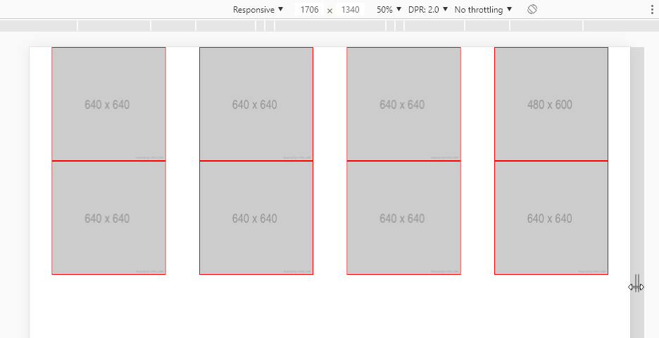
Treating the higher image
An option for correct the problem of the higher image is to put d-flex, tb in the parent container, as in the link and in itself col
Notice in the image below that now all images in the same column follow the height of the largest item
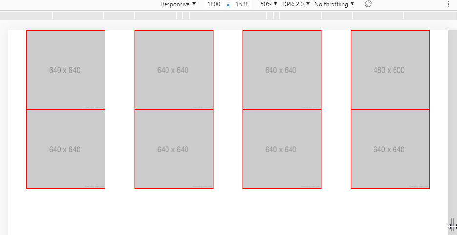
Code of the image above
<!DOCTYPE html>
<html lang="en">
<head>
  <meta charset="utf-8" />
  <title>Page Title</title>
  <meta name="viewport" content="width=device-width, initial-scale=1">
  <link rel="stylesheet" type="text/css" media="screen" href="https://stackpath.bootstrapcdn.com/bootstrap/4.2.1/css/bootstrap.min.css" />
  <link rel="stylesheet" type="text/css" media="screen" href="https://cdnjs.cloudflare.com/ajax/libs/font-awesome/5.8.2/css/all.min.css" />
<style>
    img {
    display: block;
    width: 100%;
    max-width: 324px !important;
    max-height: 324px !important;
    object-fit: cover;
    border: 2px solid red !important;
  }
</style>
</head>
<body>


<link href="https://stackpath.bootstrapcdn.com/bootstrap/4.3.1/css/bootstrap.min.css" rel="stylesheet"/>
<section class="section section-sm">

  <div class="container-fluid clearfix d-flex">

    <div class="row list-inline mx-auto justify-content-center" *ngIf="grid">
      <!-- A view wtih big Photos and no text -->
      <div class="p-0 col-6 col-lg-3 col-md-3 col-sm-3 d-flex justify-content-center">
        <div class="photoContainer d-flex justify-content-center">
          <a href="#" target="_blank" class="d-flex " >
            <img class="img-fluid" src="https://via.placeholder.com/640x640" >
          </a>
        </div>
      </div>
            <div class="p-0 col-6 col-lg-3 col-md-3 col-sm-3 d-flex justify-content-center">
        <div class="photoContainer d-flex justify-content-center">
          <a href="#" target="_blank" class="d-flex " >
            <img class="img-fluid" src="https://via.placeholder.com/480x600" >
          </a>
        </div>
      </div>
            <div class="p-0 col-6 col-lg-3 col-md-3 col-sm-3 d-flex justify-content-center">
        <div class="photoContainer d-flex justify-content-center">
          <a href="#" target="_blank" class="d-flex " >
            <img class="img-fluid" src="https://via.placeholder.com/640x640" >
          </a>
        </div>
      </div>
            <div class="p-0 col-6 col-lg-3 col-md-3 col-sm-3 d-flex justify-content-center">
        <div class="photoContainer d-flex justify-content-center">
          <a href="#" target="_blank" class="d-flex " >
            <img class="img-fluid" src="https://via.placeholder.com/640x640" >
          </a>
        </div>
      </div>
            <div class="p-0 col-6 col-lg-3 col-md-3 col-sm-3 d-flex justify-content-center ">
        <div class="photoContainer d-flex justify-content-center">
          <a href="#" target="_blank" class="d-flex " >
            <img class="img-fluid" src="https://via.placeholder.com/640x640" >
          </a>
        </div>
      </div>
    </div>
  </div>
  </section>

  <script src="https://code.jquery.com/jquery-3.2.1.min.js"></script>
  <script src="https://cdnjs.cloudflare.com/ajax/libs/popper.js/1.12.9/umd/popper.min.js"></script>
  <script src="https://stackpath.bootstrapcdn.com/bootstrap/4.2.1/js/bootstrap.min.js"></script>
</body>
</html>
Face if the image is at most 324px wide it will not go beyond this... how do you expect it to behave? Occupying the entire space of the
col?– hugocsl
@hugocsl I want her to have at max 324px but when it’s at lower resolution she doesn’t keep track of the div getting on top of each other. If I take this max it works with most images but this image with different resolution gets bigger than the others.
– Giovanni Dias