How do I leave the background with greyscale, but its elements in the same original color?

Asked

Viewed 40 times

0

<html xmlns="http://www.w3.org/1999/xhtml">
<head runat="server">
<title>bluantinoo CSS Grayscale Bg Image Sample</title>
<style type="text/css">
    div {
        border: 1px solid black;
        padding: 5px;
        margin: 5px;
        width: 600px;
        height: 600px;
        float: left;
        color: white;
    }
     .grayscale {
         background: url(https://aquitemplacas.com.br/img/produtos/g/36-atencao-area-de-teste.jpg);
         -moz-filter: url("data:image/svg+xml;utf8,<svg xmlns=\'http://www.w3.org/2000/svg\'><filter id=\'grayscale\'><feColorMatrix type=\'matrix\' values=\'0.3333 0.3333 0.3333 0 0 0.3333 0.3333 0.3333 0 0 0.3333 0.3333 0.3333 0 0 0 0 0 1 0\'/></filter></svg>#grayscale");
         -o-filter: url("data:image/svg+xml;utf8,<svg xmlns=\'http://www.w3.org/2000/svg\'><filter id=\'grayscale\'><feColorMatrix type=\'matrix\' values=\'0.3333 0.3333 0.3333 0 0 0.3333 0.3333 0.3333 0 0 0.3333 0.3333 0.3333 0 0 0 0 0 1 0\'/></filter></svg>#grayscale");
         -webkit-filter: grayscale(100%);
         filter: gray;
         filter: url("data:image/svg+xml;utf8,<svg xmlns=\'http://www.w3.org/2000/svg\'><filter id=\'grayscale\'><feColorMatrix type=\'matrix\' values=\'0.3333 0.3333 0.3333 0 0 0.3333 0.3333 0.3333 0 0 0.3333 0.3333 0.3333 0 0 0 0 0 1 0\'/></filter></svg>#grayscale");
     }

    .nongrayscale {
        background: url(https://aquitemplacas.com.br/img/produtos/g/36-atencao-area-de-teste.jpg);
    }
</style>
</head>
<body>
    <div class="nongrayscale">
        this is a non-grayscale of the bg image
        <button style="background-color: blue">teste</button>
    </div>
    <div class="grayscale">
        this is a grayscale of the bg image
        <button style="background-color: blue">teste</button>
    </div>
</body>
</html>

inserir a descrição da imagem aqui

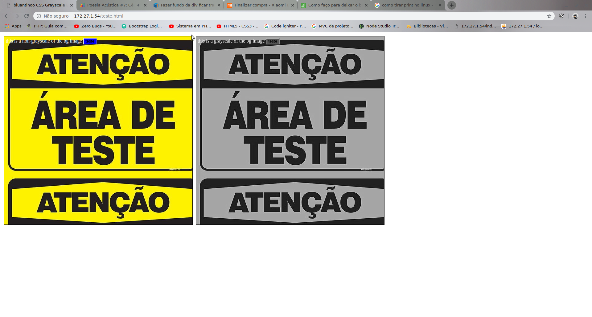
I want the button to turn blue even with the filter.

1 answer

0


Can create a pseudo-element ::before in div.grayscale with the background and apply the filter only on it:

div {
   border: 1px solid black;
   padding: 5px;
   margin: 5px;
   width: 600px;
   height: 600px;
   float: left;
   color: white;
}

.grayscale {
   position: relative;
}

.grayscale::before {
   content: "";
   position: absolute;
   width: 100%;
   height: 100%;
   top: 0;
   left: 0;
   background: url(https://aquitemplacas.com.br/img/produtos/g/36-atencao-area-de-teste.jpg);
   filter: gray;
   filter: url("data:image/svg+xml;utf8,<svg xmlns=\'http://www.w3.org/2000/svg\'><filter id=\'grayscale\'><feColorMatrix type=\'matrix\' values=\'0.3333 0.3333 0.3333 0 0 0.3333 0.3333 0.3333 0 0 0.3333 0.3333 0.3333 0 0 0 0 0 1 0\'/></filter></svg>#grayscale");
   -moz-filter: url("data:image/svg+xml;utf8,<svg xmlns=\'http://www.w3.org/2000/svg\'><filter id=\'grayscale\'><feColorMatrix type=\'matrix\' values=\'0.3333 0.3333 0.3333 0 0 0.3333 0.3333 0.3333 0 0 0.3333 0.3333 0.3333 0 0 0 0 0 1 0\'/></filter></svg>#grayscale");
   -o-filter: url("data:image/svg+xml;utf8,<svg xmlns=\'http://www.w3.org/2000/svg\'><filter id=\'grayscale\'><feColorMatrix type=\'matrix\' values=\'0.3333 0.3333 0.3333 0 0 0.3333 0.3333 0.3333 0 0 0.3333 0.3333 0.3333 0 0 0 0 0 1 0\'/></filter></svg>#grayscale");
   -webkit-filter: grayscale(100%);
   z-index: -1;
}

.nongrayscale {
   background: url(https://aquitemplacas.com.br/img/produtos/g/36-atencao-area-de-teste.jpg);
}
<div class="nongrayscale">
  this is a non-grayscale of the bg image
  <button style="background-color: blue">teste</button>
</div>
<div class="grayscale">
  this is a grayscale of the bg image
  <button style="background-color: blue">teste</button>
</div>

  • Thank you, it worked :)

  • You’re welcome. Here’s how to thank [tour].

Browser other questions tagged

You are not signed in. Login or sign up in order to post.