6
I have a div with position: fixed which occupies the entire screen and which is only displayed when the width of the screen is less than the height. With Javascript I can do this check and show or hide this div according to the above criteria, ie, screen width < height. This is to force the user to use the device in horizontal orientation (Landscape) on a specific page:
window.onresize = window.onload = function(){

   if(this.innerWidth < this.innerHeight){
      document.getElementById("aviso").style.display = "flex";
   }else{
      document.getElementById("aviso").style.display = "none";
   }

}
body{
margin: 0;
}
#aviso{
position: fixed;
top: 0;
right: 0;
bottom: 0;
left: 0;
display: none;
align-items: center;
justify-content: center;
background: black;
color: white;
}
#aviso strong{
text-align: center;
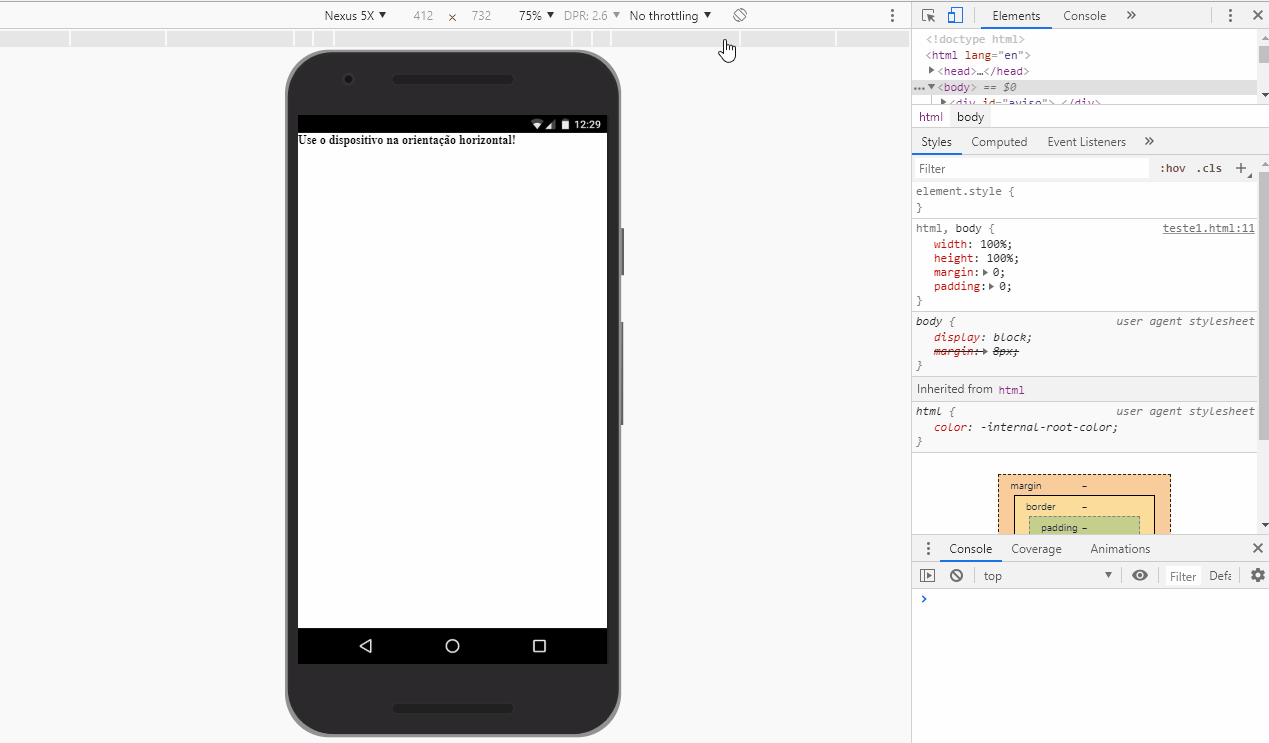
}<div id="aviso">
<strong>Use o dispositivo na orientação horizontal!</strong>
</div>
<div id="main">
Conteúdo
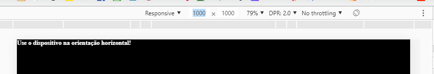
</div>When executing the above code and reducing the width of the screen until it is less than the height, the div #aviso is displayed above the page content with the warning in bold.
It is possible to do the same thing using the media queries or any specific CSS function? That is, there is some way to check when the width of the screen is smaller than its height only with CSS and change the property display of the div #aviso?
@media screen and (orientation:portrait) { … }@media screen and (orientation:landscape) { … }– Bacco