Change widget CSS when menu is pinned to top

Asked

Viewed 123 times

1

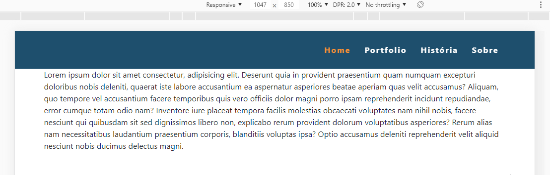
I’m using the Sticky-top bootstrap class to pin the menu to the top. But I wish that as long as the menu was not fixed, the icon would not appear.

I mean .menu-principal img, I would like when the menu is fixed at the top the opacity of .menu-principal img changes from 0 to 1. I’m using jquery, bootstrap and the visibility plugin. I’m a beginner in web development.

This is the menu:


 <nav class=" sticky-top menu-principal navbar navbar-expand-lg navbar-dark">
    <div class="container d-flex justify-content-between">
      <span style="display: block; width: 56px;"></span>
        <a class="navbar-brand m-0" href="index.html">
            <img src="icons/logo-simples.svg" alt="logotipo simplificado">
        </a>

        <button class="navbar-toggler float-right" data-toggle="collapse" 
              data-target="#navbarMenu">
          <span class="navbar-toggler-icon"></span>
        </button>

        <div class="navbar-collapse collapse justify-content-end" id="navbarMenu">
          <div class="navbar-nav">
            <a href="index.html" class="nav-item nav-link active"> Home</a>
            <a href="portfolio.html" class="nav-item nav-link"> Portfolio</a>
            <a href="historia.html" class="nav-item nav-link"> História</a>
            <a href="sobre.html" class="nav-item nav-link"> Sobre</a>
          </div>
        </div>
     </div> 
</nav>

This is the CSS of the Menu


.menu-principal {
background-color: #1C4F6E;
font-weight: bold;
letter-spacing: 2px;
}

.menu-principal .navbar-nav a {
  color: #FFF !important;
  margin-left: 6px;
  margin-right: 6px;
}

.menu-principal .navbar-nav .active {
   color: #FF9127 !important;
}

.menu-principal .navbar-nav a:hover {
  color: #FF9127 !important;
 }

.menu-principal img {
   opacity: 0;
    height: 60px;
}


 @media screen and (max-width: 991px) {
   .menu-principal img {
       height: 50px;
    }

.menu-principal .navbar-nav a {
    margin: 0;
    padding: 10px;
}

.navbar-nav {
    padding: 10px;
}

.navbar-toggler {
    margin-top: 10px;
}

.menu-principal .container {
    display: inline-block;
    text-align: center;
}
 }

1 answer

1


As you said you have jQuery on the project here is an answer. But keep in mind that only CSS does not detect Scroll events in the window like this...

The idea is to use the methods fadeIn and fadeOut jQuery to show the image or not scroll is greater than the height of navbar.

inserir a descrição da imagem aqui

Follow the image code above.

OBS: Your navbar has some problems, I do not know if it is according to the documentation, but in mobile mode when you open it is not getting cool, this is not problem of the code I did, was another CSS or something that you did not put in the code...

<!DOCTYPE html>
<html lang="en">

<head>
<meta charset="utf-8" />
<title>Page Title</title>
<meta name="viewport" content="width=device-width, initial-scale=1">
<link rel="stylesheet" type="text/css" media="screen" href="https://stackpath.bootstrapcdn.com/bootstrap/4.2.1/css/bootstrap.min.css" />
<link rel="stylesheet" type="text/css" media="screen" href="https://cdnjs.cloudflare.com/ajax/libs/font-awesome/5.8.2/css/all.min.css" />
<style>
    .menu-principal {
        background-color: #1C4F6E;
        font-weight: bold;
        letter-spacing: 2px;
        height: 76px;
    }

    .menu-principal .navbar-nav a {
        color: #FFF !important;
        margin-left: 6px;
        margin-right: 6px;
    }

    .menu-principal .navbar-nav .active {
        color: #FF9127 !important;
    }

    .menu-principal .navbar-nav a:hover {
        color: #FF9127 !important;
    }

    .menu-principal img {
        height: 60px;
    }

    .navbar-brand {
        display: none;
    }

    @media screen and (max-width: 991px) {
        .menu-principal img {
            height: 50px;
        }

        .menu-principal .navbar-nav a {
            margin: 0;
            padding: 10px;
        }

        .navbar-nav {
            padding: 10px;
        }

        .navbar-toggler {
            margin-top: 10px;
        }

        .menu-principal .container {
            display: inline-block;
            text-align: center;
        }
    }
</style>
</head>

<body>

    <nav class=" sticky-top menu-principal navbar navbar-expand-lg navbar-dark">
        <div class="container d-flex justify-content-between">
            <span style="display: block; width: 56px;"></span>
            <a class="navbar-brand m-0" href="index.html">
                <img src="https://placecage.com/16/16"  alt="logotipo simplificado">
            </a>

            <button class="navbar-toggler float-right" data-toggle="collapse" data-target="#navbarMenu">
                <span class="navbar-toggler-icon"></span>
            </button>

            <div class="navbar-collapse collapse justify-content-end" id="navbarMenu">
                <div class="navbar-nav">
                    <a href="index.html" class="nav-item nav-link active"> Home</a>
                    <a href="portfolio.html" class="nav-item nav-link"> Portfolio</a>
                    <a href="historia.html" class="nav-item nav-link"> História</a>
                    <a href="sobre.html" class="nav-item nav-link"> Sobre</a>
                </div>
            </div>
        </div>
    </nav>
    <div class="container">
        <div class="row">
            <div class="col" style="height: 200vh">
                Lorem ipsum dolor sit amet consectetur, adipisicing elit. Deserunt quia in provident praesentium quam numquam excepturi doloribus nobis deleniti, quaerat iste labore accusantium ea aspernatur asperiores beatae aperiam quas velit accusamus? Aliquam, quo tempore vel accusantium facere temporibus quis vero officiis dolor magni porro ipsam reprehenderit incidunt repudiandae, error cumque totam odio nam? Inventore iure placeat tempora facilis molestias obcaecati voluptates nam nihil nobis, facere nesciunt qui quibusdam sit sed dignissimos libero non, explicabo rerum provident dolorum voluptatibus asperiores? Rerum alias nam necessitatibus laudantium praesentium corporis, blanditiis voluptas ipsa? Optio accusamus deleniti reprehenderit velit aliquid nesciunt nobis ducimus delectus magni.
            </div>
        </div>
    </div>

    <script src="https://code.jquery.com/jquery-3.2.1.min.js"></script>
    <script src="https://cdnjs.cloudflare.com/ajax/libs/popper.js/1.12.9/umd/popper.min.js"></script>
    <script src="https://stackpath.bootstrapcdn.com/bootstrap/4.2.1/js/bootstrap.min.js"></script>

    <script>

    $(window).scroll(function() {
        var scroll = $(window).scrollTop();
        if (scroll >= 76) { // altura da sua navbar
            $(".navbar-brand").fadeIn();
        } else {
            $(".navbar-brand").fadeOut();
        }
    });

    </script>
</body>

</html>

  • Thanks, that’s exactly what I’ve been wanting

  • @Erulos tranqilo young, I’m glad you helped there, if you don’t want to use the fadeIn / Out vc can add or remove a class, ai vc creates the class you want to remove/add and in the Script you exchange where it is fadeIn for addClass and removeClass

Browser other questions tagged

You are not signed in. Login or sign up in order to post.