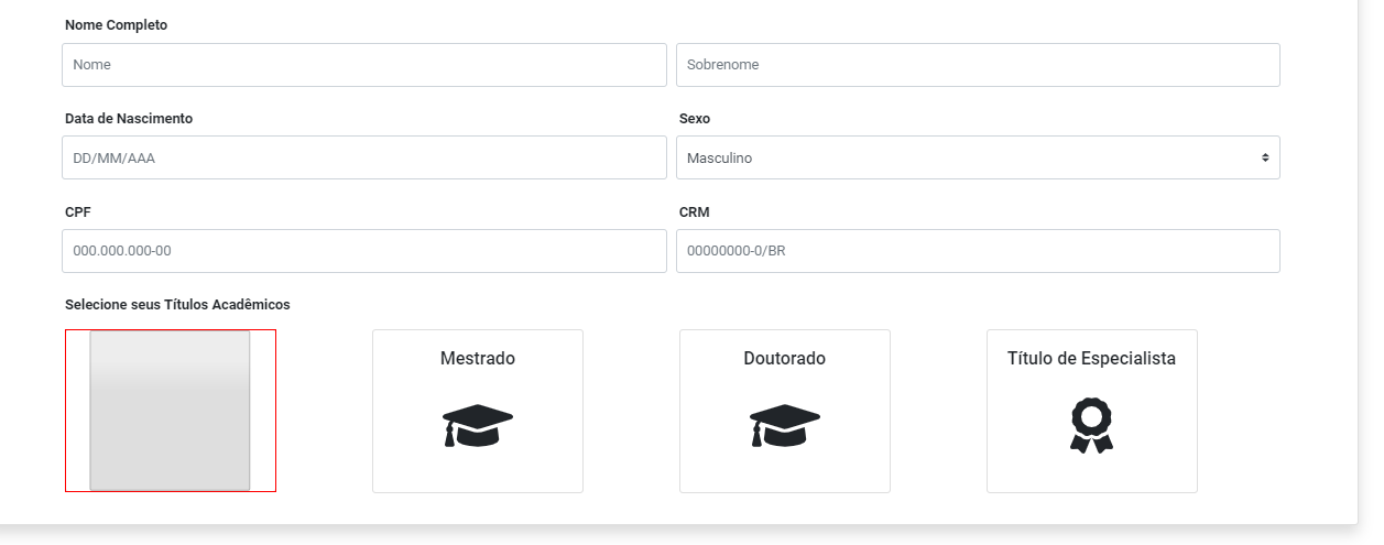
1
I’m creating multiple selections with the checkbox and need to leave it with the following characteristics:
- Transparent background
- Stylize the edges
- Remove the Check
This so that it is on top of my . card and the user thinks he is clicking on a card, when in fact it is a checkbox and is activating or disabling that option.
I tried to edit with the properties of them and nothing happens, follow the code:
<div class="form-group col-3 mt-2">
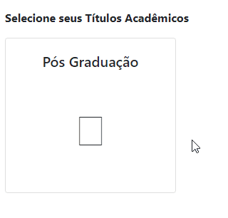
<label for="exampleInputPassword1" class="font-weight-bold ml-1">Selecione seus Títulos Acadêmicos</label>
<div class="d-flex">
<div class="position-absolute mt-2 ml-1"
style="width: 15rem; height: 11.6rem; border: 1px red solid; z-index: 1 !important">
<input type="checkbox" aria-label="Checkbox for following text input"
style="background-color: transparent !important; width: 100% !important; height: 100% !important;">
</div>
<div class="position-relative" style="z-index: 0 !important">
<div class="card py-2 pb-4 mt-2 ml-1" style="width: 15rem">
<div class="card-header pb-0 border-0 bg-transparent text-center">
<h5 class="card-title">Pós Graduação</h5>
</div>
<div class="card-body text-center">
<i class="fas fa-graduation-cap" style="font-size: 4rem"></i>
</div>
</div>
</div>
</div>
</div>
Illustrative Figure:
I didn’t know I could put other elements than the input inside the label.
– user148754
@THIAGODEBONIS can put several types of element inside a label, I myself have asked about it here https://answall.com/questions/325806/na-label-%C3%A9-without%C3%a2ntico-or-allowed-to-use-what-elements-inside
– hugocsl