0
Testing on mobile the responsiveness of my layout, I noticed that when clicking on an element HTML of data entries (I), for example in my case the <input>, the Keyboard of the device is opened (which is a standard action).
But Keyboard is somehow "lifting the container" where this element is HTML (<input>), thus completely breaking my layout.
- Why does this happen?
- Is there a way to "fix" this? If so, how to proceed?
Note
I realized this is happening because I inserted
height: 100;to center my content in the center of the screen, but how can I center the content in the center without using theheight?
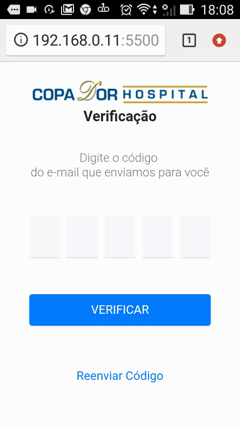
In the figure below I used an android brand Asus, but what happens here, It happens on all android the same way. In this figure we can observe that by clicking on <input> the Keyboard is triggered and pushing the container up, thus "pushing" my layout (notice where will stop the phrase, under the navbar):
HTML:
<!DOCTYPE html>
<html lang="en">

<head>
    <meta charset="UTF-8">
    <meta name="viewport" content="width=device-width, initial-scale=1.0, user-scalable=no">
    <meta http-equiv="X-UA-Compatible" content="ie=edge">
    <link rel="stylesheet" href="https://stackpath.bootstrapcdn.com/bootstrap/4.3.1/css/bootstrap.min.css"
        integrity="sha384-ggOyR0iXCbMQv3Xipma34MD+dH/1fQ784/j6cY/iJTQUOhcWr7x9JvoRxT2MZw1T" crossorigin="anonymous">
    <link href="./node_modules/@fortawesome/fontawesome-free/css/all.min.css" rel="stylesheet">
    <link href="./dist/css/verification.min.css" rel="stylesheet">
    <title>Document</title>
</head>

<body>
    <header>
        <nav id="navbar-main" class="navbar py-4">
            <div class="d-flex flex-column">
                <div><img id="navbar-main-logo" src="./dist/img/copa-dor-logo.png" alt="Copa Dor Hospital"></div>
                <div><span id="navbar-main-category-title">Verificação</span></div>
            </div>
        </nav>
    </header>

    <main>
        <div class="d-flex flex-column align-items-center justify-content-center h-100" style="border: 0px red solid;">
            <div class="pb-3">
                <h6 class="font-weight-light text-secondary text-center">
                    Digite o código <br>
                    do e-mail que enviamos para você
                </h6>
            </div>
            <div class="py-4">
                <form>
                    <div class="container-fluid">
                        <div class="form-row px-4 px-md-5 pb-5">
                            <div class="col">
                                <input type="number" class="form-control font-weight-bold text-center rounded-0 border-top-0 border-right-0 border-left-0 bg-light shadow-none" required autofocus style="font-size: 1.8rem;">
                            </div>
                            <div class="col">
                                <input type="number" class="form-control font-weight-bold text-center rounded-0 border-top-0 border-right-0 border-left-0 bg-light shadow-none" required style="font-size: 1.8rem;">
                            </div>
                            <div class="col">
                                <input type="number" class="form-control font-weight-bold text-center rounded-0 border-top-0 border-right-0 border-left-0 bg-light shadow-none" required style="font-size: 1.8rem;">
                            </div>
                            <div class="col">
                                <input type="number" class="form-control font-weight-bold text-center rounded-0 border-top-0 border-right-0 border-left-0 bg-light shadow-none" required style="font-size: 1.8rem;">
                            </div>
                            <div class="col">
                                <input type="number" class="form-control font-weight-bold text-center rounded-0 border-top-0 border-right-0 border-left-0 bg-light shadow-none" required style="font-size: 1.8rem;">
                            </div>
                        </div>
                        <div class="form-row px-4 px-md-5 pb-4">
                            <div class="col-12">
                                <button type="submit" class="btn btn-block btn-primary shadow-sm py-2 py-lg-3">VERIFICAR</button>
                            </div>
                        </div>
                    </div>
                </form>
            </div>
            <div><a href="#" class="btn mx-auto d-block text-primary" role="button">Reenviar Código</a></div>
        </div>
    </main>

    <script src="./node_modules/@fortawesome/fontawesome-free/js/all.min.js"></script>
    <script src="https://code.jquery.com/jquery-3.3.1.slim.min.js"
        integrity="sha384-q8i/X+965DzO0rT7abK41JStQIAqVgRVzpbzo5smXKp4YfRvH+8abtTE1Pi6jizo"
        crossorigin="anonymous"></script>
    <script src="https://cdnjs.cloudflare.com/ajax/libs/popper.js/1.14.7/umd/popper.min.js"
        integrity="sha384-UO2eT0CpHqdSJQ6hJty5KVphtPhzWj9WO1clHTMGa3JDZwrnQq4sF86dIHNDz0W1"
        crossorigin="anonymous"></script>
    <script src="https://stackpath.bootstrapcdn.com/bootstrap/4.3.1/js/bootstrap.min.js"
        integrity="sha384-JjSmVgyd0p3pXB1rRibZUAYoIIy6OrQ6VrjIEaFf/nJGzIxFDsf4x0xIM+B07jRM"
        crossorigin="anonymous"></script>
</body>

</html>
By chance you put position Fixed in some element inside the header or in the header itself?
– hugocsl
@No friend hugocsl, only height: 100%; in html,body, main and container and Row.
– user148754