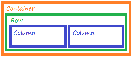
What is happening is that you are doing the implementation of GRID of bootstrap incorrectly, that is why the scroll in the x-axis. The system of GRID of Bootstrap uses a series of containers, rows and columns for layout and content alignment.
Summary of how the GRID of bootstrap:
- The
.container provides a way to center and horizontally fill the content of your site. Use .container for a responsive pixel width or .container-fluid for all sizes of display device and port.
- To
.row(lines) are casings for .col(columns). Each .col has a horizontal padding (called medianiz) to control the space between them. This is then neutralized in the .row with negative margins. Thus, the entire content of .col are aligned visually on the left side.
- In a grid layout, content should be placed within
.col and only .col may be immediate children of .row.
Illustrative Figure
Soon knowing this, in its code it remains to add the .container or .container-fluid, and correct several .col, where you inserted one into the other, so to correct this do the following:
<section class="quemsomos">
        <div class="container-fluid">
            <div class="row">
                <div class="col-md-4">
                    <div class="square1"></div>
                    <div class="square2"></div>
                </div>
                <div class="col-md-8">
                    <div class="container-fluid">
                        <div class="row">
                            <div class="col-md-12">
                                <h4 class="t-quemsomos"><span class="q">Q</span>UEM SOMOS</h4>
                            </div>
                            <div class="col-md-6">
                                <p class="p-quemsomos text-justify">
                                    Lorem ipsum dolor sit amet, consectetur adipisicing elit. Hic
                                    aspernatur eius enim, officia illo nemo doloremque, accusamus, harum minima labore odit
                                    necessitatibus blanditiis. Hic, nihil. Temporibus dicta tempore molestiae voluptatem.
                                </p>
                            </div>
                            <div class="col-md-6">
                                <a href="#" class="btn btn-primary btn-about">SAIBA MAIS</a>
                            </div>
                        </div>
                    </div>
                </div>
            </div>
        </div>
    </section>
Note
I suggest you read more about the GRID OF boostrap to better understand, because your code is structured wrong and since you have not informed in detail what you are trying to do, I cannot help you with this.

Dude if you got it with the help of some answer consider mark it as accepted, so it is not pending if answer accepted even having already been solved
– hugocsl