0
I’m trying to build a grid using the bootstrap doc but it’s very confusing!
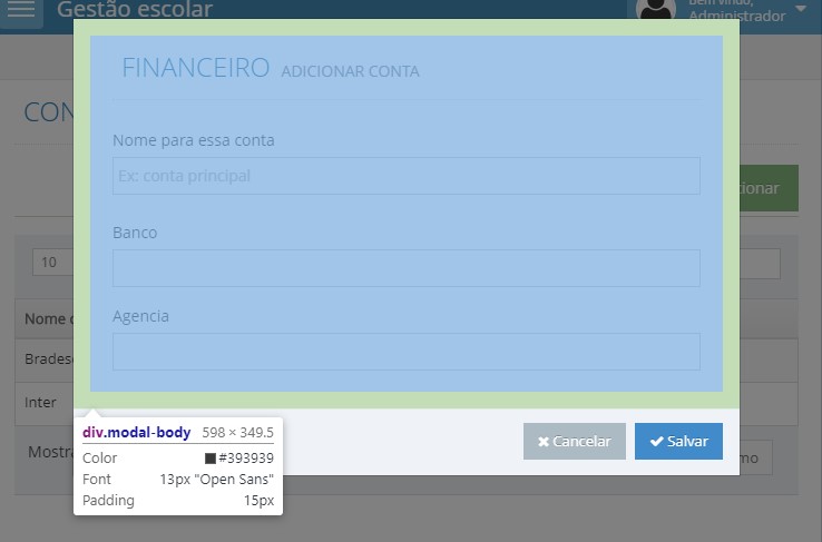
The maximum width of the iframe that loads the Forms is 868px.
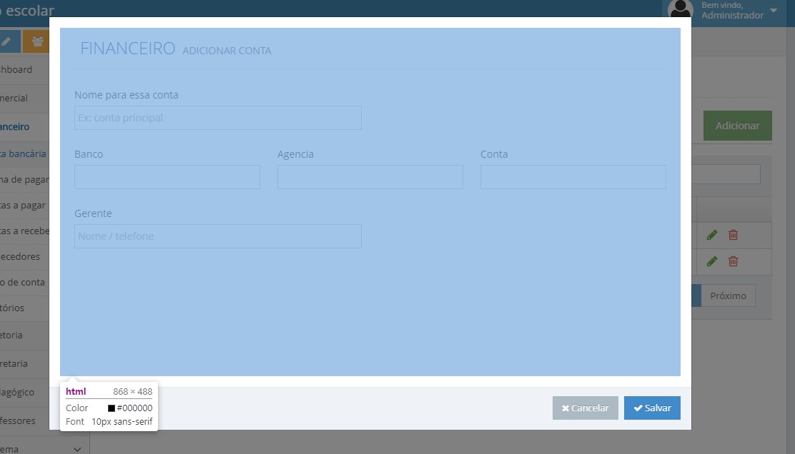
This is a simulation opening on the tablet standing and would like to change the shape of the fields.
Only in cell phones stay the full form.
I would like this visualization of the tablet:
1º Row) Name, leave imput at size 6 (half screen).
2º Row) Bank, Agency and Account, separate them in size 4, to be in the same view as the first image.
I’m trying to do this, but I’m already tied in the brain!
<form method="post" autocomplete="off">
  <div class="row">
    <div class="col-sm-6 col-md-6">
      <div class="form-group">
        <label class="control-label">Nome para essa conta</label>
        <input name="nome" type="text" class="form-control" id="" value="" placeholder="Ex: conta principal" required/>
      </div>
    </div>
  </div>

  <div class="space-4"></div>

  <div class="row">
    <div class="col-md-4 col-sm-4">
      <div class="form-group">
        <label class="control-label">Banco</label>
        <input name="banco" type="text" class="form-control" id="" value="" required/>
      </div>
    </div>

    <div class="col-md-4 col-sm-4">
      <div class="form-group">
        <label class="control-label">Agencia</label>
        <input name="agencia" type="text" class="form-control" id="" value="" required/>
      </div>
    </div>

    <div class="col-md-4 col-sm-4">
      <div class="form-group">
        <label class="control-label">Conta</label>
        <input name="conta" type="text" class="form-control" id="" value="" required/>
      </div>
    </div>
  </div>

  <div class="space-4"></div>

  <div class="row">
    <div class="col-sm-6 col-md-6">
      <div class="form-group">
        <label class="control-label">Gerente</label>
        <input name="gerente" type="text" class="form-control" id="" value="" placeholder="Nome / telefone" />
      </div>
    </div>
  </div>

  <div class="space-4"></div>


</form>
The problem is that I’m working on an admin template, and his bootstrap stops which is the old one. I saw his example, the size for mobile he still divides into 3 columns.
– Tiago
Where you got that col-Md doesn’t exist in bs4?
– hugocsl
@Tiago as you said you wanted it to be like in the first image I thought it was to divide it into 4 "Bank, Agency and Account, separate them in size 4, to be in the same view of the first image."
– Edson Filho
But he exists in 3 and 4
– hugocsl
@Edsonfilt feathers stay in a row when it is cellular, even the mobile lying down.
– Tiago
@hugocsl I who understood your question erroneously...
– Tiago
@James fixed the PEN, check there on the same link, I used col-12 for small devices as the mobile lying or standing and col-Md-4 for tablets, I’m not on the phone, see if help.
– Edson Filho
@hugocsl https://stackoverflow.com/a/41795300/2848612, in the documentation also: https://getbootstrap.com/docs/4.0/migration/ in GRID SYSTEM informs. that the XS, is why I changed the words! SM and MD continue.
– Edson Filho
@Edsonfilho As my version is 3.3.6 I did not work out. See https://codepen.io/edsonfilho10/pen/BgQxXN?editors=1010
– Tiago