0
I am developing a page where I needed to do a type of "Steps", I chose to follow with the cols of the bootstrap and with css Nth Child Odd and Even set the margins and those dotted lines next.
The problem is precisely in them. I tried to position in different ways but it is practically impossible to leave responsive (from Md up) using it in a before. The text inside the boxes may vary.
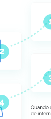
It would work if I set the absolute positions for each box in all the required breakpoints. But it’s a lot of work and it’s not dynamic.
Has anyone ever seen something like this in css or knows a lib that does something like this?
See the snippet on the whole page, I’m not using it in sm.
.medicine__section_howitworks {
  position: relative;
  padding-top: 127px;
  padding-bottom: 127px;
}
.medicine__section_howitworks:before {
  content: '';
  top: 0px;
  background-image: url('https://i.imgur.com/eZWa9Dh.png');
  background-position: center left;
  background-repeat: no-repeat;
  position: absolute;
  left: 0px;
  width: 100%;
  height: 100%;
}
.medicine__section_howitworks__title {
  font-weight: 900;
  font-size: 40px;
  line-height: 47px;
  text-align: center;
}
.medicine__section_howitworks__title b {
  color: #00d6c0;
}
.medicine__section_howitworks__box {
  background: #fff;
  border: 1px solid rgba(0, 0, 0, 0.03);
  box-sizing: border-box;
  box-shadow: 0px 10px 30px rgba(0, 162, 162, 0.08);
  border-radius: 10px;
  padding: 20px 40px;
}
.medicine__section_howitworks__box p {
  margin-bottom: 0px;
}
.medicine__section_howitworks__box p b {
  color: #00d6c0;
}
.medicine__section_howitworks .oddeven {
  margin-bottom: 40px;
}
@media (min-width: 992px) {
.medicine__section_howitworks .oddeven:nth-child(odd) {
  margin-top: -70px;
  position: relative;
}
.medicine__section_howitworks .oddeven:nth-child(odd)::before {
  content: '';
  position: absolute;
  width: 100%;
  height: 100%;
  right: -50px;
  bottom: 60px;
  background-image: url('https://i.imgur.com/eLhfY8h.png');
  background-repeat: no-repeat;
  background-position: center right;
}
}
<link href="https://stackpath.bootstrapcdn.com/bootstrap/4.3.1/css/bootstrap.min.css" rel="stylesheet" />
<div class="medicine__section_howitworks">
<div class="container">
<div class="row">
<div class="col-md-6">
<div class="medicine__section_howitworks__title">
Veja como <b>funciona</b>:
</div>
</div>
<div class="col-md-6 oddeven">
<div class="medicine__section_howitworks__box">
<div class="row align-items-center">
<div class="col-3">
<img src="https://i.imgur.com/lGK7Bst.png">
</div>
<div class="col-9">
<p>Basta baixar o aplicativo g-----</p>
</div>
</div>
</div>
</div>
<div class="col-md-6 oddeven">
<div class="medicine__section_howitworks__box">
<div class="row align-items-center">
<div class="col-9 text-right">
<p>Preencher um breve cadastro sobre sua saúde</p>
</div>
<div class="col-3">
<img src="https://i.imgur.com/lGK7Bst.png">
</div>
</div>
</div>
</div>
<div class="col-md-6 oddeven">
<div class="medicine__section_howitworks__box">
<div class="row align-items-center">
<div class="col-3">
<img src="https://i.imgur.com/lGK7Bst.png">
</div>
<div class="col-9">
<p>Acionar o Botão Médico no aplicativo g-----</p>
</div>
</div>
</div>
</div>
<div class="col-md-6 oddeven">
<div class="medicine__section_howitworks__box">
<div class="row align-items-center">
<div class="col-9 text-right">
<p>E pronto! Você será conectado rapidamente a um excelente médico, <b>altamente qualificado</b> para o atendimento</p>
</div>
<div class="col-3">
<img src="https://i.imgur.com/lGK7Bst.png">
</div>
</div>
</div>
</div>
</div>
</div>
</div>
You said you’re not using in Mobile, but is it to be responsive in Mobile? Got a little confused, comes has an image of how you want on large screens and how would like on small screens?
– hugocsl
Yes, breakpoint I’m not wearing but Md up yes.
– Taylor Roos
Add the line backwards, I increased the size of the boxes, decreases the width of the lines, did not become dynamic but worked until finding a better solution.
– Taylor Roos