Insert a background inside a triangle in the corner of a div

Asked

Viewed 76 times

5

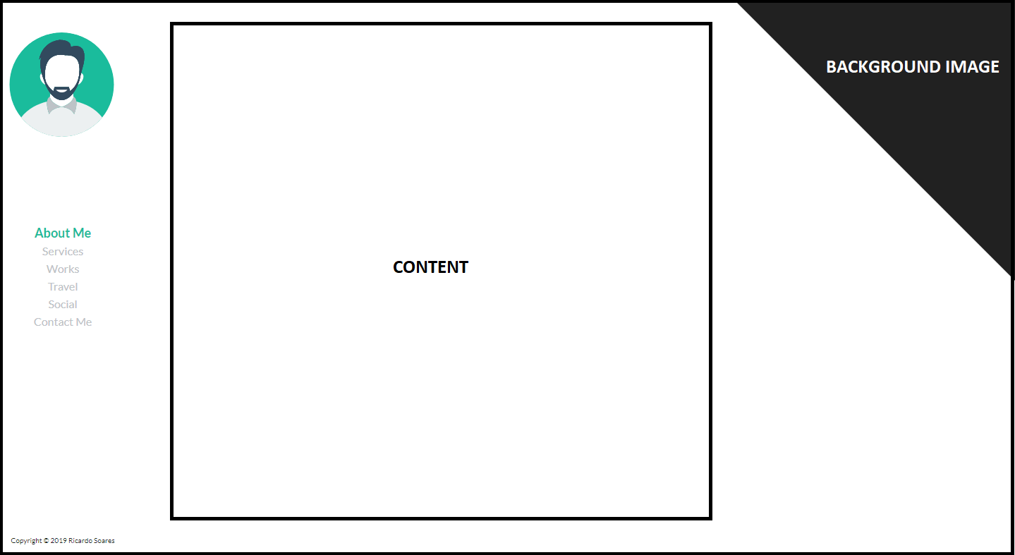
I’m developing an angle portfolio, but I have a question about SCSS. I was interested in creating something that I don’t usually see much in portfolios, insert the portfolio background only in the upper or lower corner of the main div, that is, I leave an example in a print below.

Exemplo da dúvida

In my HTML I have the following code:

<div class="background"></div>
<div class="ui grid content-main">
  <div class="two wide column">
    <div class="menu">
      <div class="menuAvatar">
        <img class="ui small circular image avatar" src="./assets/icons/avatar.svg">
      </div>
      <div class="ui list menuNavigation">
        <div class="item" [routerLink]="['/about-me']" routerLinkActive="item-active">About Me</div>
        <div class="item" [routerLink]="['/services']" routerLinkActive="item-active">Services</div>
        <div class="item" [routerLink]="['/works']" routerLinkActive="item-active">Works</div>
        <div class="item" [routerLink]="['/travel']" routerLinkActive="item-active">Travel</div>
        <div class="item" [routerLink]="['/social']" routerLinkActive="item-active">Social</div>
        <div class="item" [routerLink]="['/contact-me']" routerLinkActive="item-active">Contact Me</div>
      </div>
      <div class="menuCopyRights">
        <p>Copyright © 2019 Ricardo Soares</p>
      </div>
    </div>
  </div>
  <div class="fourteen wide column content-pages">
    <router-outlet></router-outlet>    
  </div>
</div>

The first div is my background with an Absolute position with width 100% and height 100% with a z-index at 0 and then I have my content. In terms of SCSS I was/am doing as follows:

.background{
    position: absolute;
    width: 100%;
    height: 100%;
    background-image: url('https://viagensasolta.com/wp-content/uploads/2018/12/Funchal_Cable_Car_Madeira.jpg');
    background-size: cover;
    background-repeat: no-repeat;
    background-position: center center;
    filter: brightness(75%);
    z-index: -1;
}

.content-main{
    height: 100%;
    margin: 0;
    background-color: white;
    position: relative;

    &:after {
        content: "";
        position: absolute;
        border-left: 400px solid transparent; 
        border-top: 400px solid transparent;
        top: 0px;
        right:0px;
    }  
}

Where will I be failing here so that this is not working, because the triangle turns white, I can’t come to any conclusion.

2 answers

6


There are several ways to do this and the simplest and most crossbrowser to my mind is to put two backgrounds in a div, the first bg of the background is the image, and over it I have a linear-gradiente in 45deg covering only 50% of the image with the same background color.

html, body {
	width: 100%;
	height: 100%;
	margin: 0;
	padding: 0;
}

.box {
	position: absolute;
	top: 0;
	right: 0;
	width: 160px;
	height: 160px;
	background: 
	linear-gradient(to top right, #fff 50%, transparent 50%),
	url(https://unsplash.it/160/160);
	background-repeat: no-repeat;
	background-size: cover;
}
<div class="box"></div>


Option 2

Making a mask-image with a linear-gradiente that will create a mask of opacity in the image. So vc will give transparency in the image and not put a solid color gradient over the image. You can read more about this technique here Make edge effects in CSS such as chamfer

html, body {
  width: 100%;
  height: 100%;
  margin: 0;
  padding: 0;
}
body {
  background-image: linear-gradient(-45deg, #f00 0%, #000 100%);
}
.box {
  position: absolute;
  top: 0;
  right: 0;
  width: 160px;
  height: 160px;
  background: url(https://unsplash.it/160/160);
  background-repeat: no-repeat;
  background-size: cover;
  -webkit-mask-image: linear-gradient(-135deg, #000000 50%, transparent 50%);
}
<div class="box"></div>

  • Thank you this worked well!

  • @Ricardosoares cool that helped there! []s

2

You can use the property clip-path to display only a part of the ::after. In the example below I cut out the ::after of the element in the form of a triangle with 3 coordinates. The coordinates are responsive to the dimensions of the ::after using the value in percentage (%), so you can scale the ::after the size you want. See the example:

.background{
    position: absolute;
    width: 100%;
    height: 100%;
    background-image: url('https://viagensasolta.com/wp-content/uploads/2018/12/Funchal_Cable_Car_Madeira.jpg');
    background-size: cover;
    background-repeat: no-repeat;
    background-position: center center;
    filter: brightness(75%);
    z-index: -1;
}

.content-main{
    height: 100%;
    margin: 0;
    background-color: white;
    position: relative;
}
.content-main::after {
        content: "";
        position: absolute;
        width: 200px;
        height: 200px;
        background-image: url(https://www.cleverfiles.com/howto/wp-content/uploads/2016/08/mini.jpg);
        clip-path: polygon(0% 0%, 100% 0%, 100% 100%);
        top: 0px;
        right:0px;
}
<div class="background"></div>
<div class="ui grid content-main">
  <div class="two wide column">
    <div class="menu">
      <div class="menuAvatar">
        <img class="ui small circular image avatar" src="./assets/icons/avatar.svg">
      </div>
      <div class="ui list menuNavigation">
        <div class="item" [routerLink]="['/about-me']" routerLinkActive="item-active">About Me</div>
        <div class="item" [routerLink]="['/services']" routerLinkActive="item-active">Services</div>
        <div class="item" [routerLink]="['/works']" routerLinkActive="item-active">Works</div>
        <div class="item" [routerLink]="['/travel']" routerLinkActive="item-active">Travel</div>
        <div class="item" [routerLink]="['/social']" routerLinkActive="item-active">Social</div>
        <div class="item" [routerLink]="['/contact-me']" routerLinkActive="item-active">Contact Me</div>
      </div>
      <div class="menuCopyRights">
        <p>Copyright © 2019 Ricardo Soares</p>
      </div>
    </div>
  </div>
  <div class="fourteen wide column content-pages">
    <router-outlet></router-outlet>    
  </div>
</div>

Browser other questions tagged

You are not signed in. Login or sign up in order to post.