0
I have a page where I created a modal with some text boxes inside, nothing very elaborate. When I change the screen resolution to very low resolutions like 800x600 my modal deforms a lot, it gets very narrow (I put it wide) and the items inside it come out of position as well. How can I treat it so that it does not deform so much? I understand that it is a question of resposivity.
I configured the modal itself in this way:
      #Mod-gravar{ /*botão que chama a modal */
        background-color:#C25C40;
        border-color:white;
        position:absolute;
        left:120px;
        top:05px;
        height:40px;
        border-radius:8px;
        color:white;

    }

    #Mod-gravar:focus{
        background-color:#262626
    }

    #Mod-gravar:hover{
        background-color:#262626
    }


    input[id=cgc]{
    position:absolute;
    width:160px;
    height:auto;
    border:2px solid #aaa;
    border-radius:8px;
    margin:8px 0;
    outline:none;
    padding:8px;
    box-sizing:border-box;
    transition:.3s;
    top: 140px;
    left: 280px;
    }

    input[id=cgc]:focus{
    border-color:#C25C40;
    box-shadow:0 0 8px 0 #C25C40;
    }

    input[id=cliente]{
    position:absolute;
    width:240px;
    height:auto;
    border:2px solid #aaa;
    border-radius:8px;
    margin:8px 0;
    outline:none;
    padding:8px;
    box-sizing:border-box;
    transition:.3s;
    top: 140px;
    left: 30px;
    }

    input[id=cliente]:focus{
    border-color:#C25C40;
    box-shadow:0 0 8px 0 #C25C40;
    }


    input[id=razao]{
    position:absolute;
    width:240px;
    height:auto;
    border:2px solid #aaa;
    border-radius:8px;
    margin:8px 0;
    outline:none;
    padding:8px;
    box-sizing:border-box;
    transition:.3s;
    top: 90px;
    left: 30px;
    }

    input[id=razao]:focus{
    border-color:#C25C40;
    box-shadow:0 0 8px 0 #C25C40;
    }

    button[id=modalcadastrar]{
        width:120px;
        height:auto;
        top:605px;
        right: 140px;
        position:absolute;
    -webkit-user-select: none;
  user-select: none;


    }

    button[id=modalfecharcad]{
        width:120px;
        height:auto;
        top:605px;
        position:absolute;

        -webkit-user-select: none;
  user-select: none;


    }

    #modaldialog2{
        border:2px solid #C25C40;
        border-radius:8px;
        background-color:#C25C40;
        width:auto;
        min-height:650px;
        margin:auto;
            z-index:110;


    }
HTML
   <div id="Modal-gravar" class="modal fade" role="dialog">
  <div class="modal-dialog modal-lg" id="modaldialog2">

    <!-- Modal content-->
    <div class="modal-content">
      <div class="modal-header" style="background-color:#C25C40; color:white;  border-bottom: 0 none; height:45px;">
       <!-- <h5 class="modal-title" style="top:10px;position:absolute;">Criar novo cliente</h5> -->
         <h5 style="top:5px;position:absolute;font: 19px ;"><i class="fas fa-address-card">  Criar novo cliente</i></h5>
    </div>

    <!-- abas -->

    <div class="modal-body" style="background-color:#262626;">
    <div class="tab">
  <button class="tablinks active" onclick="openTab(event,'aba1')"><i class="far fa-id-badge">  Cadastro Básico</i></button>
  <button class="tablinks" onclick="openTab(event,'aba2')">Indice Fiscal</button>
  <button class="tablinks" onclick="openTab(event,'aba3')">Tabela de Preço</button>
  <button class="tablinks" onclick="openTab(event,'aba4')">Fabricantes</button>
  <button class="tablinks" onclick="openTab(event,'aba5')">Fabricantes</button>
  <button class="tablinks" onclick="openTab(event,'aba6')">Fabricantes</button>
  <button class="tablinks" onclick="openTab(event,'aba7')">Fabricantes</button>
  <button class="tablinks" onclick="openTab(event,'aba8')">Fabricantes</button>


</div>

<div id="aba1" class="tabcontent" style="display:block;">
  <input type="text" placeholder="Razão" id="razao">
    <input type="text" placeholder="Cliente" id="cliente">
    <input type="text" placeholder="CPF/CNPJ" id="cgc">
</div>

<div id="aba2" class="tabcontent">
  <h3 style="position: absolute; left:130px;">Aba 2</h3>
  <p style="position: absolute; left:130px; top:50px;">Conteudo aba 2</p>
</div>

<div id="aba3" class="tabcontent">
  <h3 style="position: absolute; left:130px;">Aba 3</h3>
  <p style="position: absolute; left:130px; top:50px;">preço</p>
</div>

<div id="aba4" class="tabcontent">
  <h3 style="position: absolute; left:130px;">Aba 4</h3>
  <p style="position: absolute; left:130px; top:50px;">teste</p>
</div>

<div id="aba5" class="tabcontent">
  <h3 style="position: absolute; left:130px;">Aba 5</h3>
  <p style="position: absolute; left:130px; top:50px;">teste</p>
</div>

    <div id="aba6" class="tabcontent">
  <h3 style="position: absolute; left:130px;">Aba 6</h3>
  <p style="position: absolute; left:130px; top:50px;">teste</p>
</div>

        <div id="aba7" class="tabcontent">
  <h3 style="position: absolute; left:130px;">Aba 7</h3>
  <p style="position: absolute; left:130px; top:50px;">teste</p>
</div>

        <div id="aba8" class="tabcontent">
  <h3 style="position: absolute; left:130px;">Aba 8</h3>
  <p style="position: absolute; left:130px; top:50px;">teste</p>
</div>

        </div>


      <div class="modal-footer" style="height:570px; background-color:#262626;border-top: 0 none;">

        <button type="button" name="save" id="modalcadastrar"  class="row btn btn-success" data-dismiss="modal" data-backdrop="static" data-keyboard="false">Criar</button>

        <button type="button" class="btn btn-danger" data-dismiss="modal" id="modalfecharcad" >Voltar</button>

        </div>
    </div>

  </div>
</div>
Javascript for the tabs:
function openTab(evt, aba) {

    var i, tabcontent, tablinks;

    tabcontent = document.getElementsByClassName("tabcontent");
    for (i = 0; i < tabcontent.length; i++) {
        tabcontent[i].style.display = "none";
    }

    tablinks = document.getElementsByClassName("tablinks");
    for (i = 0; i < tablinks.length; i++) {
        tablinks[i].className = tablinks[i].className.replace(" active", "");
    }

    document.getElementById(aba).style.display = "block";
    evt.currentTarget.className += " active";
}
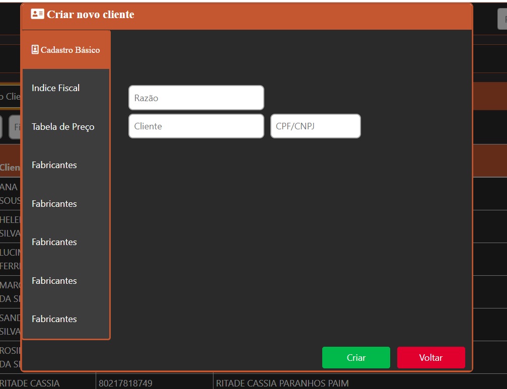
This is how I want to leave it, and how it stays in most resolutions:
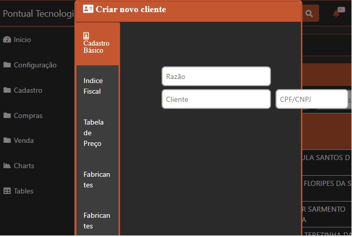
This is how it looks in low resolutions:
It is not the solution to your problem, but the value
autoinmin-widthseems to me incorrect, because if you want a minimum width for the element, it cannot beauto. It should be a value in px, %, 'em' or 'rem', I believe.– Sam
Another thing is that without a [mcve] there is no way to find an answer to the problem.
– Sam
This auto at width prevented the modal from changing its width every time the screen resolution changed, except for the resolution I set.
– Gabriel Midão
Friend put the full HTML CSS there, edit the question and include the rest of the code so we can try to simulate your problem... just with this piece of code can’t help you much...
– hugocsl
@Sam Sorry if I didn’t post more things to make it easier, what else should I put? The modal html? My problem is specifically in modal, so I think css is only in this key but I can post all css if necessary.
– Gabriel Midão
I put the html and css of the modal, sorry again for the kkk job
– Gabriel Midão
Okay, but what are the items inside that you say are going out of position? You put an empty modal.
– Sam
The text boxes (cgc, client and reason). This happens when I decrease the screen resolution, or zoom in, because the modal itself does not keep the size.
– Gabriel Midão
This is normal https://imgur.com/qhjMiMI
– hugocsl
If the complete modal HTML has no help, because it is not known how you are arranging the elements within it.
– Sam
I put prints to try to show better.
– Gabriel Midão
@Sam The only part I didn’t put in the html of the modal was that of this menu tabs but even without it I have this problem. Otherwise I put everything related to modal.
– Gabriel Midão
Missed to put the form.
– Sam
Are you using Bootstrap? If yes which version?
– hugocsl
How so form?
– Gabriel Midão
@hugocsl version 4.1.3
– Gabriel Midão
Don’t have a form inside the modal? The code you posted has nothing inside the modal.
– Sam
By form you mean the text boxes I put inside the modal? I’m still beginner, forgive the confusion
– Gabriel Midão
I edited the complete HTML with the tabs.
– Gabriel Midão