Help with positioning Divs when you arrive at a certain media query

Asked

Viewed 66 times

1

Good evening to you... I’m doing a simple test here to start a project, only I’m not getting the Divs positioning the way I want it. I wonder if anyone has ever done something like this and if you could help me.

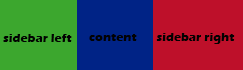
have to have two sidebar and one content in between (all are Divs) as shown in the figure below.

inserir a descrição da imagem aqui

I would like when you get to a certain media query (@media) it to be in this format:

inserir a descrição da imagem aqui

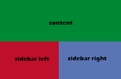
The colors gave a messy rsrs but you can understand, I need the sidebar to go down.

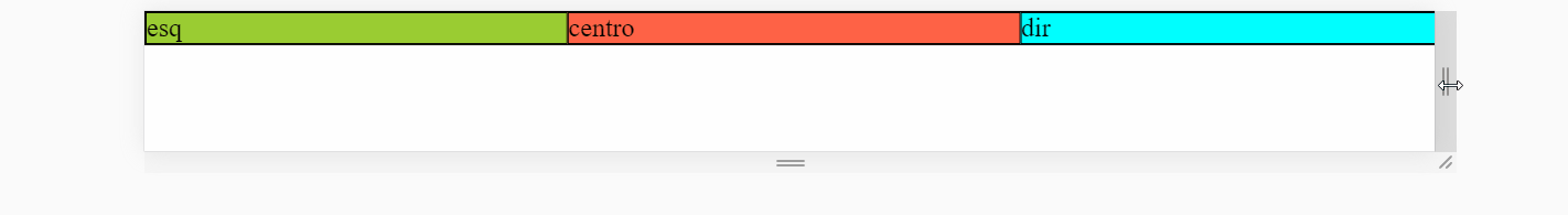
I don’t have code yet, I’m just at the beginning. The only test I did as a position, only it didn’t get very good.

If anyone can help, thank you.

1 answer

2

With Display:Flex

There is a simple solution to this using a container flex to place the divs with flex-grow:1 to be divided equally. Thereafter, in the div downtown, when you arrive at the @media that you define, you put the flex-basis from it to 100% and order for -1 so she "jump" to the first position occupying the entire line, and leaving the other divs on the low tb line divided equally.

inserir a descrição da imagem aqui

Follow the image code above. Display all over the screen to see the grid changing :)

.centro {background: tomato;}
.esq {background: yellowgreen;}
.dir {background: aqua;}

.container {
	display: flex;
	flex-wrap: wrap;
}
.container > div{
	flex-grow: 1;
}

@media (max-width: 768px)  {
	.container .centro {
		order: -1;
		flex-basis: 100%;
	}
}
<div class="container">
	<div class="esq">esq</div>
	<div class="centro">centro</div>
	<div class="dir">dir</div>
</div>

Read more about flex in this documentation https://developer.mozilla.org/en-US/docs/Web/CSS/flex


With Display:Grid

Using display:grid It is very quiet to do, you can use the property grid-area and grid-template-areas to "name" each div and define how they will dispose on face @media. Then the template would look like below so you have an idea...

grid-template-areas:      "esq centro dir";

@media 768px  {

    grid-template-areas: "centro centro" "esq dir";

}

Follow the full code:

.centro {
    background: tomato;
    grid-area: centro;
}
.esq {
    background: yellowgreen;
    grid-area: esq;
}
.dir {
    background: aqua;
    grid-area: dir;
}

.container {
	display: grid;
    grid-template-areas: "esq centro dir";
}


@media (max-width: 768px)  {
    .container {
        grid-template-areas: 
          "centro centro" 
          "esq dir";
    }
}

</style>
</head>
<body>
    
<div class="container">
    <div class="esq">esq</div>
	<div class="centro">centro</div>
	<div class="dir">dir</div>
</div>

Browser other questions tagged

You are not signed in. Login or sign up in order to post.