-1
I have a section that in mobile instead of falling down this overlapping the whole div.
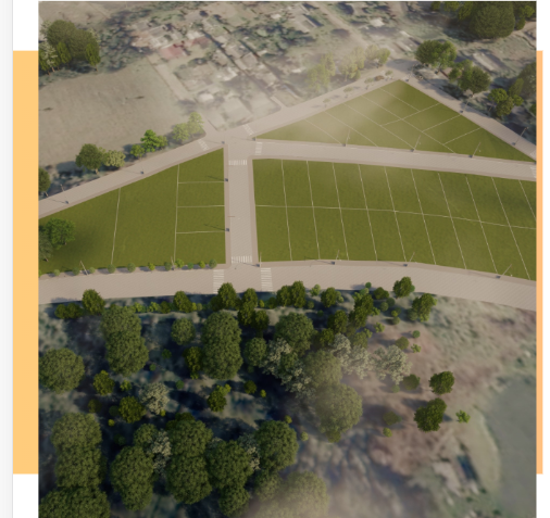
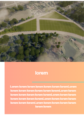
It’s supposed to look like this, but the image is getting over everything in mobile.
HTML
  <section class="second-section">
<div class="container">
  <div class="row align-items-center box-orange">
    <div class="col-md-6">
      <img class="w-100" src="img/campos.png">
    </div>
    <div class="col-md-6 ml-5 ml-md-0 text-center">
      <h3>lorem lorem lorem lorem lorem <div class="line"></div>
      </h3>
      <p>Lorem ipsum dolor sit amet consectetur adipisicing elit. Eveniet, esse dolore. Ex voluptatibus ipsum, perferendis alias at necessitatibus minima, sequi facilis odio illum nostrum provident expedita eaque modi animi quasi.
      </p>
    </div>
  </div>
</div>
CSS
.second-section{
.box-orange{
background-image:url('/img/fundo2.png');
height: 400px;
color: white;
margin-top: 10%;
margin-bottom: 10%;
img{
  height: 550px;
  margin-top: -10%;
  margin-left: 2%;
  object-fit: cover;
}
h3{
  font-size: 2.5em;
  margin-bottom: 5%;
  .line{
    width: 80%;
    border: 3px solid #77D3C2;
    position: absolute;
    left: 33%;
    top: 100%;
  }
}

p{
  font-size: 1.4em;
  padding: 0% 10%;
  }
 }
}
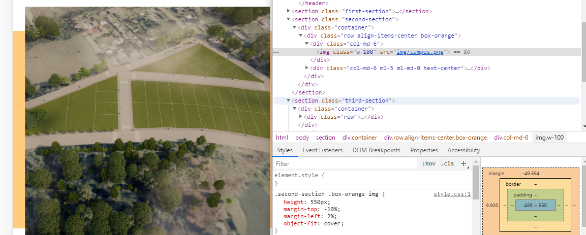
In inspecting element does not show the reason it is on top, is getting the same from CSS
Edit 1
After placing a media rule setting the img to auto she got like this.

In inspecting element it looks like height:auto;
When you say "mobile", you refer to devices that are not correct tablets?
– user148754
I’m not finding this mistake for nothing :(
– Guilherme Rigotti
@THIAGODEBONIS width: -728px
– Guilherme Rigotti
@Sam edited the question with the inspect element, but there seems to be nothing wrong.
– Guilherme Rigotti
@Sam is SCSS, I forgot to mention.
– Guilherme Rigotti
This is because the image has a fixed height of 550px. Place at the end of your CSS a @media Rule:
@media screen and (max-width: 767px){
 .second-section img{
 height: auto;
 }
}
– Sam
@Sam sees the Dit.
– Guilherme Rigotti
So. There you adjust the properties (height, margins etc) as you want in @media.
– Sam
But I tried to put a min-width: 100%; on . box-Orange, but it didn’t change.
– Guilherme Rigotti