Basically it is due to the accessibility and control of the layout of the design system.
Using measurements in REM / EM if the user changes the size of the font root it will have a homogeneous increase of all text on the screen. In most browser the value of the default font-size is 16px, equivalent to 1rem. So taking all relative measures, if you change the value of font root vc changes the entire typeface scale of the page. But keeping the typeface relation defined. As well as margin and paddings which tb are based on rem/em.
It is noteworthy that REM and EM are not the same thing, while REM is related to font-size of :root, the EM is related to font-size declared in the element (obviously if you do not declare anything it takes as a reference the 16px root), for example, if you declare the element with font-size of 20px and the margin with 0.5em, those 0.5 as corresponding to 10px. You can read more about it here: Why it is recommended to use the "em" unit instead of "px" for fonts?
So this is a way to maintain the typographic consistency of the design system, if the user has vision problem and configure a larger font for the browser, Bootstrap will adapt not to break the layout and maintain the "harmony" of the layout.
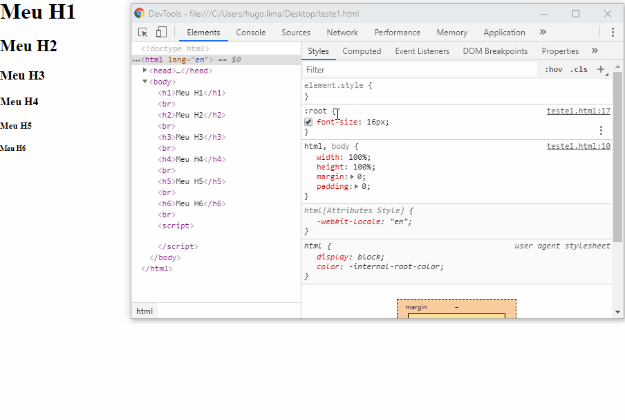
Here’s a practical example of what I mean. This is the default hierarchy of headers of user-agent, note that when I change the value of the root font all headers change equally. This is the intention of the sources rem/em, it becomes easier for the designer to control the system, even if the user changes the value of the font root.
Test yourself to understand better :)
Change the value of the root font to see how everything fits and you continue with the hierarchy, you change the font-size on only one selector :root and changes the size of all text in the document.
:root {
	font-size: 16px;
}
h1, h2, h3, h4, h5, h6 {
  margin: 0;
}
h1 {
  font-size: 3rem;
}
h2 {
  font-size: 2.5em;
}
h3 {
  font-size: 2em;
}
h4 {
  font-size: 1.5em;
}
h5 {
  font-size: 1em;
}
h6 {
  font-size: 0.5em;
}
<h1>Meu H1</h1><br>
<h2>Meu H2</h2><br>
<h3>Meu H3</h3><br>
<h4>Meu H4</h4><br>
<h5>Meu H5</h5><br>
<h6>Meu H6</h6><br>
See an example using @media to increase the root font on large screens. See that if vc display the code on "full screen" headers tb will increase. Just changing the value of font-size in the :root, This helps a lot for you to customize your theme and use of Bootstrap.
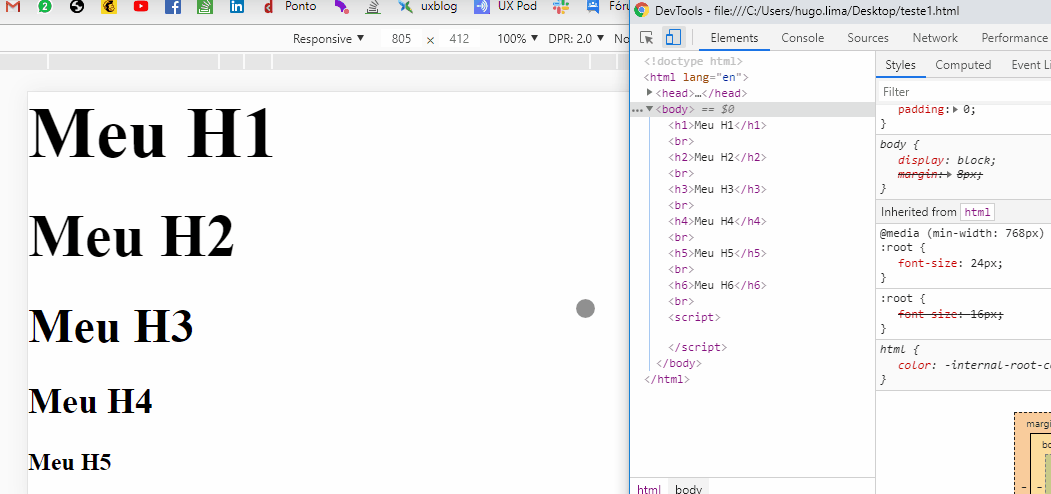
:root {
	font-size: 16px;
}
h1, h2, h3, h4, h5, h6 {
  margin: 0;
}
h1 {
  font-size: 3rem;
}
h2 {
  font-size: 2.5em;
}
h3 {
  font-size: 2em;
}
h4 {
  font-size: 1.5em;
}
h5 {
  font-size: 1em;
}
h6 {
  font-size: 0.5em;
}

@media (min-width: 768px) {
	:root {
		font-size: 24px;
	}
}
<h1>Meu H1</h1><br>
<h2>Meu H2</h2><br>
<h3>Meu H3</h3><br>
<h4>Meu H4</h4><br>
<h5>Meu H5</h5><br>
<h6>Meu H6</h6><br>
Bootstrap 5 + VW and the RFS project
Currently on Bootstrap 4.3 You can already use a more responsive font, because it uses a formula that uses the width of the screen to set the size of the site’s font. In fact it leaves the source responsive until 1200px who is the greatest breakpoint and from there she fixed the size of the source so that it would no longer grow.
RFS project link (Responsive font size) https://github.com/twbs/rfs
@media (max-width: 1200px) {
  .title {
    font-size: calc(1.525rem + 3.3vw); /* repare na medida em vw */
  }
}
Our Biggest new addition to Bootstrap in v4.3 is Responsive font Sizes, a new project in the Bootstrap Github org to automate calculate an appropriate font-size based on the Dimensions of a Visitor’s device or browser viewport.
Translating: "Our biggest new addition to Bootstrap in v4.3 are responsive font sizes, a new project at Bootstrap Github org to automate the calculation of a size of appropriate source based on the device dimensions of a visitor or browser viewport."
You can check the chart to understand better.
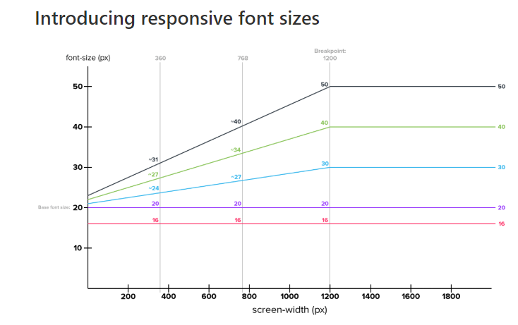
Official documentation: https://getbootstrap.com/docs/4.1/content/typography/#Responsive-typography

Maybe this article will help you understand: When to use REM, EM, and Pixels
– Pedro Roweder
Related: Why it is recommended to use the "em" unit instead of "px" for fonts?
– Woss
Related: What are the differences between the "vw", "em" and "%" font size units?
– Woss