Align a div that contains a text with a div that has a login box

Asked

Viewed 171 times

-1

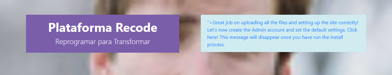
I would like to know how I can align the Divs of the image below:

inserir a descrição da imagem aqui

I’m using bootstrap, and this Templete already came with this login box on the right side. I’m having trouble positioning this other div with the text next to the login. Follow the code:

   <div class="section-banner">
        <div class="text-banner">
            <div class="titulo">
                <h2>Plataforma Recode</h2>
                <h3>Reprogramar para Transformar </h3>
            </div>
        </div>
    <br />
    <br />
    <br />
    <br />
    <br />
    <div class="col-md-5" style="font-color: white;">

    </div>
    <div class="container" >
    <div class="row">
    <div class="col-md-12">
        <?php if($this->settings->info->install) : ?>
          <div class="row">
                        <div class="col-md-12">
                                <div class="alert alert-info"><b><span class="glyphicon glyphicon-warning-sign"></span></b> <a href="<?php echo site_url("install") ?>">Great job on uploading all the files and setting up the site correctly! Let's now create the Admin account and set the default settings. Click here! This message will disappear once you have run the install process.</a></div>
                        </div>
            </div>
        <?php endif; ?>

        <?php echo $content ?>

    </div>
    </div>
    </div>
    <br />
    </div>

css file

.section-banner {
    background: url(../images/bg.png) no-repeat fixed;
    min-height: 480px;
    background-position: center;
    background-repeat: no-repeat;
    background-size: cover;
}

.text-banner {
    width: 500px;
    float: left;
    text-align: center;
    padding: 3% 4%;
    background-color: #7a5eaa;
}

.titulo h2 {
    font-size: 2.5em;
    color: #fff;
    font-weight: 700;
}

.titulo h3 {
    font-size: 1.5em;
    color: #fff;
    font-weight: 300;
}

3 answers

1

The problem is that you are creating a "loose" div, using float:left and outside the Grid bootstrap.

inserir a descrição da imagem aqui

Like you want a div next to the other just put two col-6 and not a col-12 another div "loose" with float.

<!DOCTYPE html>
<html lang="en">
<head>
	<meta charset="utf-8" />
	<title>Page Title</title>
	<meta name="viewport" content="width=device-width, initial-scale=1">
	<link rel="stylesheet" type="text/css" media="screen" href="https://stackpath.bootstrapcdn.com/bootstrap/4.2.1/css/bootstrap.min.css" />
	<link rel="stylesheet" type="text/css" media="screen" href="https://cdnjs.cloudflare.com/ajax/libs/font-awesome/5.8.2/css/all.min.css" />
	<style>
			.section-banner {
				background: url(https://placecage.com/100/100) no-repeat fixed;
				min-height: 480px;
				background-position: center;
				background-repeat: no-repeat;
				background-size: cover;
			}
	
			.text-banner {
				width: 500px;
				float: left;
				text-align: center;
				padding: 3% 4%;
				background-color: #7a5eaa;
			}
	
			.titulo h2 {
				font-size: 2.5em;
				color: #fff;
				font-weight: 700;
			}
	
			.titulo h3 {
				font-size: 1.5em;
				color: #fff;
				font-weight: 300;
			}
		</style>
	</head>
	
	<body>
	
	
		<div class="section-banner">
	
			<div class="container">
				<div class="row">
					<div class="col-md-12">
						<!-- <?php if($this->settings->info->install) : ?> -->
						<div class="row mt-5">
							<div class="col-md-6">
								<div class="text-banner">
									<div class="titulo">
										<h2>Plataforma Recode</h2>
										<h3>Reprogramar para Transformar </h3>
									</div>
								</div>
							</div>
							<div class="col-md-6">
								<div class="alert alert-info"><b><span class="glyphicon glyphicon-warning-sign"></span></b>
									<a href="<?php echo site_url("install") ?>">Great job on uploading all the files and
										setting up the site correctly! Let's now create the Admin account and set the
										default settings. Click here! This message will disappear once you have run the
										install process.</a></div>
							</div>
						</div>
						<!-- <?php endif; ?>
			
					<?php echo $content ?>
			 -->
					</div>
				</div>
			</div>
			<br />
		</div>
	
	
	<script src="https://code.jquery.com/jquery-3.2.1.min.js"></script>
	<script src="https://cdnjs.cloudflare.com/ajax/libs/popper.js/1.12.9/umd/popper.min.js"></script>
	<script src="https://stackpath.bootstrapcdn.com/bootstrap/4.2.1/js/bootstrap.min.js"></script>
</body>
</html>

0

". text-banner" would be the one you want to align right ? If it is, it changes the property from "float: left;" to "float: right;". But if you want to align the two equally, you can place the 2 Divs in a parent DIV and align using flex-box.

  • Yes, it is the "text-banner" I want it to be on the left, and the login on the right. The two Divs are in a parent div, the so-called "Section-banner". Only I’m not getting to align the two

  • Got it, I’ll put another answer then.

0

I made an example for you using the bootstrap showing how you can leave your template.

HTML:

<!DOCTYPE html>
<html lang="en">
<head>
    <meta charset="UTF-8">
    <title>Teste alinhamento</title>
    <link rel="stylesheet" href="estilo.css">
    <link href="https://stackpath.bootstrapcdn.com/bootstrap/4.3.1/css/bootstrap.min.css" rel="stylesheet" integrity="sha384-ggOyR0iXCbMQv3Xipma34MD+dH/1fQ784/j6cY/iJTQUOhcWr7x9JvoRxT2MZw1T" crossorigin="anonymous">
    <script src="https://stackpath.bootstrapcdn.com/bootstrap/4.3.1/js/bootstrap.min.js" integrity="sha384-JjSmVgyd0p3pXB1rRibZUAYoIIy6OrQ6VrjIEaFf/nJGzIxFDsf4x0xIM+B07jRM" crossorigin="anonymous"></script>
</head>
<body>
<div class="section-banner col-lg-12">

    <div class="container">
        <div class="row justify-content-end">
            <div class="text-banner col-lg-6">
                <div class="titulo">
                    <h2>Plataforma Recode</h2>
                    <h3>Reprogramar para Transformar </h3>
                </div>
            </div>
            <div class="w-100"></div>
            <div class="col-lg-6 login">
               LOGIN
            </div>
        </div>
    </div>
    <br />
</div>
</body>
</html>

CSS:

.section-banner {
    background: black;
    min-height: 480px;
    background-position: center;
    background-repeat: no-repeat;
    background-size: cover;
}

.text-banner {
    width: 500px;
    text-align: center;
    padding: 3% 4%;
    background-color: #7a5eaa;
}

.login{
    color: black;
    background: white;
    width: 500px;
    text-align: center;
}

.titulo h2 {
    font-size: 2.5em;
    color: #fff;
    font-weight: 700;
}

.titulo h3 {
    font-size: 1.5em;
    color: #fff;
    font-weight: 300;
}

I did not move much in the size of the elements, just did in focus of aligning the two elements to the right. You can use the property "Justify-content-end" (which is a very similar term to the one used in the flex-box), the parent DIV of the elements, and between the child elements Oce can use the property "div class="w-100">

Link: https://getbootstrap.com.br/docs/4.1/getting-started/introduction/

Browser other questions tagged

You are not signed in. Login or sign up in order to post.