Col-Md-6 falling down instead of standing on the side

Asked

Viewed 185 times

1

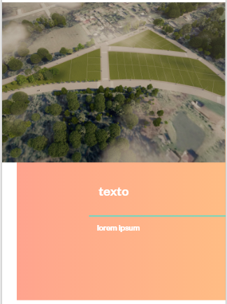
I need to make a section as in the image. Como é para ficar

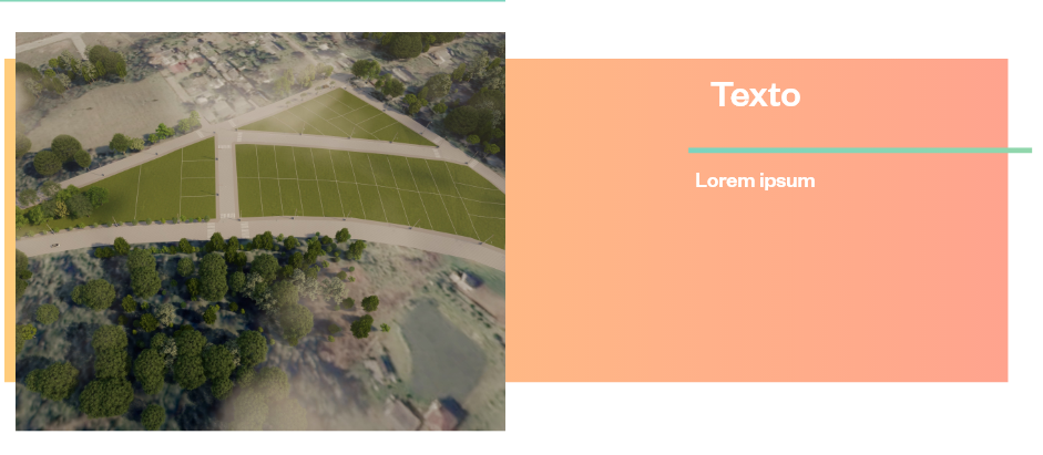
That’s why I organized it this way.

HTML

 <section class="second-section">
  <div class="container">
    <div class="row align-items-center my-5">
      <div class="col-md-12 box-orange">
          <div class="col-md-6"><img src="img/campos.png" alt="campos"></div>
          <div class="col-md-6">
            <h3>Texto</h3>
            <p>Lorem ipsum, dolor sit amet consectetur adipisicing elit. Dicta libero saepe natus nam recusandae molestiae neque reprehenderit quae, impedit eos vero, in eligendi voluptas nostrum deserunt odit voluptatibus voluptate quis?
            </p>
          </div>
      </div>
    </div>
  </div>
</section>

CSS

.second-section{
.box-orange{
background-image:url('/img/fundo2.png');
height: 400px;
color: white;
img{
  height: 480px;
  margin-top: -5%;
  margin-left: -2%;
  }
 }
}

But the result I got is this, with the text falling down instead of standing next to. como esta

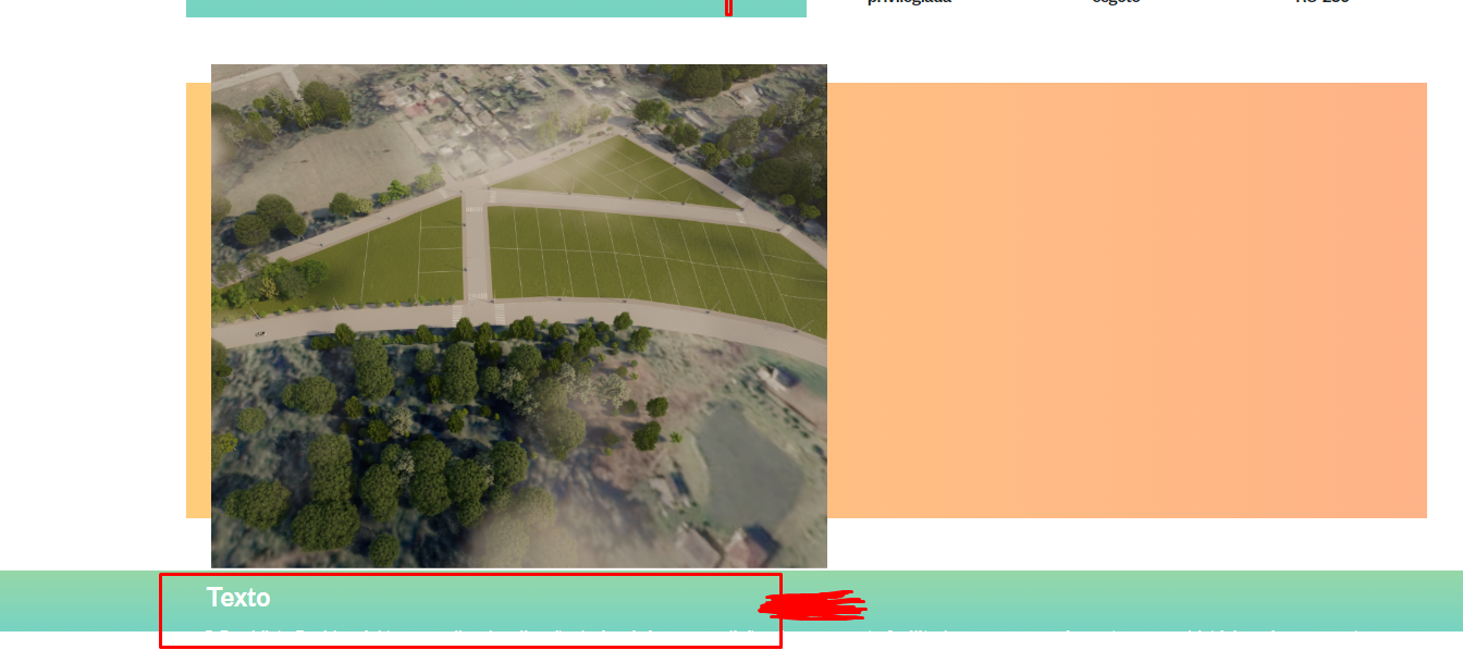
When it comes to responsiveness I need to leave it that way but with col-Md-6 that way it doesn’t stay.

responsividade

1 answer

1


The way you set up the Bootstrap Grid is wrong, you put a div col-12 unnecessary, besides you used a margin-left -2%, but 2% would be more appropriate for the purpose...

inserir a descrição da imagem aqui

Follow the image code above

.second-section .box-orange {
    background-image: url('/img/fundo2.png');
    height: 400px;
    color: white;
}

.second-section img {
    height: 480px;
    margin-top: -5%;
    margin-left: 2%;
    object-fit: cover;
}
@media (max-width: 768px) {
    .second-section .box-orange {
        background-image: url('/img/fundo2.png');
        height: initial;
        color: white;
        padding: 0;
        margin: 0;
    }
    .second-section img {
        height: 480px;
        margin-top: initial;
        margin-left: initial;
    }
}
<link rel="stylesheet" type="text/css" media="screen" href="https://maxcdn.bootstrapcdn.com/bootstrap/4.3.0/css/bootstrap.min.css" />

<section class="second-section">
    <div class="container">
        <div class="row align-items-center my-5 bg-primary">
            
                <div class="col-md-6 box-orange">
                    <img class="w-100" src="https://placecage.com/100/100">
                </div>
                <div class="col-md-6 ml-5 ml-md-0">
                    <h3>Texto</h3>
                    <p>Lorem ipsum, dolor sit amet consectetur adipisicing elit. Dicta libero saepe natus nam
                        recusandae molestiae neque reprehenderit quae, impedit eos vero, in eligendi voluptas
                        nostrum deserunt odit voluptatibus voluptate quis?
                    </p>
                </div>
            
        </div>
    </div>
</section>

  • I edited the question with the responsiveness to see if it gets better to understand.

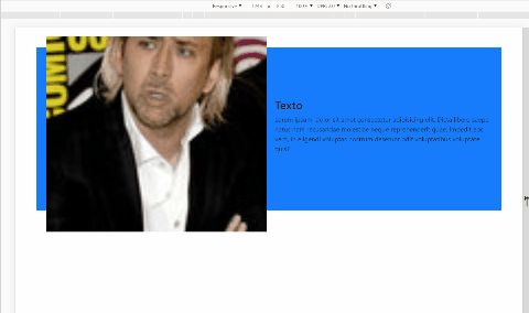
  • @Guilhermerigotti gave a tweaked code I used @media at breacking point 768px which is the same that Bootstrap uses for medium screens -md-, but if you want you can add others, I particularly think you do not need. To move the text away from the left edge I used the class ml-5 which is the greatest Bootstrap original, but you can make another one if you want.

Browser other questions tagged

You are not signed in. Login or sign up in order to post.