How do I place Text inside a Shape made with CSS? Is it possible to place text inside a circle?

Asked

Viewed 1,548 times

3

I know CSS evolves slowly, but I’ve seen a lot of new things out there, especially with the more modern browsers that accept very new properties.

My question is whether there is already any way to put a text inside a shape. Currently it is already possible to place a text inside a circle as in the image below?

inserir a descrição da imagem aqui

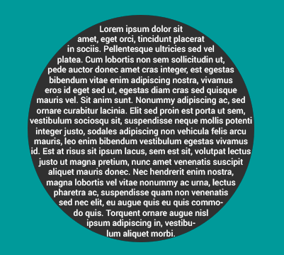
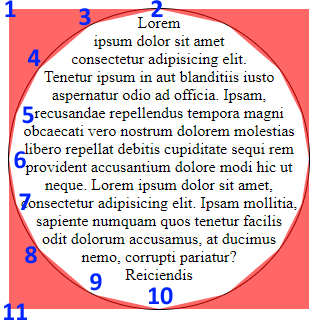
The ball can be made with border-radius, but to make the text accompany the shape of the circle? How to make the text be contained or insert the text into a circular shape, or a div with a certain shape?

Example I tried:

.box {
	width: 300px;
	height: 300px;
	border-radius: 50%;
	border: 1px solid #000;
	margin: auto;
	text-align: center;
}
<div class="box">
  Lorem ipsum dolor sit amet consectetur adipisicing elit. Tenetur ipsum in aut blanditiis iusto aspernatur odio ad officia. Ipsam, recusandae repellendus tempora magni obcaecati vero nostrum dolorem molestias libero repellat debitis cupiditate sequi rem provident accusantium dolore modi hic ut neque. Lorem ipsum dolor sit amet, consectetur adipisicing elit. Ipsam mollitia, sapiente numquam quos tenetur facilis odit dolorum accusamus, at ducimus nemo, corrupti pariatur? Reiciendis exercitationem quibusdam voluptatum assumenda ullam voluptas. 
</div>

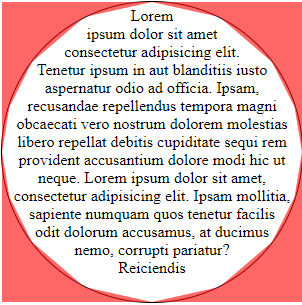
  • I saw it here: https://teamtreehouse.com/community/force-text-to-respect-the-boundaries-inside-of-a-circle

  • There is an option using SVG as code snippet: https://codepen.io/noahblon/pen/pjvPPN

  • It was worth the touch @Laérciolopes but it’s not much what I imagine, there we can say basically that the guy was lucky with the rss alignment

1 answer

3


There is really no property for this. This is because the box elements (div, span, inputs etc.) are built in square form. With clip-path it is possible to hack using the property shape-outside using two daughters, one positioned on the left (float_left) and one on the right (float-right), and the text is in the middle skirting the edges of both sides.

See below a print of the elements clipped in polygon form:

inserir a descrição da imagem aqui

I put a red background and reduced the opacity to be able to visualize the elements clipped around the edge of the circle.

In the clip-path I used 11 coordinate points, adjusting each point in a position so that they are evenly distributed over the edge of the circle.

Below a print with the sequence of points in the polygon in div.left-shape:

inserir a descrição da imagem aqui

To apply the values in div.right-shape the logic is the same, just reversing the values of the left polygon.

Once created the polygon coordinates of the clip-path, just copy the same values to the property shape-outside.

Code:

.box {
	width: 300px;
	height: 300px;
	border-radius: 50%;
	border: 1px solid #000;
	text-align: center;
}

.left-shape{
  shape-outside: polygon(
  0 0,
  100% 0,

  55% 5%,
  20% 20%,
  5% 35%,

  0 50%,

  5% 65%,
  20% 80%,
  55% 95%,

  100% 100%,
  0 100%
  );
  float: left;
  width: 50%;
  height: 100%;
  clip-path: polygon(
  0 0,
  100% 0,

  55% 5%,
  20% 20%,
  5% 35%,

  0 50%,

  5% 65%,
  20% 80%,
  55% 95%,

  100% 100%,
  0 100%
  );
}

.right-shape{
  shape-outside: polygon(
  100% 0,
  0 0,

  45% 5%,
  80% 20%,
  95% 35%,

  100% 50%,

  95% 65%,
  80% 80%,
  45% 95%,

  0 100%,
  100% 100%
  );
  float: right;
  width: 50%;
  height: 100%;
  clip-path: polygon(
  100% 0,
  0 0,

  45% 5%,
  80% 20%,
  95% 35%,

  100% 50%,

  95% 65%,
  80% 80%,
  45% 95%,

  0 100%,
  100% 100%
  );
}
<div class="box">
   <div class="left-shape"></div>
   <div class="right-shape"></div>
   Lorem ipsum dolor sit amet consectetur adipisicing elit. Tenetur ipsum in aut blanditiis iusto aspernatur odio ad officia. Ipsam, recusandae repellendus tempora magni obcaecati vero nostrum dolorem molestias libero repellat debitis cupiditate sequi rem provident accusantium dolore modi hic ut neque. Lorem ipsum dolor sit amet, consectetur adipisicing elit. Ipsam mollitia, sapiente numquam quos tenetur facilis odit dolorum accusamus, at ducimus nemo, corrupti pariatur? Reiciendis
</div>

Documentations:

Compatibility:

  • 1

    That’s right Uncle! I didn’t think anyone would show up to answer... ;) Is there a shap-outside-inset or shape-inside ?

  • 1

    From my research, the only one I could find was shape-outside.

Browser other questions tagged

You are not signed in. Login or sign up in order to post.