One below the other input

Asked

Viewed 3,392 times

1

I’m making a code HTML.

I have some inputs created however they are getting next to each other as if they had a float in them, only I don’t want so.

I want it to be one below the other, it has a function in the CSS that does this?

I know with the <br> I can do it, but I was wondering how CSS.

5 answers

4

There are several ways to do this through CSS, but the important thing is to know that the input is an element of the inline, in fact inline-block, that is, it stays in line, because it only occupies the space of itself, as well as labels, spans, etc..

inserir a descrição da imagem aqui

But how to solve this only with CSS?

One of the ways to put a input by line is giving him the display:block, so it takes up 100% of the width of the screen, and the next input would only come down from it, on the "bass line".

input {
	display: block;
}
<input type="text">
<input type="text">
<input type="text">

  • Hugo I tried to do this only that the inputs come out of alignment. I’m using text-align: center; in the <form>, but by putting block in inputs they are no longer centralized.

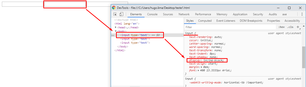
  • @Jeanextreme002 speaks Jean, every time after you change it to display: block it starts to accept some attributes from box model block, then with a simple margin: 0 auto; vc can align them in the center again look here https://prnt.sc/t6vk02 Qq doubt comments that I help you

  • It worked, you can tell me just how to give a margin between inputs?

  • @Jeanextreme002 olha ai https://prnt.sc/t72ffn

  • 1

    Thank you very much ;)

  • @Jeanextreme002 Nothing young!

Show 1 more comment

0

You can do it in various ways as already said, you should only decide if the CSS will be put in the input (that is, all input will have this effect) or any .classeDefinida (then you specify when you want to use) in the case below I created a .class calling for .limitar

.limitar{
     inline-size: 20px;
}
<div class="limitar"> 
<input type="text">
<input type="text">
<input type="text">
</div>

0

tries to put in CSS, each input, as Display: block; or else in the container in which they are.

0

It could be solved like this too.

Depending on what you are doing. You will probably need to put a label.

To add a label, it would look like this:

<body>
	<div>
		<input type="checkbox" name="checkBox[]" class="checkbox-block" id="checkbox-id-1">
		<label for="checkbox-id-1">Checkbox 1</label>
	</div>
	<div>
		<input type="checkbox" name="checkBox[]" class="checkbox-block" id="checkbox-id-2">
		<label for="checkbox-id-2">Checkbox 2</label>
	</div>
	<div>
		<input type="checkbox" name="checkBox[]" class="checkbox-block" id="checkbox-id-3">
		<label for="checkbox-id-3">Checkbox 3</label>
	</div>
</body>

0

You can use a div flexbox in column form and define a width for inputs (generally or individually). In the example below I defined a width 200px for the div where the inputs are. Since the div is a flexbox, the inputs will have 100% div width:

div.col{
   display: flex;
   flex-direction: column;
   width: 200px;
}

div.col input:not(:last-child){
   margin-bottom: 10px;
}
<p>
   Exemplo de inputs em coluna:
</p>
<div class="col">
   <input type="text">
   <input type="text">
   <input type="text">
   <input type="text">
</div>

I also set a spacing of 10px from one input to the other below, except for the last with :not(:last-child).

Browser other questions tagged

You are not signed in. Login or sign up in order to post.