Align textarea with other input with bootstrap

Asked

Viewed 692 times

1

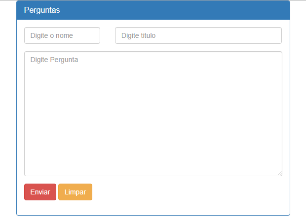
Guys I’m making a little project that is a question and answer site like yahoo so I’m trying to align the textarea with other inputs and not getting it this way
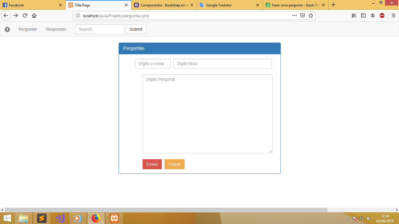
 inserir a descrição da imagem aqui

soon after the code

<?php 
include"index.php";
 ?>
<!DOCTYPE html>
<html lang="">
    <head>
        <meta charset="utf-8">
        <meta http-equiv="X-UA-Compatible" content="IE=edge">
        <meta name="viewport" content="width=device-width, initial-scale=1">
        <title>Title Page</title>

        <!-- Bootstrap CSS -->
        <link rel="stylesheet" href="https://maxcdn.bootstrapcdn.com/bootstrap/3.3.6/css/bootstrap.min.css" integrity="sha384-1q8mTJOASx8j1Au+a5WDVnPi2lkFfwwEAa8hDDdjZlpLegxhjVME1fgjWPGmkzs7" crossorigin="anonymous">
        <link rel="stylesheet" type="text/css" href="style.css">

        <!-- HTML5 Shim and Respond.js IE8 support of HTML5 elements and media queries -->
        <!-- WARNING: Respond.js doesn't work if you view the page via file:// -->
        <!--[if lt IE 9]>
            <script src="https://oss.maxcdn.com/libs/html5shiv/3.7.2/html5shiv.min.js"></script>
            <script src="https://oss.maxcdn.com/libs/respond.js/1.4.2/respond.min.js"></script>
        <![endif]-->
    </head>
    <body>
        <div class="container">
            <div class="row">
                <div class="col-lg-6 col-lg-offset-3">
                    <div class="panel panel-primary">
                        <div class="panel-heading">
                            <h3 class="panel-title">Perguntas</h3>
                        </div>
                        <div class="panel-body">
                            <form action="processar-pergunta.php" method="post" class="form-inline">


                                <div class="container">
                                    <div class="form-group">
                                        <div class="row">
                                            <div class="col-lg-6 col-lg-offset-2 col-xs-12">
                                                <label class=" control-label sr-only">Nome</label><input type="text" name="nome" class="form-control" placeholder="Digite o nome" size="12" required="">
                                            </div>
                                        </div>
                                    </div>
                                    <div class="form-group">
                                        <div class="row">
                                            <div class="col-lg-6 col-lg-offset-1 col-xs-12">
                                                <label class=" control-label sr-only">Titulo</label><input type="text" name="titulo" size="48" class="form-control" placeholder="Digite titulo" required="">
                                            </div>
                                        </div>
                                    </div>

                                </div>

                                <div class="container">
                                    <div class="form-group">
                                        <div class="row">
                                            <div class="col-lg-6 col-lg-offset-1 col-xs-12">
                                                <br>
                                                <label class=" control-label sr-only">Pergunta</label> 
                                                <textarea name="pergunta" id="input" class="form-control" rows="12" cols="63" placeholder="Digite Pergunta" required="required" ></textarea>

                                                <div class="btn-group">
                                                    <br>
                                                    <button type="submit" class="btn btn-danger ">Enviar</button>
                                                    <button type="reset" class="btn btn-warning" style="left: 10px" >Limpar</button>

                                                </div>
                                            </div>
                                        </div>
                                    </div>
                                </div>

                            </form>
                        </div>
                    </div>
                </div>  
            </div>
        </div>

        <!-- jQuery -->
        <script src="https://code.jquery.com/jquery.js"></script>
        <!-- Bootstrap JavaScript -->
        <script src="https://maxcdn.bootstrapcdn.com/bootstrap/3.3.6/js/bootstrap.min.js" integrity="sha384-0mSbJDEHialfmuBBQP6A4Qrprq5OVfW37PRR3j5ELqxss1yVqOtnepnHVP9aJ7xS" crossorigin="anonymous"></script>
        <!-- IE10 viewport hack for Surface/desktop Windows 8 bug -->

    </body>
</html>

1 answer

0


Dude I found the way you set up the form Grid a little confusing, in your case I think it’s best to use the Horizontal Form than the Inline Form . Here is the full documentation link https://getbootstrap.com/docs/3.4/css/#Forms

inserir a descrição da imagem aqui

With the Horizontal Form vc divides the fields into columns, following the Grid in a very simple way.

See how the code of the image above looks

<!DOCTYPE html>
    <html lang="">
    	<head>
    		<meta charset="utf-8">
    		<meta http-equiv="X-UA-Compatible" content="IE=edge">
    		<meta name="viewport" content="width=device-width, initial-scale=1">
    		<title>Title Page</title>
    
    		<!-- Bootstrap CSS -->
    		<link rel="stylesheet" href="https://maxcdn.bootstrapcdn.com/bootstrap/3.3.6/css/bootstrap.min.css" integrity="sha384-1q8mTJOASx8j1Au+a5WDVnPi2lkFfwwEAa8hDDdjZlpLegxhjVME1fgjWPGmkzs7" crossorigin="anonymous">
    		<link rel="stylesheet" type="text/css" href="style.css">
    
    		<!-- HTML5 Shim and Respond.js IE8 support of HTML5 elements and media queries -->
    		<!-- WARNING: Respond.js doesn't work if you view the page via file:// -->
    		<!--[if lt IE 9]>
    			<script src="https://oss.maxcdn.com/libs/html5shiv/3.7.2/html5shiv.min.js"></script>
    			<script src="https://oss.maxcdn.com/libs/respond.js/1.4.2/respond.min.js"></script>
        <![endif]-->
        
    	</head>
    	<body>
    		<div class="container">
    			<div class="row">
    				<div class="col-lg-6 col-lg-offset-3">
    					<div class="panel panel-primary">
    						<div class="panel-heading">
    							<h3 class="panel-title">Perguntas</h3>
    						</div>
    						<div class="panel-body">
    							<form action="processar-pergunta.php" method="post" class="form-horizontal">

                          <div class="form-group">
                            <div class="col-sm-4">
                                <label class=" control-label sr-only">Nome</label>
                                <input type="text" name="nome" class="form-control" placeholder="Digite o nome" required="">
                            </div>
                            <div class="col-sm-8">
                                <label class=" control-label sr-only">Titulo</label>
                                <input type="text" name="titulo" class="form-control" placeholder="Digite titulo" required="">
                            </div>
                          </div>

                          <div class="form-group">
                            <div class="col-sm-12">
                                <label class=" control-label sr-only">Pergunta</label> 
                                <textarea name="pergunta" id="input" class="form-control" rows="12" placeholder="Digite Pergunta" required="required" ></textarea>
                            </div>
                          </div>

                          <div class="form-group">
                            <div class="col-sm-12">
                                <button type="submit" class="btn btn-danger ">Enviar</button>
                                <button type="reset" class="btn btn-warning" style="left: 10px" >Limpar</button>
                            </div>
                          </div>

    							</form>
    						</div>
    					</div>
    				</div>	
    			</div>
    		</div>
    		
    		<!-- jQuery -->
    		<script src="https://code.jquery.com/jquery.js"></script>
    		<!-- Bootstrap JavaScript -->
    		<script src="https://maxcdn.bootstrapcdn.com/bootstrap/3.3.6/js/bootstrap.min.js" integrity="sha384-0mSbJDEHialfmuBBQP6A4Qrprq5OVfW37PRR3j5ELqxss1yVqOtnepnHVP9aJ7xS" crossorigin="anonymous"></script>
    		<!-- IE10 viewport hack for Surface/desktop Windows 8 bug -->
     		
    	</body>
    </html>

  • 1

    Thanks line up, dude I wanted help to learn how to use the grid system I don’t know very well use you know some article where I can help in this?

  • @Adrianorufino flexbox is the best currently to build layouts and has better support than grid. Look for the Origamid flexbox guide that will help you a lot and this in Portuguese. But in this case study well the grid used by Bootstrap, because it is he that you are using in the project for what I saw. If you think the answer solved the problem remember March as accepted in this icon below the arrows of the answer. ;)

Browser other questions tagged

You are not signed in. Login or sign up in order to post.