1
I’m having difficulties to format the following grid, when I have several boxes, the format is correct.
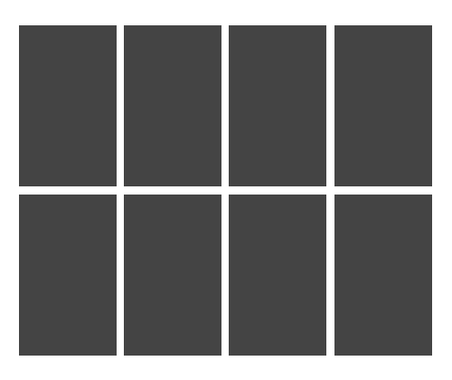
When only one box is added/shown, the grid picks up 100% of my father div, and I’d like it to be 155px

<div class="grid">
<?php for ($i = 0; $i < 15; $i++) :?>
<a href=""><div class="mbp">
box grid
</div></a>
<?php endfor;?>
</div>
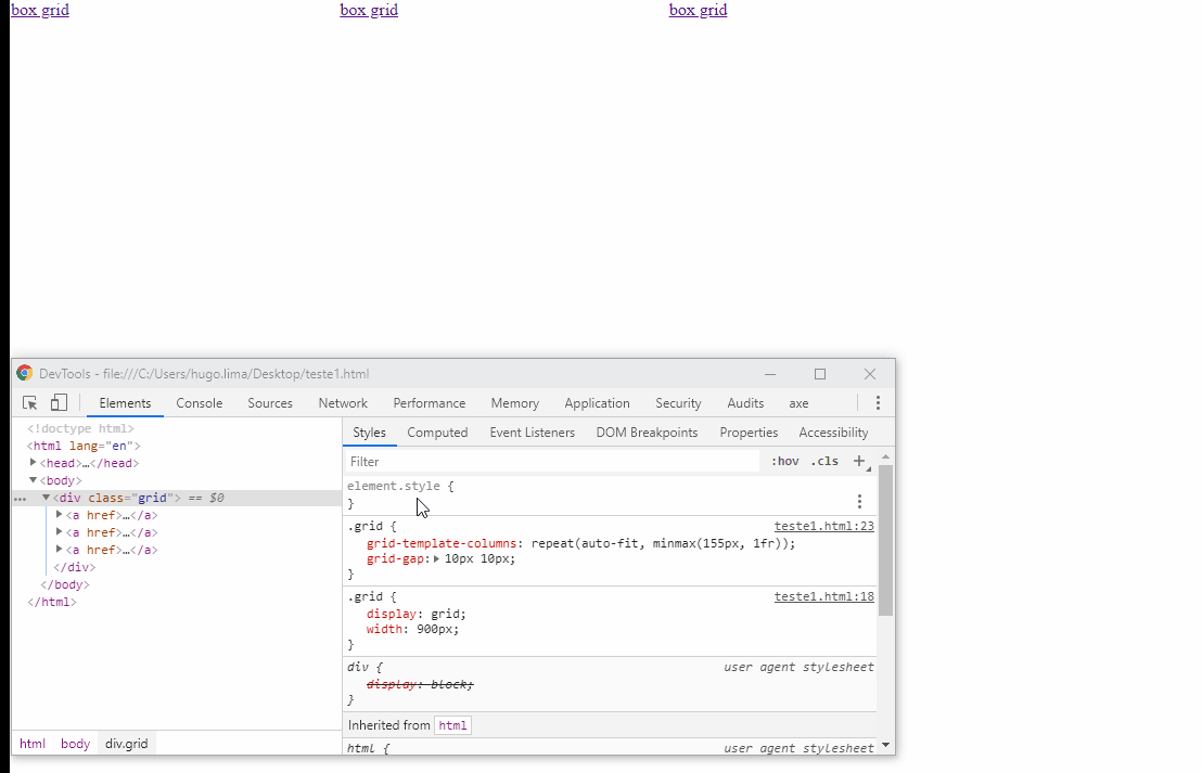
.grid {
display: grid;
width: 900px;
}
.grid {
grid-template-columns: repeat(auto-fit,
minmax(155px, 1fr));
grid-gap: 10px 10px;
}
.grid a > div {
display: flex;
flex-flow: column;
height: 290px;
border: 1px solid transparent;
}
almost that old, only problem is when only has a
flex-itemShe’s in the center, has to stay on the left– goio
@goio, no css
flex-container, change thejustify-contentforleft– Pedro Henrique