I don’t think you have a single answer to your question. Most of it can be answered with this other question What is the difference between "Css Resolution" and "Pixel Resolution" where vc can better see what the difference is between high and low density screens and how we can treat CSS using media queries rules such as
@media (min-resolution: 2dppx) { ... } /* regra css para telas com 2x a densidade de  pixel */
@media (min-resolution: 3dppx) { ... } /* regra css para telas com 3x a densidade de pixel */
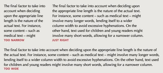
Another part of the answer may be based on typographical and UX concepts, where some good practices can be followed. As it does not have very long text lines, for example a text line with more than 14 words, or a very wide inputs, but the user will insert only a few characters.
The ideal is to have up to 14 words per line. But how will you treat this on a monitor that is 2,500px wide? Probably you will need to "break" the text in 2 columns or more.
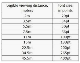
Another point is that usually on the desktop if it is close to the screen, in the mobile closer still then the font-size doesn’t have to be so big. Already on a presentation screen or TV you are already far away and the font-size needs to be treated, independent of screen resolution.
On the images the ideal is to use the SRCSET https://developer.mozilla.org/en-US/docs/Aprender/HTML/Multimedia_and_embedding/Responsive_images
<img srcset="imagem-320w.jpg 320w,
             imagem-480w.jpg 480w,
             imaem-800w.jpg 800w"
     sizes="(max-width: 320px) 280px,
            (max-width: 480px) 440px,
            800px"
     src="imagem-800w.jpg" alt="">
For Bootstrap it would be something like this
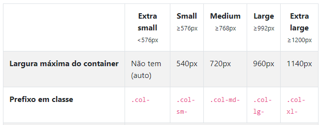
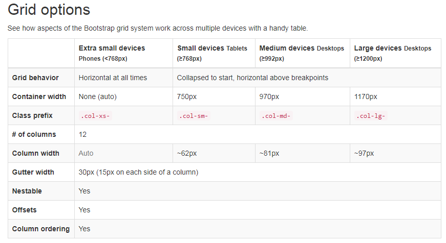
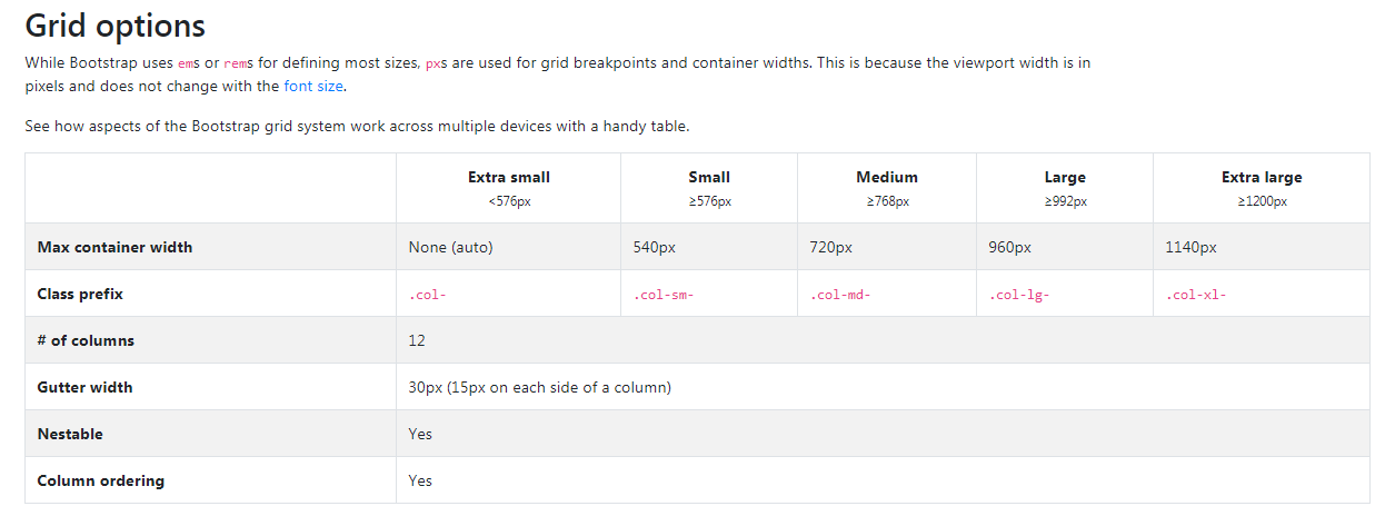
1 - If you are using Bootstrap with the default Grid you theoretically would need the images in these resolutions. Here is the official documentation: https://getbootstrap.com/docs/4.0/layout/grid/
$grid-breakpoints: (
  // Extra small screen / phone
  xs: 0,
  // Small screen / phone
  sm: 576px,
  // Medium screen / tablet
  md: 768px,
  // Large screen / desktop
  lg: 992px,
  // Extra large screen / wide desktop
  xl: 1200px
);
2 - To load the images with each of the grid resolutions would look something like this:
<picture>
    <source media="(min-width: 576px)" srcset="suaimagem-sm.png"/>
    <source media="(min-width: 768px)" srcset="suaimagem-md.png"/>
    <source media="(min-width: 992px)" srcset="suaimagem-lg.png"/>
    <source media="(min-width: 1200px)" srcset="suaimagem-lx.png"/>
    <img src="suaimagem-md.png" alt="">
<picture>
Another option would be you having a stylesheet for mobile.css and one for desktop.css, and identifying the type of access device by JS you use a sheet or another. One option is to use direct from the attribute media of link of css.
<link rel="stylesheet" href="mobile.css" media="screen and (max-width: 768px)" />
<link rel="stylesheet" href="desktop.css" media="screen and (min-width: 769px)" />
But this technique if the device is mobile, but has more than 768px width, the user will end up loading the sheet desktop.css even being on mobile... There is an approach recognizing the user-agent device by JS is better.
One thing that can help is trying to do Media Queries that take the orientation of the device if it is portrait or landscape.
And His @media would look something like this for example:
@media all and (orientation: portrait) { ... }

@media (min-width: 700px) and (orientation: landscape) { ... }
You can read more about CSS and device guidance here: https://developer.mozilla.org/en-US/docs/Web/Guide/CSS/CSS_Media_queries#orientation
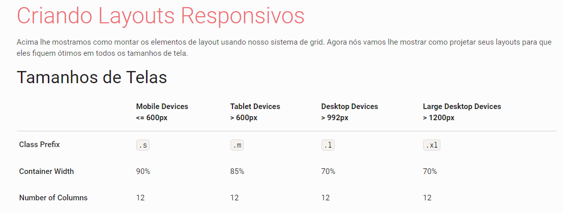
Breakpoint
About the "Breaking Points" (break points of the layout) nor the Google or the Mozilla make references to this in their documentation. In fact what they recommend and use of Meta Viewport and treat the layout in a way that is responsive and accessible.
Follow official links with good practices.
Nor is there much consensus among the Frameworks Design System most famous as Bootstrap, Materialize and Foundation!
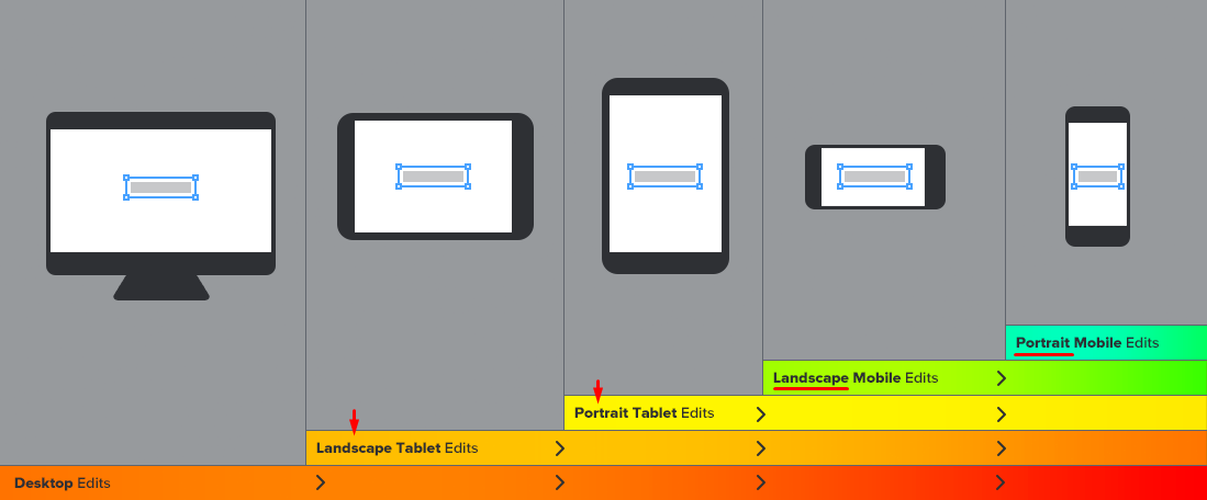
Note below that each of them determines a different width for the Breaking Points of Grid who use.
Bootstrap3 Breaking Points
Bootstrap4 Breaking Points
Materialize Breaking Points
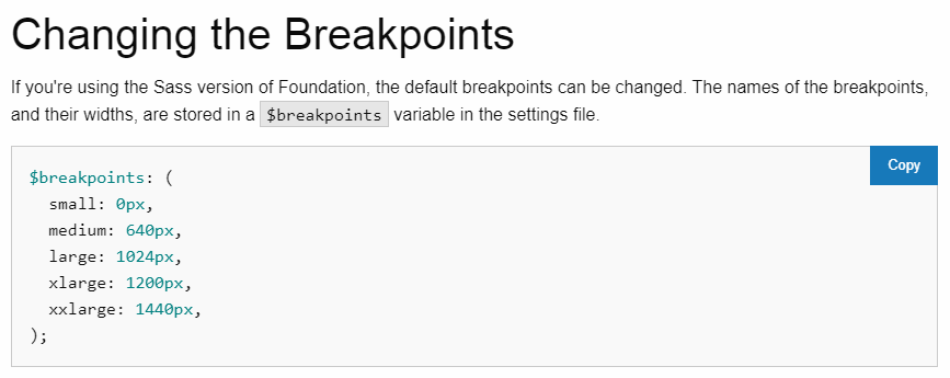
Foundation Breaking Points
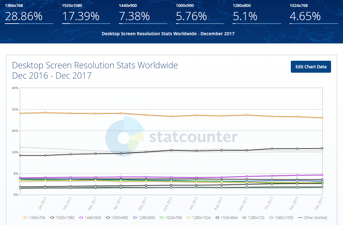
And to finish here is an excellent article about the most used screen sizes currently, the data are from December 2017. Article: https://www.hobo-web.co.uk/best-screen-size/
Telas Desktop
- 1366 768 - 29.25%
- 1920 1080 - 17.34%
- 1440 900 - 7.32%
- 1600 900 - 5.72%
- 1280 800 - 5.27%
- 1280 1024 - 4.51%
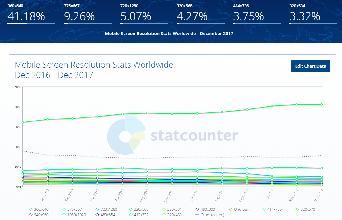
Telas Mobile
- 360 640 - 41.11%
- 375 667 - 9.58%
- 720 1280 - 5.16%
- 320 568 - 4.55%
- 414 736 - 3.79%
- 320 534 - 3.46%
Telas Tabler
- 768 1024 - 57.99%
- 1280 800 - 5.89%
- 600 1024 - 4.6%
- 601 962 - 3.02%
- 800 1280 - 2.94%
- 1024 600 - 2.36%
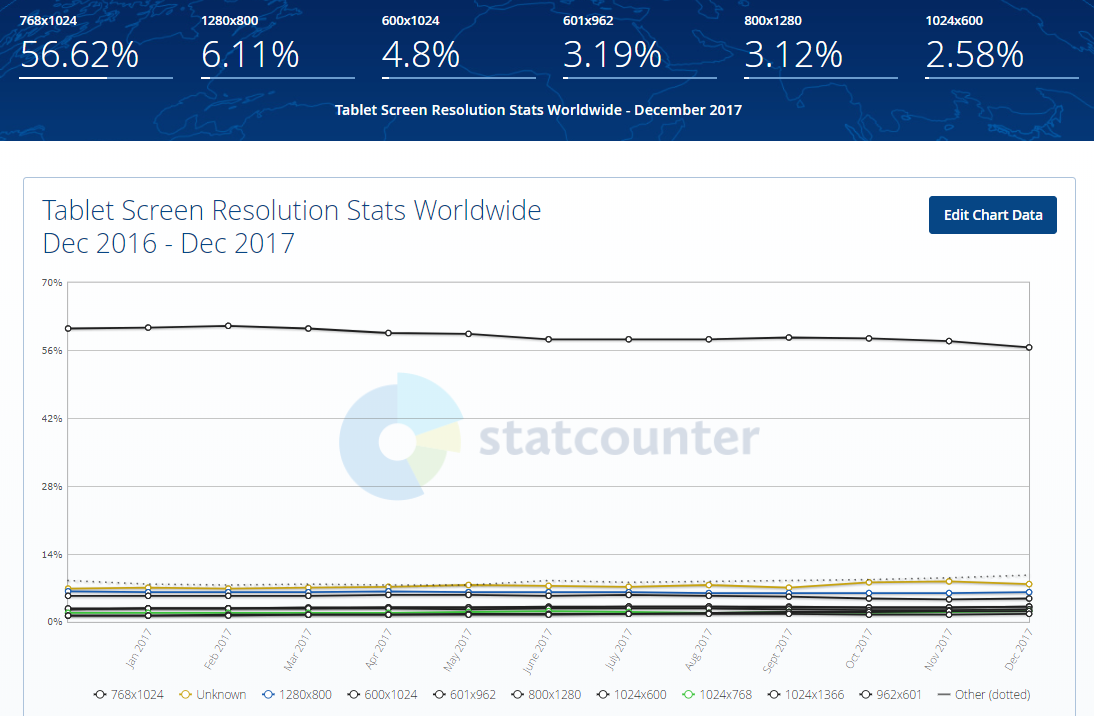
Source: http://gs.statcounter.com/screen-resolution-stats/tablet/worldwide
OBS: Always consider your target audience and user experience before you begin development!
I don’t know if I touched all the dots, but I believe I have something to shed some light on.