-1
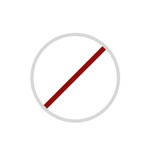
I need to make this circular shape below, with a diagonal stroke in CSS.
Can someone help me?
-1
I need to make this circular shape below, with a diagonal stroke in CSS.
Can someone help me?
3
Just use the linear-gradient on the diagonal does not have much secret
body {
  background-color: azure;
}
.box {
  width: 100px;
  height: 100px;
  border: 7px solid #666;
  border-radius: 50%;
  background-image: linear-gradient(to top left, transparent 47%, red 48%, red 53%, transparent 54%)
}
<div class="box"></div>3
You can also use a pseudo-element ::after, centering it with flexbox and applying a 45 degree rotation:
.proibido {
   width: 150px; /* largura da circunferência */
   height: 150px; /* altura da circunferência */
   border: 10px solid #ddd; /* largura e cor da borda da circunferência */
   border-radius: 50%;
   position: relative;
   display: flex;
   justify-content: center;
}

.proibido::after{
   content: '';
   position: absolute;
   top: 0;
   width: 10px; /* largura da faixa */
   height: 100%;
   background: #BF2600; /* cor da faixa */
   transform-origin: center;
   transform: rotate(45deg);
}
<div class="proibido"></div>Browser other questions tagged css css3
You are not signed in. Login or sign up in order to post.
Have you tried anything? What was the result?
– Woss