Create layout with`content` responsive

Asked

Viewed 60 times

0

I’m developing a layout, but I need help.

I want to create a content fit the page.

sample code.

<!DOCTYPE html>
<html lang="pt-br">

<head>
  <meta charset="utf-8">
  <meta name="viewport" content="width=device-width, initial-scale=1, shrink-to-fit=no">
  <meta name="description" content="">
  <meta name="author" content="">
  <link rel="apple-touch-icon" href="apple-touch-icon.png">
  <title>Start Template</title>

</head>

<body class="theme-teal">
    <nav class="navbar"></nav>
	<aside id="leftsidebar" class="sidebar main-sidebar">
	    <div class="legal">
            <div class="copyright">© copyright 2019</div>
        </div>
	</aside>
	
	<section class="content">
	    <div class="main-content">
            <p id="">CONTENT</p>
		</div>
    </section>
</body>

</html>
<style>
    .navbar {
	    border-radius: 0;
	    box-shadow: 0 1px 5px rgba(0, 0, 0, 0.3);
		border: none;
		position: fixed;
		top: 0;
		left: 0;
		z-index: 12;
		width: 100%;
		min-height: 50px;
        margin-bottom: 20px;
	}
	.theme-teal .navbar {
        background-color: #009688;
    }
	.sidebar {
		font-family: "Roboto", sans-serif;
		background: #fdfdfd;
		width: 300px;
		overflow: hidden;
		display: inline-block;
		height: calc(100vh - 50px);
		position: fixed;
		top: 50px;
		left: 0;
		box-shadow: 2px 2px 5px rgba(0, 0, 0, 0.1);
		z-index: 11 !important;
	}
	.theme-teal .sidebar .legal {
	    background-color: #fff;
	}
	.sidebar .legal {
	    position: absolute;
		bottom: 0;
		width: 100%;
		border-top: 1px solid #eee;
		padding: 15px;
		overflow: hidden;
	}
	.content {
	    min-height: 250px;
		padding: 15px;
		margin-right: auto;
		margin-left: auto;
		padding-left: 15px;
		padding-right: 15px;
		background: #e6e6e6;
	}
	.mainNav {
	    margin-bottom: 0px;
		background: #ecf0f5;
	}
	
	@media (max-width: 1187px){
	    .sidebar {
	        width: 0px;
	    }
	}	
	
</style>

I want you inside this content, all page information is displayed.

OBSERVING The content remains visible on the screen, as shown in the image below, and the information inside it, can run in a scroll, if necessary.

inserir a descrição da imagem aqui

1 answer

5


You have to adjust many properties in the CSS to position the section. See that I used some calc() in the width (discounting the width of the sidebar) and height (adjusting to the height of the screen), I placed to the right with float, put a margin-top of the height of nav so that the section do not get below, adjusted the width of class .legal discounting the paddings, among other various adjustments. If you are going to comment one by one it will get huge the answer. Best you see the differences in CSS and compare with your original code.

It is also important to reset the margin of body with margin: 0. Afterlife to take out the overflow and just put in the section, like you explained in the question.

<!DOCTYPE html>
<html lang="pt-br">

<head>
  <meta charset="utf-8">
  <meta name="viewport" content="width=device-width, initial-scale=1, shrink-to-fit=no">
  <meta name="description" content="">
  <meta name="author" content="">
  <link rel="apple-touch-icon" href="apple-touch-icon.png">
  <title>Start Template</title>

</head>

<body class="theme-teal">
    <nav class="navbar"></nav>
	<aside id="leftsidebar" class="sidebar main-sidebar">
	    <div class="legal">
            <div class="copyright">© copyright 2019</div>
        </div>
	</aside>
	
	<section class="content">
	    <div class="main-content">
            <p id="">CONTENT</p>
            <br><br><br><br><br><br><br><br><br><br><br><br><br><br><br><br><br><br><br><br><br><br><br><br><br><br><br><br><br><br><br><br><br><br><br><br><br><br><br>


		</div>
    </section>
</body>

</html>
<style>
body{
   margin: 0;
   overflow: hidden; 
}
    .navbar {
	    border-radius: 0;
	    box-shadow: 0 1px 5px rgba(0, 0, 0, 0.3);
		border: none;
		position: fixed;
		top: 0;
		left: 0;
		z-index: 12;
		width: 100%;
		min-height: 50px;
        margin-bottom: 20px;
	}
	.theme-teal .navbar {
        background-color: #009688;
    }
	.sidebar {
		font-family: "Roboto", sans-serif;
		background: #fdfdfd;
		width: 300px;
		overflow: hidden;
		display: inline-block;
		height: calc(100vh - 50px);
		position: fixed;
		top: 50px;
		left: 0;
		box-shadow: 2px 2px 5px rgba(0, 0, 0, 0.1);
		z-index: 11 !important;
	}
	.theme-teal .sidebar .legal {
	    background-color: #fff;
	}
	.sidebar .legal {
	    position: absolute;
		bottom: 0;
		width: 270px;
		border-top: 1px solid #eee;
		padding: 15px;
		overflow: hidden;
	}
	.content {
      float: right;
      width: calc(100vw - 330px);
	    height: calc(100vh - 65px);
		padding: 15px;
      margin-top: 50px;
		background: #e6e6e6;
	}
   
   .main-content{
      background: #FFEECF;
      padding: 15px;
      height: calc(100vh - 110px);
      overflow: auto;
   }
	.mainNav {
	    margin-bottom: 0px;
		background: #ecf0f5;
	}
	
	@media (max-width: 1187px){
	    .sidebar {
	        width: 0px;
	    }
	}	
	
</style>

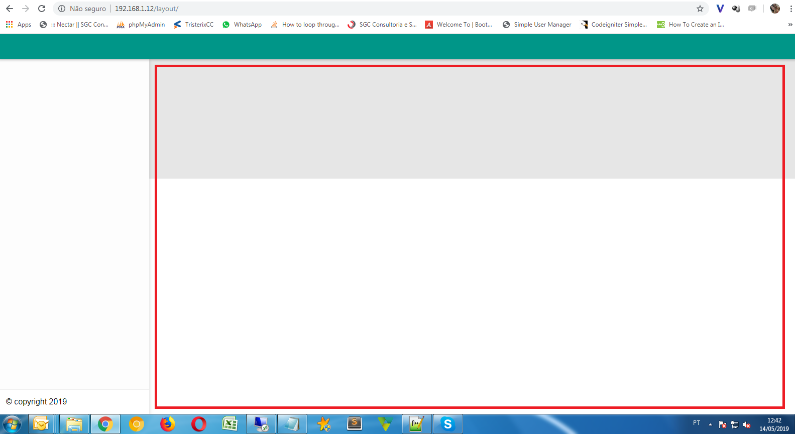
  • image, for the class main-content I changed the background color and added a shadow to explain it better. content is fixed on the page and the re-reading of the screen is appropriate, but is always visible in the way it is in the image, the only content that will change, will be what is inside main-content.. Is it possible ? https://i.imgur.com/hGl7yGQg.png

  • Look now.....

  • Very good, thank you for the time, response and help..

Browser other questions tagged

You are not signed in. Login or sign up in order to post.