Guy first you’re on the right track! Doing it by hand on your own, without copying codes that others have done or tutorials, let alone using Bootstrap! Doing in hand you will learn CSS in depth and that will help you for the rest of your life.
Now for your answer.
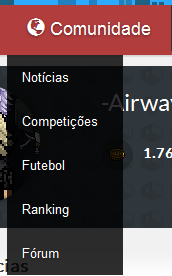
First make in HTML the sub-menu with a new <ul> within the <li> as in the example below:
...
<ul>
<li class="active">
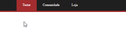
<a href="/"><i class="glyphicon glyphicon-user"></i> Tester</a>
<ul>
<li><a href="#">sub-1</a></li>
<li><a href="#">sub-2</a></li>
<li><a href="#">sub-3</a></li>
</ul>
</li>
...
Now that you already have HTML in place it’s time for CSS, first you need to hide the UL with the sub menu until you have the :hover in li, for that use display:none. Enjoy and already put other properties you will need, as position:absolute to get the element out of the content stream and not to push the other elements of the screen when it appears.
.active ul {
position: absolute;
display: none;
flex-direction: column;
width: auto;
padding: 0;
}
Now the style of :hover, I used as little CSS as possible to make it easy for you to understand what was done
.active:hover ul {
display: flex;
}
Follow the image code above
.menu {
  width: 100%;
  background: #1f1f1f;
  border-bottom: 4px solid #a32c2e;
  font-size: 11px;
}

.menu ul {
  margin: 0 auto;
  width: 960px;
}

.menu ul li {
  list-style: none;
  float: left;
}

.menu ul li:hover {
  cursor: default;
}

.menu a {
  display: block;
  text-decoration: none;
  color: #FFFFFF;
  padding: 0 20px;
}

.menu:after,
.menu ul:after {
  content: '';
  display: block;
  clear: both;
}

.menu>ul>li>a {
  line-height: 39px;
}

.menu ul li:hover>a,
.menu ul li.active>a {
  background: #a32c2e;
  color: #FFFFFF;
}
    .active ul {
        position: absolute;
        display: none;
        flex-direction: column;
        width: auto;
        padding: 0;
    }
.active:hover ul {
    display: flex;
}
.active:hover ul li a{
color: black;
}
<nav>
    <div class="menu">
        <ul>
            <li class="active">
                <a href="/"><i class="glyphicon glyphicon-user"></i> Tester</a>
                <ul>
                    <li><a href="#">sub-1</a></li>
                    <li><a href="#">sub-2</a></li>
                    <li><a href="#">sub-3</a></li>
                </ul>
            </li>

            <li><a href="/"><i class="glyphicon glyphicon-globe"></i> Comunidade</a></li>
            <li><a href="/"><i class="glyphicon glyphicon-shopping-cart"></i> Loja</a></li>

            <li style="float:right"><a href="/"><i class="glyphicon glyphicon-log-out"></i> Sair</a></li>
        </ul>
    </div>
</nav>
You are the guy :))
– Pedro
@Pedro for nothing my young man, I just gave an update on the code, I think it’s now more cute as you can see ni Gif who also updated, []s
– hugocsl